EN
EN

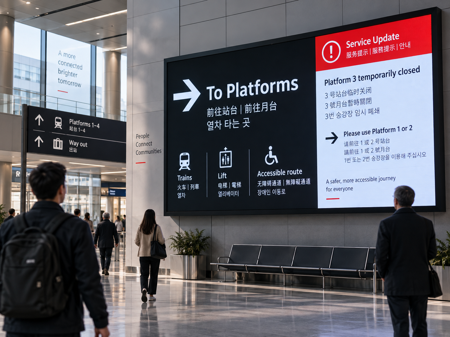
A public information screen is successful only when people can understand the essential message quickly enough to act on it. That sounds simple until the same screen must serve fast and slow readers, people approaching from different distances, visitors who use different languages, and operators who occasionally need to replace routine information with a temporary instruction.
For a custom LED display screen, accessibility is therefore not just a question of making text visible. It is a content-architecture decision: what should be understood first, what can wait, what must remain consistent between languages, and what should happen when an urgent or temporary message interrupts the normal screen state.
The physical display and the content plan should be considered together. When comparing a custom LED display screen for a transport entrance, public lobby, hospital wayfinding point, campus, municipal facility or similar information environment, the useful question is not “How much content can fit?” It is “Can the reader still identify the primary action before secondary information competes for attention?”
Start With the Reading Moment, Not the Artwork
The same message can perform very differently depending on when and where it is read. A visitor standing in a reception area has time to scan supporting detail. A person walking toward a junction may have only a few seconds to decide which direction to take. A passenger entering a concourse may need to recognise a route change before looking for any secondary explanation.
That is why project context should be defined before typography, colour treatment or decorative composition. The content team needs a clear picture of the audience, the viewing moment, the kinds of messages that will appear, the language requirement and who is responsible for changing screen states during normal operation.
Map the first useful viewing point and the decision the person is likely to make there.
Separate the immediate action from information that can be read after the decision is made.
Define which routine content yields to a temporary message and who restores the normal state.
This prevents a common planning error: designing one attractive “normal” screen and treating every later message as a variation of the same layout. Public-information content usually needs several states, and those states should be related by a stable hierarchy rather than improvised one at a time.
Build Text Hierarchy Around the Reader’s Next Decision
A practical text hierarchy does not need rigid font-size formulas to be useful. It needs clear roles. The reader should be able to tell which line is the instruction, which information supports that instruction, and which detail can be ignored until later.
The critical test is subtraction. If removing a line does not change the reader’s immediate decision, that line should not compete visually with the instruction that does. This is especially important on a public-information LED Display Board, where several message categories may share the same physical screen over the course of a day.
Another useful test is distance. The primary message should still make sense when the reader is far enough away that supporting detail is not yet practical to read. As the person moves closer, the second layer can answer the next question. This creates a natural information sequence without pretending that every line deserves equal emphasis.
A crowded screen often fails before it becomes unreadable
Users may technically be able to read every item and still struggle to decide what matters. Too many equal-weight labels, icons, banners and supporting lines increase the time needed to identify the action. Accessibility improves when visual emphasis follows decision priority rather than content quantity.
Use Contrast to Separate Information Roles
Contrast should do more than make individual words stand out. It should help people distinguish information roles and recognise when the screen has changed state. Foreground text needs clear separation from its background, but the bigger content-design question is whether the same visual system consistently tells the reader what is primary, secondary, normal or temporary.
A normal directional message, for example, should not use the same emphasis pattern as a route closure if the project expects people to recognise the closure as an exception. Conversely, an urgent state should not become a collage of competing colours, icons and blocks that makes the instruction harder to find.
The strongest separation belongs to the message that changes the reader’s action. Supporting text remains clear but visually quieter. Decorative content stays behind the information structure.
Every label is highlighted, every panel uses a strong accent, and the user has to compare several “important” elements before finding the actual instruction.
The review should therefore compare content states, not just one screenshot. If routine messages, temporary notices and priority instructions are evaluated side by side, it becomes easier to see whether the visual language remains predictable.
Choose Multilingual Layout by Reading Task, Not Symmetry
Adding a second or third language changes the amount of usable content space and can disturb a hierarchy that worked well in one language. The solution is not to squeeze every translation into matching boxes. The project should decide whether people need to see the languages at the same time or whether separate language states are acceptable for that particular message.
Both languages are visible together. This is useful when the reader should not have to wait before finding the instruction in the required language.
Watch for: compressed lines, inconsistent hierarchy and a translated block becoming visually subordinate simply because it is longer.
Each language receives its own state. This preserves more space per version and can suit longer notices where the reading moment allows it.
Watch for: readers arriving between states and waiting for a language when the decision itself is time-sensitive.
The primary action must stay primary in every language. If “Proceed to Hall C” is the decision in the source language, its translation should not be visually demoted beneath a descriptive sentence merely to preserve a symmetrical layout.
Real copy should be tested early. Placeholder text tends to hide the problems that matter: long destination names, unequal sentence lengths, mixed scripts, abbreviations that cannot be translated cleanly, or a supporting note that becomes longer than the instruction itself.
A practical multilingual check
Place the longest realistic message in every required language into the proposed layout. Then ask whether the action is still obvious, whether each language remains associated with the same message, and whether the layout still works without reducing every element to the same visual weight.
Define Priority Messages Before an Operator Needs Them
Priority is a content-state problem. Normal information may include directions, schedules, service status or general notices. A temporary change may need to replace part of that content. A higher-priority instruction may need to suppress almost everything else. The hierarchy should be decided before the event, not invented while the screen is already in use.
Wayfinding, schedule, status or general public information.
Room change, closure, revised route or another short-term condition.
The message that must dominate the screen because competing content would slow the required response.
Decide the override scope
Not every temporary message needs the whole screen. A local change may only need the primary content zone, while a critical instruction may justify removing secondary content entirely. The planning team should define which message classes can take over which areas so the operator is not forced to make layout decisions under time pressure.
Plan the return to normal
A temporary state is incomplete unless the return condition is also clear. Once the changed route, closure or special event ends, the screen needs an intentional normal state to return to. Otherwise an expired message may remain visible, or routine information may return in a partially updated form.
Avoid “urgent-looking” routine content
If ordinary promotions, announcements or decorative graphics repeatedly use the same treatment reserved for priority information, users learn that the visual cue does not mean anything special. The strongest visual language should be protected for the messages that truly change what a person needs to do.
Give the Supplier the Inputs That Actually Shape the Content Area
A useful project brief should describe the communication problem, not only the desired screen. The following inputs help connect the physical display with the proposed information layout without turning the discussion into a separate brightness, networking or approval guide.
Send representative messages, not only category names
“Wayfinding” is too abstract to test a layout. A real example such as “International Conference Centre — Hall C — East Lift” immediately reveals line length, hierarchy and translation pressure. A small set of realistic normal, multilingual and temporary messages is more useful than a long list of generic content labels.
Use Factory Review to Confirm Display Fit, Not to Outsource Content Decisions
The project team owns the meaning of the messages: wording, required languages, operational priority and the conditions that trigger temporary states. The display side of the project needs to understand how those requirements translate into usable screen zones and whether the proposed format gives the content enough room to preserve hierarchy.
The most useful factory discussion therefore sits at the interface between physical display and content plan. Confirm the intended primary zone, the space needed for secondary information, how multilingual states affect the layout, and whether a priority state materially changes the composition.
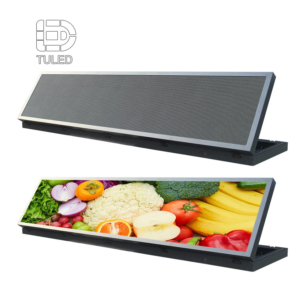
Test the board with realistic message states
An empty board can make almost any layout look spacious. Representative copy exposes the real pressure points: a long destination, two language versions, a temporary route change or an instruction that needs to dominate the screen.
The review should confirm that the proposed information zones still make sense when these states are inserted, rather than judging fit from placeholder headlines alone.
Explore LED Display BoardClarify the technical/content interface
A clean handoff identifies which decisions belong to content operations and which need to be reflected in the screen project. For example, the project team can define that a priority message uses the full screen, while the display/layout review confirms that the proposed screen format can accommodate the required language versions and information blocks.
This boundary prevents two opposite problems: the content team discovering too late that realistic messages do not fit the planned composition, or the hardware discussion drifting into assumptions about wording, translation or operational responsibility that only the project owner can define.
Review Accessibility by Message State
One table is useful here because the review is comparative. It allows the team to check whether each message type has a clear reader task, hierarchy, language treatment and priority state without turning the entire article into a specification sheet.
| Message type | Primary reader task | Hierarchy focus | Language treatment | Priority state |
|---|---|---|---|---|
| Wayfinding | Identify where to go next. | Destination or direction first; detail second. | Parallel languages often help when the decision is immediate. | Normal |
| Service status | Understand availability or current condition. | Status first; explanation subordinate. | Parallel or sequential depending on reading time. | Normal |
| Route or room change | Recognise that previous guidance no longer applies. | Changed instruction must outrank routine information. | Keep the changed action equally clear in each required language. | Temporary override |
| Priority instruction | Understand the required action immediately. | Remove competing content where necessary. | Essential action remains primary in every language. | Highest defined priority |
| General notice | Read supporting information without losing core navigation. | Keep notice subordinate to essential operational information. | Choose layout according to copy length and reading time. | Normal or scheduled |
The strongest review uses actual project messages. Generic samples rarely reveal the issues that affect real reading: one language expanding beyond the expected space, a temporary message that looks too similar to routine content, or supporting detail becoming visually stronger than the instruction it is meant to explain.
Frequently Asked Questions
How should text hierarchy be structured on an accessible LED display? +
What should be considered when the same message appears in multiple languages? +
How can priority messages override normal content without creating confusion? +
What information should be defined before customising the display content layout? +
Send the screen context and message states before the layout is locked
For a useful content-layout discussion, prepare the screen size, viewing locations, required languages, message types, priority states, content source, indoor/outdoor environment, quantity, power requirement, installation country and timeline. Add examples of a normal message, a multilingual message and a temporary or priority message where possible.
That gives the project team a concrete basis for checking information zones, display-board fit and the boundary between screen configuration and content responsibility before production decisions are finalised.