EN
EN

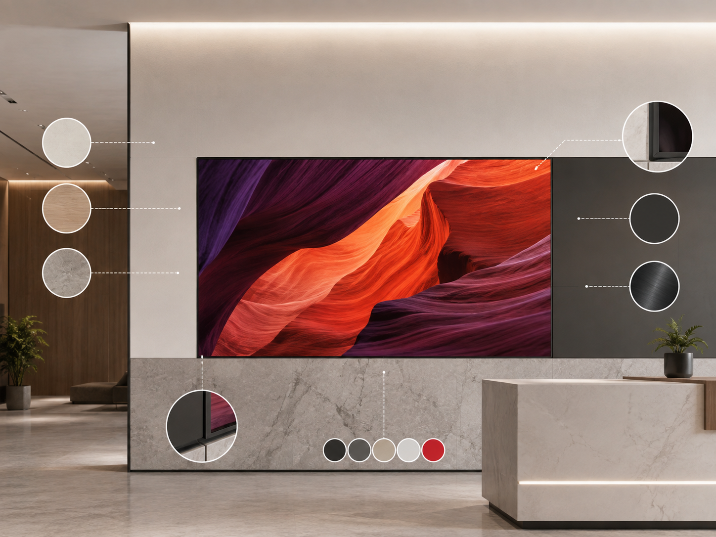
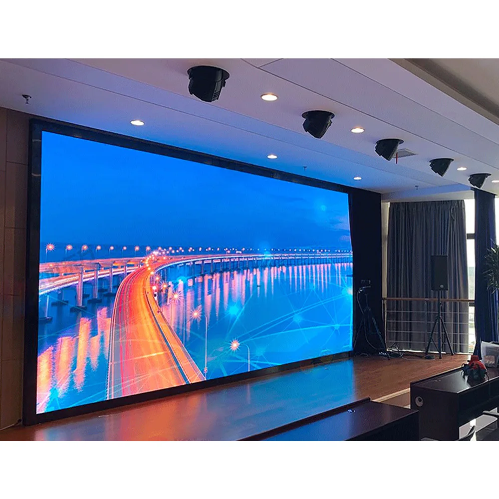
A wall-integrated LED display can perform well and still feel visually unfinished when the surrounding materials are not coordinated. In a branded interior, a Custom LED Wall Sign sits beside stone joints, timber grain, metal finishes, painted surfaces, trim lines, lighting, and brand colors. Those interfaces often determine whether the finished wall looks intentional or simply fitted around a screen.
This guide explains how to coordinate wall materials, bezel finishes, trim gaps, and brand colors before an integrated LED wall detail is approved.
The useful design question is not how to hide every edge. Instead, the screen perimeter should have a clear relationship with the architecture. Sometimes it should almost disappear. In other spaces, a controlled metal edge or shadow line works better. The same principle applies to brand color: the physical wall and the luminous image need to feel related, even though they create color in different ways.
The Wall Material Changes What a Good LED Edge Looks Like
Stone, timber, metal, and gypsum do not create the same visual background. Each one introduces different joints, reflections, textures, and tolerances. Consequently, the same black perimeter can look almost invisible on one wall and unusually heavy on another.
This is where many otherwise well-designed feature walls lose quality. The screen dimensions may be correct, yet a nearby stone seam ends awkwardly at one corner. A timber panel may be left too narrow beside the display. Alternatively, a metal bezel may almost match the wall finish without matching closely enough to look deliberate.
Stone needs one shared setting-out drawing
For stone walls, the display should be read together with the slab layout. A vertical seam ending only a short distance from the LED edge may look accidental. Moving the screen or changing the stone setting-out slightly can often create a much stronger composition than trying to solve the problem later with trim.
Reflection also matters. Polished marble or engineered stone can pick up bright image content around the screen. Meanwhile, matte or honed stone produces a quieter edge. For that reason, bezel gloss should be judged beside the actual wall finish rather than selected independently.
Timber needs breathing room around the opening
Timber walls usually look better when the display respects the surrounding panel rhythm. A screen that leaves one thin piece of veneer on one side can make the complete elevation feel unbalanced, even when the screen itself is correctly centered in the room.
Instead, the opening can align with a joinery bay, sit clearly inside one panel zone, or interrupt the rhythm in a visibly intentional way. Grain direction and slat orientation should remain visible on the same elevation during this review.
Metal finishes expose near-matches
Metal is less forgiving when two finishes are intended to match. A fine-texture black coating can look lighter than a smooth satin black. Brushed metal changes brightness with viewing angle, while metallic coatings can shift under spotlights.
Therefore, a clearly contrasting black edge can sometimes look more intentional than a bronze or grey finish that only nearly matches the wall. The decision is architectural rather than simply technical: match closely, disappear visually, or create a deliberate boundary.
Bezel Color Works Better When the Design Intention Is Clear
The bezel sits exactly where digital content meets physical material. That makes even a narrow visible edge important. However, the answer is not always to make the frame as invisible as possible.
Three approaches usually cover most interior conditions: let the perimeter disappear, coordinate it closely with the wall finish, or use a deliberate contrast. Once that choice is clear, finish color, sheen, texture, and trim width become much easier to judge.
Useful when the image should read as the dominant surface and the surrounding finish is already dark or visually calm.
Best when architectural metalwork or another perimeter finish already provides a strong material language around the wall.
A deliberate dark edge often looks cleaner than an inaccurate attempt to reproduce stone, bronze, timber, or another complex finish.
Color alone cannot define the bezel appearance. A matte charcoal finish may visually disappear against a dark wall, while a glossy finish of almost the same hue can create a bright reflection line around the image. Texture creates similar differences.
Where a close finish match is required, useful information includes the finish reference, coating type where known, sheen, texture, metallic character, and sample status. A RAL number can provide a shared color target for some architectural coatings, but it does not describe gloss or texture by itself.
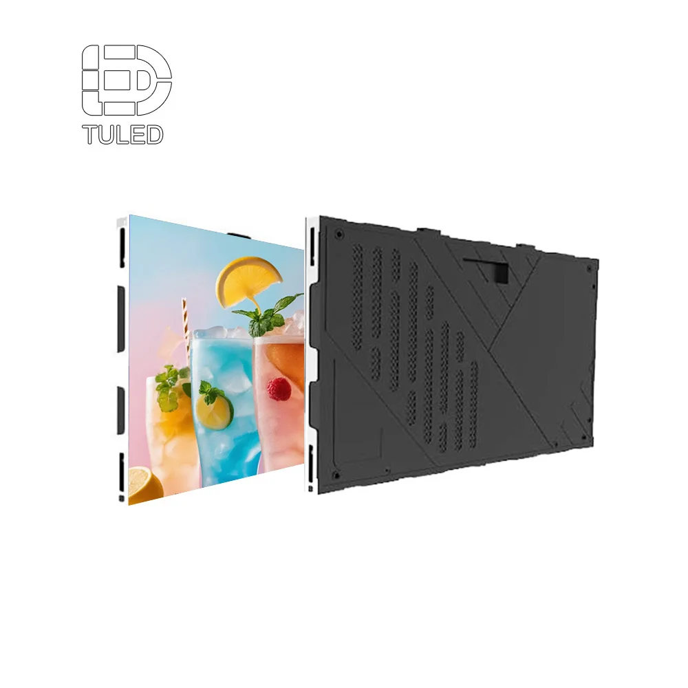
Separate the LED panel from the decorative wall finish
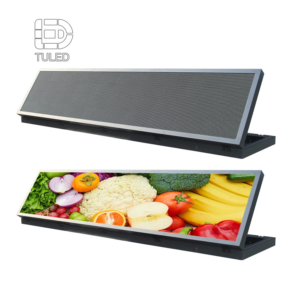
A real panel image helps the interior team understand the physical digital surface before decorative trim is added. The surrounding stone, timber, plaster, metal return, or shadow reveal should then be designed around the confirmed product direction.
This avoids a common rendering problem where the final screen is drawn as a perfect black rectangle without showing how the real wall edge will meet it.
For close-view reception walls and branded interiors where fine detail matters, review an indoor fine-pitch display after the viewing distance, wall dimensions, installation depth, and service direction are confirmed.
View Indoor LED DisplayA Trim Gap Should Look Intentional Before Anyone Measures It
Trim gaps often become difficult because several different requirements get grouped into one number. An architectural reveal creates visual separation. A ventilation opening may support thermal management. A removable joint may relate to future service. Those functions can overlap, but they should not be assumed to be the same thing.
From the finished-room perspective, the most important point is simple: every visible line around the screen should have a reason to exist. Once the line is intentional, its width, depth, color, and alignment can be coordinated with the surrounding architecture.
MATERIAL
DISPLAY FACE
Uniformity matters more than chasing the smallest possible reveal
A very narrow gap may sound refined on paper. However, if it appears wider on one side because of material variation or surrounding geometry, the result can look less controlled than a slightly wider but consistent shadow line.
Contrast changes perception as well. A dark reveal around white plaster looks much stronger than the same reveal beside charcoal stone or dark timber. Accordingly, gap decisions should be reviewed on the actual elevation and section instead of copied from another project.
Ventilation should not turn into visual clutter
The selected display configuration may require a project-specific airflow strategy. Exact requirements need engineering confirmation. Still, any opening visible from the room becomes part of the architecture once the wall is complete.
Where the system allows, a required slot can sometimes align with an existing panel joint or shadow reveal. That creates a cleaner result than adding another unrelated line below or beside the screen. Functional requirements should remain intact, while their visible expression becomes part of the finish design.
A flush-looking wall still needs a realistic service concept
A rendering can make an LED surface appear completely seamless. In practice, the final edge still has to respect the selected maintenance method. Visible removable trim or service-related joints may remain part of the finished condition.
For modular wall-display discussions, the LED Wall Panel direction provides a useful starting point. Once the panel and maintenance concept are confirmed, the architectural finish can be coordinated around the real interface instead of an idealized black rectangle.
Brand Color Matching Is a Coordination Problem, Not a Single Color-Code Problem
Brand colors become more complicated when a physical material and a luminous screen appear in the same field of view. Paint, powder coating, stone, timber, print, and laminate reflect room light. An LED display emits light directly. As a result, identical reference values do not automatically create identical perceived color.
The better target is visual consistency. A brand red on the screen should feel appropriate beside physical brand elements and the surrounding interior, even when both surfaces cannot behave exactly the same way.
Defines an approved target for the relevant brand or physical finish workflow.
Carries the brand palette into screen-based content production.
Brightness, white balance, and display behavior affect perceived color.
Lighting and nearby materials determine how the final color feels in context.
RAL, Pantone, RGB, and HEX should not be treated as interchangeable
RAL references often support architectural coating decisions, while Pantone references commonly appear in brand and graphic systems. RGB and HEX values support digital content. Each reference can be useful, but each serves a different part of the workflow.
For that reason, the finish package should identify where each color reference applies. This avoids a common problem where one code is expected to control powder coating, wall paint, printed graphics, and LED output with exactly the same appearance.
Brightness can change the emotional weight of a brand color
A saturated red displayed brightly inside a dark lobby can dominate the entire interior. Meanwhile, the same brand color printed on signage may appear much quieter. This does not necessarily mean the digital color is wrong. It may simply be too visually intense for the space.
Conversely, daylight can reduce the apparent intensity of screen colors while changing how physical wall finishes look. Representative viewing conditions therefore matter more than comparing color values on separate office monitors.
White balance can affect the whole interior impression
Brand content rarely consists of one solid logo color. Product photography, skin tones, white backgrounds, neutral greys, and typography appear around it. A screen that feels too cool or too warm can therefore make the complete wall feel disconnected from the surrounding lighting.
For brand-sensitive interiors, overall image balance can matter more than maximum visual intensity. The digital wall should support the material palette and room atmosphere instead of competing with them.
Final approval should use representative content on the actual panel at the intended operating brightness and under the project’s normal lighting conditions. RGB or HEX values alone should not be treated as a guarantee of visual color matching.
A Small Finish Package Can Prevent a Large Amount of Rework
The architectural team does not need to send an entire construction set simply to discuss the screen perimeter. A focused package is usually more useful. It should show the materials touching the display, the wall composition, the depth relationship, and the relevant brand references.
If the project is still at an earlier stage, the brand store LED wall planning guide explains how mounting surfaces, electrical routing, content approval, and service access fit into the wider project.
The strongest package normally combines three views of the same problem: the Finish Schedule explains the material, the elevation explains the composition, and the Wall Section explains the depth.
What is the material?
Material code, color, sheen, texture, coating reference, panel type, and approval status.
Where does everything align?
Screen location, stone joints, timber bays, metal seams, reveals, furniture, ceiling lines, and branding.
How do the surfaces meet?
Display face plane, wall finish plane, trim face, recess depth, shadow line, return, and visible access conditions.
The elevation is often more useful than another specification sheet
A screen width and height cannot show whether the opening clashes with a stone joint or leaves an awkward timber panel beside it. A full feature-wall elevation makes those relationships visible immediately.
It should also distinguish the active image from the outer finish condition. Otherwise, one drawing may treat the screen dimension as the active canvas while another treats it as the complete architectural opening.
The section is where “flush” becomes a real condition
Terms such as flush, recessed, and projecting can mean different things without a section. A simple perimeter section should show the finished wall plane, digital face, visible trim, shadow line, wall return, and any maintenance-related joint that remains visible.
Exact thermal, service, fabrication, and engineering dimensions remain project-specific. Where a condition is unresolved, marking it as requiring confirmation is safer than turning a visual assumption into an unsupported fixed tolerance.
| Information | Useful input | What it helps resolve |
|---|---|---|
| Wall finish | Material code, sample, color, texture, sheen | Whether the bezel should disappear, coordinate, or contrast |
| Panel layout | Stone joints, timber bays, metal seams, grain direction | Opening position and edge alignment |
| Wall elevation | Current feature-wall composition | Overall proportion and relationship with nearby architectural lines |
| Wall section | Display face, wall plane, trim, reveal, return | Depth and visible perimeter condition |
| Bezel finish | RAL or other finish reference, texture, gloss | Physical finish coordination |
| Brand references | Pantone, RGB, HEX, approved logo files | Content preparation and display color review |
| Representative content | Dark scenes, bright scenes, logo graphics, photography | How strongly the perimeter appears during normal operation |
| Interior rendering | Latest material and lighting view | Shared visual target across design disciplines |
| Open items | Items still awaiting finish or engineering confirmation | Prevents provisional assumptions from becoming final instructions |
The Small Details That Most Often Make the Wall Feel Unfinished
The most distracting problems are usually not major engineering failures. They are visual inconsistencies that sit close to the bright image and remain noticeable every day.
FAQ: LED Wall Finish Coordination
How should trim gap, ventilation, and maintenance needs be balanced?
They should first be identified as separate functions. A shadow gap is primarily a visual element, while airflow and service conditions depend on the selected display configuration. After those requirements are confirmed, visible openings can be coordinated with the architectural wall lines instead of appearing as unrelated slots.
Why can Pantone or RAL references still look different on the screen?
Physical materials reflect light, while a digital display emits light. Brightness, white balance, ambient lighting, and nearby finishes also affect perception. Pantone, RAL, RGB, and HEX references remain useful, but final brand appearance should be checked with representative content on the actual panel at the intended operating brightness.
What should be included in the architectural finish package?
The most useful package includes the relevant Finish Schedule, wall elevation, Wall Section, material codes, panel or joint layout, bezel finish preference, official brand color references, representative content, and the latest interior rendering. Physical finish samples can also help where texture or reflection is important.
The Best Result Is Usually the Wall That Needs the Least Explanation
A successful digital feature wall should feel resolved when viewed from the room. Stone joints should not compete with the screen edge. Timber panels should not end in awkward strips. Metal finishes should either coordinate convincingly or contrast deliberately. Shadow lines should look intentional rather than accidental.
At the same time, brand color should feel appropriate in the actual space, not only inside a graphic file. This requires physical finish information and display color review to support the same visual direction.
Three items make the next design review much more productive:
- Bring the wall finish into the LED discussion early. Include stone, timber, metal, paint, joints, and the complete wall elevation.
- Define the edge intention before detailing the edge. Decide whether the perimeter should disappear, coordinate, or contrast.
- Review brand color as part of the room. Combine approved references, representative content, display setup, lighting, and surrounding materials.
Send the Wall Finish Information Before the Edge Detail Is Frozen
Prepare the finished screen width and height, closest viewing distance, wall material, Finish Schedule, wall elevation, relevant Wall Section, installation method, service direction, bezel finish preference, RAL or Pantone references, approved logo artwork, representative screen content, and latest interior rendering.
Where available, include stone or timber joint layouts, metal finish references, proposed shadow-gap appearance, and any confirmed visible service or ventilation condition. These inputs make it possible to review how the custom led wall sign meets the finished architecture before the surrounding wall becomes difficult to change.
Submit Wall Material, Brand Color & Rendering