LED Sign Suppliers: SMD vs DIP for Outdoor Signboards
For teams comparing led sign suppliers, the most common mistake in outdoor LED planning is simple: the screen is chosen by a technical label before the actual street scene is understood. On a real storefront, plaza corner, roadside wall, or billboard structure, that shortcut quickly shows its weakness. Some signs need to feel clean, modern, and easy on the eyes at short distance. Others need to stay forceful and legible in strong daylight from much farther away. So the real question is not which technology sounds more advanced. The real question is what kind of outdoor job the screen is expected to do every day.
Phenomenon first: why one outdoor sign feels right and another feels tiring
In outdoor LED projects, people often notice the result before they understand the reason. One sign feels crisp and inviting. Another feels harsh even though it is technically bright. One screen still looks balanced in the late afternoon. Another looks flat in daylight and too aggressive at night. One billboard reads clearly from a distance. Another seems visually finer in a showroom but loses authority once it faces open sky and fast-moving traffic.
That contrast is the real starting point for SMD vs DIP. The difference is not only about components. It is about how the sign behaves in daily life: how it catches the eye, how comfortable it feels, how easily the message lands, and how well the screen fits the architecture around it. Therefore, a more useful article should start with visible outcomes, not a block of raw specifications.
On many commercial streets, a signboard now plays two roles at once. First, it has to communicate. Second, it has to belong. A bright, attention-grabbing surface can still feel wrong if it fights the storefront, overwhelms the brand image, or makes content look rougher than intended. Meanwhile, on a highway-facing board or a more distant roadside wall, that same directness can be exactly what makes the screen effective. So the same brightness can feel either helpful or excessive depending on context.
This is why outdoor LED selection cannot rely on one simple idea such as newer is better or brighter is safer. Different scenes reward different strengths. The smarter way to compare technologies is to look at the visible phenomenon first, then work backward to the reason, then forward to a practical judgement method.
In other words, the goal is not to sound technical. The goal is to avoid the uncomfortable situation where the sign looks acceptable in theory but disappointing in use. Once that happens, the problem is rarely solved by reading the specification sheet again. It has to be solved by understanding the original mismatch between technology, scene, content, and operating habit.
Why it happens: SMD and DIP are not just two specs, but two different outdoor languages
At a practical level, SMD and DIP shape how the screen presents light, color, and structure to the viewer. That sounds technical, yet the result is easy to feel. SMD usually comes across as smoother and more refined when a sign is viewed from closer or mixed distances. It tends to support cleaner-looking graphics, more natural color transitions, and a softer overall impression when the screen is part of a branded environment.
DIP usually comes across as more direct and more forceful. It is less about polish and more about command. In scenes where the screen must stay readable in strong daylight and where the audience sees it from farther away, that quality can be extremely useful. A long-distance message board does not need to feel elegant up close if almost nobody will ever stand that close to it. It needs to stay visible, convincing, and easy to read from the real audience position.
This is why a pure better-or-worse comparison misses the point. SMD often wins in environments where the screen behaves like visual media. DIP often stays relevant where the screen behaves like outdoor signage in the most classic sense. Therefore, the right answer is usually less about technical hierarchy and more about communication style.
What SMD feels like in real use
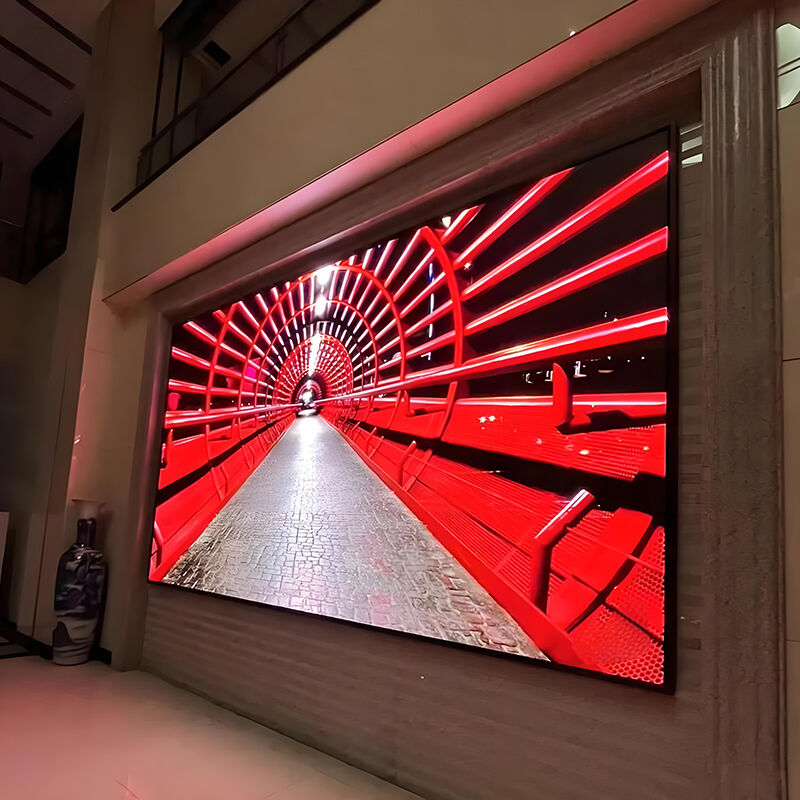
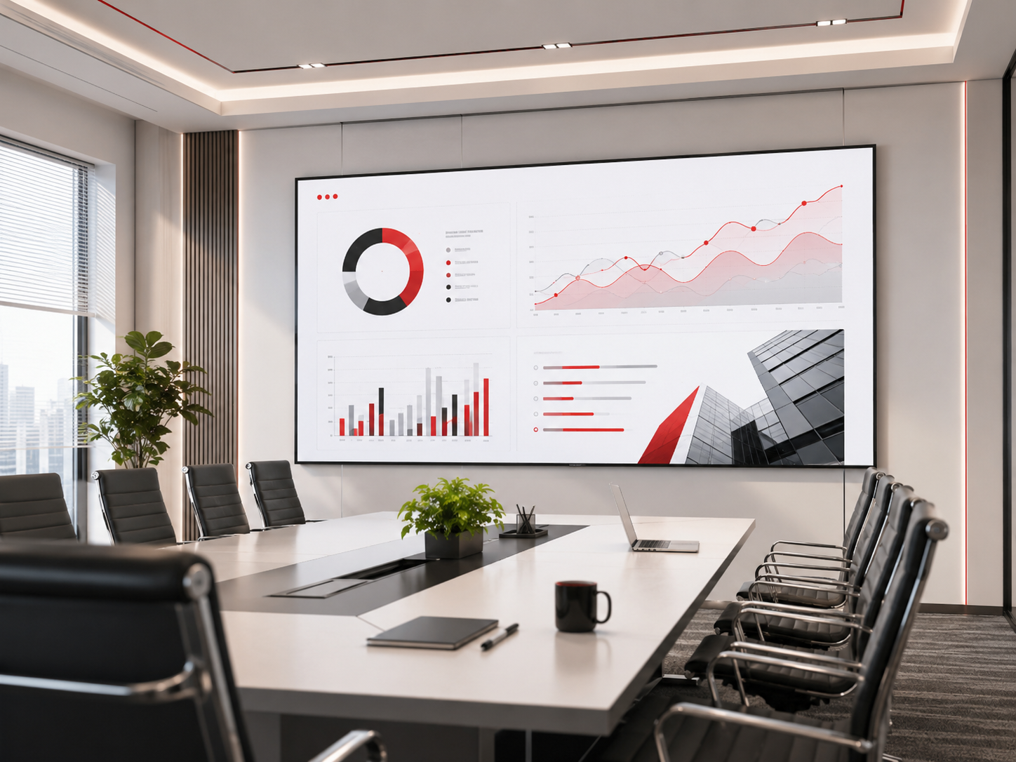
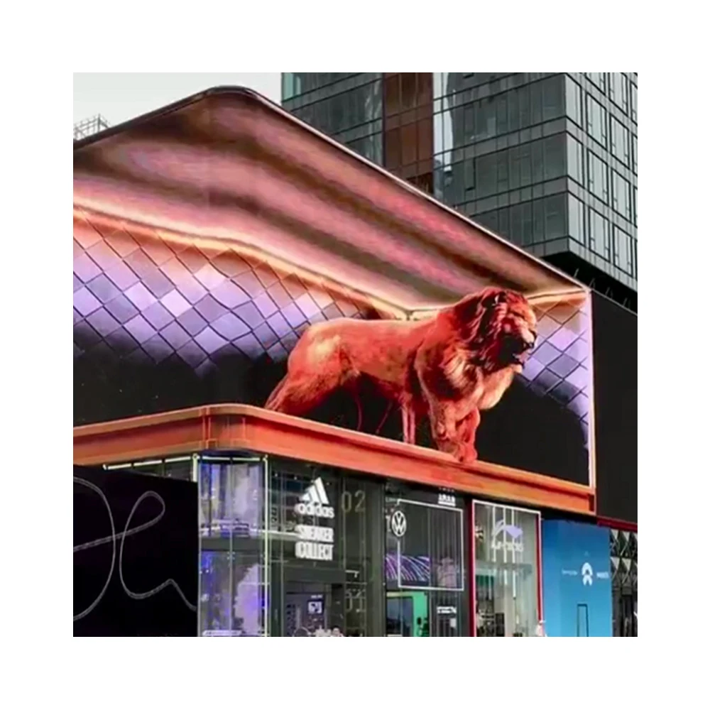
In a storefront, mixed-traffic street, plaza entrance, restaurant frontage, or branded commercial façade, SMD usually feels more composed. Logos look more at home. Product visuals feel less coarse. Content can shift from simple promotion to more visual storytelling without the surface fighting the design. That matters because outdoor signs are often expected to do more than they did a few years ago. They are no longer only shouting a message. They are also supporting brand atmosphere.
Another reason SMD feels attractive in those settings is that people do not view the sign from one fixed spot. They walk past it, cross the street, glance from cars, and notice it again on the return route. In those mixed-angle experiences, a cleaner-looking display surface often feels more natural. The sign participates in the street instead of dominating it.
What DIP feels like in real use
DIP makes more sense when the screen’s role is not subtle. A larger roadside board, a long-distance advertising structure, or a more purely functional outdoor sign often benefits from a display style that feels straightforward and powerful. In those cases, the sign does not need to charm someone standing nearby. It needs to remain legible when conditions are less forgiving and attention time is shorter.
That does not make DIP old-fashioned in a negative sense. Instead, it means DIP continues to align well with certain outdoor priorities. If the message is bold, the environment is bright, and the viewing position is more distant, visual elegance becomes less important than readable impact. Under those conditions, DIP still belongs in a serious comparison.
A simple way to frame the difference is this: when the screen behaves like part of a brand experience, SMD often earns more attention. When the screen behaves like a high-visibility outdoor signal, DIP often stays more relevant than people first assume.
When SMD usually makes more sense
SMD usually becomes the more natural choice when the signboard is seen from shorter or mixed distances and when the visual impression of the screen matters almost as much as the message itself. This often applies to retail façades, shopping street signs, hospitality entrances, lifestyle brands, commercial plazas, and property exteriors where the screen is close enough to become part of the environment’s visual language.
In these scenes, people notice more than whether the message is visible. They also notice whether the content looks clean, whether the sign feels premium or rough, and whether the screen contributes to the atmosphere of the storefront or pulls against it. That is why SMD often feels like a better fit where the sign is expected to support both communication and image.
There is also a future-use reason. Many signs start out with simple text-led promotions, then evolve. A retail operator may later want product visuals, timed campaigns, event graphics, brand-led loops, or cleaner motion content. A sign selected only for today’s basic message can quickly feel restrictive once those expectations grow. Therefore, SMD often supports more flexibility when content ambition is likely to rise after installation.
Evening appearance is another factor. In city and retail settings, the sign is often judged twice each day: once for how it survives daylight, and once for how it lives after sunset. A screen that feels too hard at night can reduce the sense of quality, even if it is technically successful. SMD often helps in these environments because it is easier to imagine a balanced, more brand-sensitive result.
Typical SMD-friendly scenes
Street-facing retail signs, branded building exteriors, restaurant and hotel frontage, plaza entrances, entertainment venues, commercial streets with pedestrians, and outdoor signs that show mixed graphics rather than only big, simple words.
Why those scenes favor it
The sign is usually viewed from nearer positions, from different angles, and as part of the property’s visual identity. In those conditions, cleaner graphics and a more polished surface feel more valuable.
Still, it is worth keeping one important point in mind. SMD is not automatically the premium answer just because it can look finer. If the real scene is distant, the content is simple, and the sign mostly needs raw outdoor authority, then extra visual softness may not create much practical benefit. In other words, SMD should be chosen because the job needs it, not because the label sounds safer.
When DIP still makes sense
DIP continues to deserve attention when the signboard is working under more classic outdoor conditions: stronger daylight, longer viewing distance, simpler content, and a more functional communication goal. In these situations, the sign often needs to be legible first and beautiful second. That priority shift is exactly why DIP remains relevant even though many newer discussions focus almost entirely on finer-looking formats.
Think about a board that is mainly read by drivers, a roadside screen that carries short promotional messages, a large-format wall used for quick campaign recognition, or an outdoor display in a harsher commercial or industrial setting. In those environments, visual texture at close range matters far less than message delivery at the actual audience distance. If hardly anyone will stand near enough to appreciate subtle image softness, then the selection logic changes immediately.
DIP also makes sense when a more conservative outdoor mindset is appropriate. Some projects value dependable visibility and straightforward use over design sensitivity. That is especially true where the sign’s role is clear, the content is repetitive, and maintenance access may be expensive or disruptive. Under those conditions, a more direct display character can be easier to justify.
The key is not to treat DIP as a backup choice. It should be treated as a better match for certain outdoor priorities. Once the sign’s job is defined correctly, that becomes much easier to see.
Typical DIP-friendly scenes
Highway-facing boards, longer-distance roadside ads, more functional outdoor message boards, industrial areas, logistics-related signage, and large-format displays where the message needs to arrive quickly from far away.
Why those scenes still suit it
The sign is judged less by close-up finesse and more by daylight presence, message speed, and outdoor directness. In that kind of setting, DIP’s strengths can still line up well with the actual job.
This matters because overspecifying a sign can be just as unhelpful as underspecifying it. A screen can be visually impressive and still be the wrong commercial answer if the audience will never experience the advantages that justified the extra decision complexity. Good outdoor planning is not about chasing the most refined option. It is about matching the screen’s character to the location’s real behaviour.
How to judge the right fit without getting lost in parameters
The easiest way to make a sound decision is to judge the sign in four layers: viewing distance, content style, daylight exposure, and maintenance reality. This approach works because it translates technical differences into visible and operational consequences. Instead of asking which technology is better in general, it asks which technology is better for this exact daily life.
1. Judge by viewing distance
Start with where the audience truly sees the screen, not where the design team imagines they might see it. If most of the attention comes from shorter or mixed distances, image comfort becomes more important. If the sign is mainly read from farther away, clarity and force matter more. This simple distinction already removes a lot of confusion.
It also helps to remember that mixed distance is not the same as far distance. A sign that drivers see from across the road and pedestrians see from the pavement often benefits from a different balance than a sign that almost everyone sees from one long viewing position.
2. Judge by content style
Next, ask what the screen will mostly show over the next twelve months. If the sign mainly shows large words, prices, short promotional loops, arrows, or direct statements, then refined visual behaviour may matter less. If it needs to show logos, product visuals, event art, mixed layouts, or cleaner motion content, then the display surface itself starts to matter much more.
Many outdoor decisions go wrong because the hardware is selected for a simple launch message, while the business later expects the sign to behave like richer media. Therefore, it helps to select based on the content life cycle, not just the first campaign.
3. Judge by daylight and atmosphere
Daylight is not only about whether the screen can be seen. It is also about how the sign feels in the environment. On a hard-sun roadside wall, stronger visual presence can be an advantage. On a premium retail frontage, the same intensity may feel more brutal than useful once the light changes later in the day. This is why outdoor planning should think in time blocks, not just in one fixed brightness idea.
In practice, teams often judge signs only at the brightest part of the day. However, many outdoor signs spend just as much time being part of the early evening street scene. A sign that survives noon but looks too severe at dusk is not fully successful. The better judgement method is to imagine the sign across the whole day, not only at its hardest test moment.
4. Judge by maintenance reality
Finally, look at how the sign will actually be lived with after installation. Is service access straightforward or awkward? Is the screen mounted where routine attention becomes expensive? Is the sign likely to need content changes, brightness adjustments, or fast response during busy campaign periods? These questions matter because the best-looking sign can still become frustrating if the daily operating rhythm was not considered early enough.
| Scene | What matters most | Usually stronger fit | Why |
|---|---|---|---|
| Retail façade on a busy street | Close viewing, cleaner graphics, brand feel | SMD | The sign is part of the storefront image and is often seen from short or mixed distances. |
| Plaza entrance or hospitality frontage | Visual polish, balanced day-night look, mixed graphics | SMD | The screen needs to communicate clearly without making the property feel harsh. |
| Urban roadside with varied traffic speed | Readable content plus decent image quality | Often SMD | These scenes usually require both visibility and a more composed visual surface. |
| Long-distance billboard | Fast recognition, strong daylight readability | Often DIP | Far-view message boards gain more from direct clarity than from close-range refinement. |
| Industrial or logistics messaging | Function, legibility, outdoor directness | Often DIP | The environment rewards straightforward communication over aesthetic softness. |
| Premium branded building sign | Property image, visual comfort, stronger brand expression | SMD | The sign needs to feel like media that belongs, not just a bright object on the wall. |
This table is useful because it mirrors how the sign is judged in real use. It does not pretend that one technology is universally superior. Instead, it highlights the more important truth: the same hardware choice can feel brilliant in one scene and misplaced in another.
Experience tips: how outdoor signs work better in daily use
Once the technology direction is roughly clear, the next step is not more technical debate. It is learning how outdoor signs behave best in the field. This is where many projects either mature into a calm, confident installation or slip into a screen that always feels slightly too bright, too busy, or too hard to read. Fortunately, the fixes are often simple once the patterns are understood.
Keep motion calmer than first instinct suggests
Outdoor LED content often improves when it moves less. Fast transitions, constant flashing, and crowded layouts can make a sign feel cheaper and harder to absorb, especially in retail or branded commercial environments. Short, clear loops usually look more confident. They also let the audience understand the message without feeling visually rushed.
This is one reason more refined outdoor screens benefit from more restrained content. The hardware can do a lot, but the best result usually comes from knowing when not to use every capability at once.
Write for the street, not for the design file
Many outdoor signs fail because the copy and layout are built as if the audience has more time than it really does. In reality, outdoor reading happens quickly. Simpler layouts, fewer competing messages, and stronger headline hierarchy usually improve performance more than adding extra visual complexity. This applies whether the screen is SMD or DIP. Good use makes every technology look better.
Think in daylight rhythm, not one fixed setting
A sign that is perfect at noon can feel uncomfortable in the evening if brightness behaviour is not managed thoughtfully. Likewise, a sign that feels elegant after sunset may underperform earlier in the day if it was set too cautiously. The useful habit is to think of the sign as something that lives through changing light, not as something that should look identical at every hour.
This is particularly important for storefronts, mixed-use properties, and hospitality settings where the sign affects atmosphere as well as communication. A more balanced daily rhythm often makes the installation feel more premium even without changing the hardware.
Respect maintenance before it becomes a problem
Maintenance is not just a technical responsibility. It is part of the sign’s long-term comfort. If the installation makes service awkward, even small issues feel bigger. Therefore, cabinet format, access planning, and a basic spare strategy should be considered early. This is not glamorous, but it is one of the clearest differences between a sign that stays easy to manage and one that becomes annoying after the excitement of install day fades.
In practice, the best outdoor signboards usually share the same feeling: they seem obvious once installed. The message reads easily. The brightness feels appropriate. The content is not trying too hard. The sign belongs to the space. That sense of calm fit is often the best signal that the decision was right.
Simple field checklist before final approval
- Confirm where the sign is truly read from, not just where it can theoretically be seen.
- Match the display choice to the kind of content that will be used most often.
- Review the sign in both daytime logic and evening atmosphere, not one moment only.
- Keep layout and motion simple enough for the street, not only for internal review screens.
- Check service access before structure and mounting decisions become fixed.
- Choose the screen that fits the scene best, not the one that sounds safest in abstract terms.
Common mistakes that make the final result feel less professional
The first mistake is choosing mainly by label. Saying SMD is better or DIP is stronger may sound decisive, yet it usually hides the more important question of scene fit. Outdoor signs are successful when the chosen technology supports the real use case. Without that context, the conclusion stays too broad to be reliable.
The second mistake is overvaluing close-up impressions. A sign can look beautifully refined at short range and still be the wrong answer for a distant roadside application. Likewise, a more direct-looking display can seem less elegant in a showroom and still be exactly right for a bright, long-view outdoor setting. Judging the sign from the wrong distance often leads to the wrong conclusion.
The third mistake is ignoring how content will evolve. A screen selected for simple launch promotions may later be asked to carry more brand-led material. When that happens, the installation can suddenly feel limited even though the original quote looked sensible. Therefore, it helps to think one stage beyond the first campaign.
The fourth mistake is treating maintenance as something to solve later. In reality, maintenance difficulty should influence the product discussion from the start. The inconvenience of access rarely gets smaller after install. It usually becomes more expensive and more distracting.
The fifth mistake is trying to solve communication with sheer intensity. Strong brightness has an important place in outdoor LED. Still, more force is not always more effective. On many street-facing signs, clarity, calm pacing, and proper content hierarchy outperform an approach that simply tries to overpower the environment.
Questions worth asking before a quote becomes serious
A good inquiry is not long for the sake of being long. It is useful because it gives enough context for a realistic recommendation. The strongest questions are usually the ones that connect screen choice to visible and operational outcomes instead of asking only for a best model.
For example, it helps to ask which option better fits the actual viewing distance and the type of content planned most often. It also helps to ask how the sign is expected to feel in bright daylight and in the early evening, since those two moments can pull the decision in different directions. In addition, it is worth asking how maintenance works on the real installation structure rather than on a warehouse floor.
Another productive question is about future flexibility. If the sign may later carry cleaner promotional graphics, more branded media, or more design-sensitive content, it is helpful to surface that possibility before the recommendation is finalized. A screen that fits the current brief but not the next stage can create unnecessary regret.
Questions about the scene
- Where is the real audience position?
- How direct is the sunlight?
- Is the sign part of a premium façade or a more functional outdoor setting?
Questions about the content
- Will the screen mostly show simple text or richer graphics?
- How often will campaigns change?
- Does the sign need to feel visually calm as well as visible?
Questions about operation
- What does maintenance access look like after installation?
- How should brightness be managed across the day?
- What support is helpful during the early running period?
Questions about product direction
- Does this sign behave more like a storefront sign or more like a billboard?
- Is a category such as LED Sign Board or Billboard LED Screen closer to the real project type?
- Would an Outdoor LED Display layout offer a better cabinet path?
These questions create a better discussion because they move the conversation away from generic product language and toward actual project judgement. That is often the point where technology choice becomes much easier to trust, especially when early comparisons between screen types and led sign suppliers still feel too broad to support a confident decision.
FAQ
Is SMD always the better choice now for outdoor signboards?
Not always. SMD usually makes more sense where the sign is seen from shorter or mixed distances and where the screen needs to support a more polished visual impression. However, that does not automatically make it the best fit for every outdoor scene. Long-distance boards with simpler content can still align well with DIP.
Why does the same sign seem perfect in one place and too harsh in another?
Because outdoor signs are judged by context as much as by hardware. Viewing distance, surrounding architecture, daylight exposure, and content style all shape how the screen feels. A setup that looks balanced on a roadside structure may feel too aggressive above a premium storefront.
How should the decision be made without relying too much on raw specifications?
A practical approach is to judge the sign by four things: true viewing distance, typical content style, daylight rhythm, and maintenance reality. Once those are clear, the technology choice becomes much easier and far more grounded.
What is the biggest content mistake with outdoor LED signs?
The biggest mistake is trying to show too much too quickly. Outdoor content often performs better when it is simpler, calmer, and easier to absorb. A cleaner message usually improves the effect of both SMD and DIP.
What should be prepared before starting a real inquiry?
It helps to prepare the sign size, the real viewing distance, sunlight conditions, content style, intended scene, and a rough idea of maintenance access. With that context, recommendations become more realistic and more useful.
Natural conclusion: choose the screen that fits the scene, then let the product follow
The strongest outdoor LED projects usually do not begin with a winner between SMD and DIP. They begin with a clear understanding of what the sign must feel like in daily use. Once that is clear, the technology decision becomes calmer, more practical, and easier to defend. That is also why the best comparison is rarely the most technical one. It is the one that explains what people will actually see, what the sign will actually need, and how the installation will actually live over time.
For a more grounded next step, it helps to review the project in three layers: scene first, content second, maintenance third. After that, product direction becomes much easier to narrow. The conversation can then move naturally toward the most suitable signboard, outdoor display, or billboard route without forcing the answer too early.
When the project is ready for that stage, the most useful move is usually a direct consultation around sign type, scene fit, cabinet direction, and outdoor use conditions rather than a generic request for the best model. That makes the recommendation far more efficient and much easier to trust.
- Start with where the sign is really seen, not where it looks good in a mockup.
- Choose based on the content the screen will carry most often, not only on launch week.
- Let service comfort and long-term use shape the decision before price becomes the only focus.