Many custom size LED screen ideas look powerful in a concept drawing. A curved surface makes a room feel more immersive. A corner screen makes a dead edge look active. An irregular screen makes a booth or showroom feel custom instead of generic. However, once the project leaves the rendering stage, the real questions become much more practical. Will the shape still look right when everyday content replaces the launch animation? Will it improve how the space works, or only feel interesting for a short time? Will the installation stay manageable, or will the shape create complexity that no one fully considered at the beginning?
That is why a non-standard LED screen should never be chosen only because it looks creative. It should be chosen because the shape improves the way the environment is seen, used, or remembered. In one project, that may mean helping a retail corner attract attention from two directions. In another, it may mean making a showroom wall feel more immersive and architectural. In an exhibition setting, it may mean preventing the booth from looking like a rented rectangle with content placed on top. In a lobby, it may mean letting the visual surface sit inside the architecture more naturally.
This guide focuses on the part of the decision that matters most in real commercial work. It does not treat the project like a specification list. Instead, it stays focused on what experienced readers actually want to judge: why this type of screen is worth choosing, what spaces really suit it, how to tell whether it is the right move, and what common mistakes make these projects feel awkward, expensive, or underused after installation.
- Why choose a custom size LED screen
- What spaces fit best
- When curved screens make sense
- When corner screens create real value
- When irregular shapes are worth it
- How to tell whether it is worth buying
- What technical points really change the decision
- Common mistakes
- How to use it well after installation
- What to confirm before quotation
- Extended reading
- FAQ
Why choose a custom size LED screen
The strongest reason is not simply that it looks more advanced. The strongest reason is that it can make the space perform better. A custom-shaped display should improve how people move through the room, where they stop, what they notice first, and how the brand stays in memory after they leave. If the only result is novelty, the value tends to fade quickly. If the result is better flow, better visibility, or a stronger visual identity for the environment, the investment holds up much longer.
A standard rectangle still has clear strengths. It is easier to compare, easier to mount, easier to fill with content, and easier to maintain. That is exactly why rectangles remain the default choice across so many projects. So, once a project moves away from that format, the shape needs to justify itself. A curve should soften the environment or extend the viewing path. A corner screen should solve a true two-direction visibility problem. An irregular outline should either fit the architecture, support the brand language, or transform a temporary environment into something that feels purpose-built.
There is also an emotional reason that matters more than teams sometimes admit. In premium commercial spaces, screens do not function only as information tools. They shape the mood of the room. A curved surface feels softer and more immersive. A corner wrap feels more spatial and less like a flat sign. An irregular silhouette can make the display read as part of the environment rather than a device attached to it afterward. That change in feeling matters in luxury retail, branded showrooms, museums, premium lobbies, automotive presentation centers, and exhibition projects where the entire goal is to create a memorable environment.
There is a practical commercial reason as well. Spaces that rely on attention benefit from features that people notice, photograph, and remember. A custom screen shape can help create exactly that kind of landmark. In a retail project, it can turn one zone into the part of the store that visitors naturally share. In an exhibition booth, it can help the booth stop looking temporary. In a showroom, it can lift a product story from “content on a wall” to “content inside an environment.” When those outcomes are real, the custom shape stops being decoration and becomes an active part of the brand strategy.
At the same time, the shape should always be tested against simpler alternatives. Sometimes the best decision is still a strong custom proportion with a standard face. Sometimes a high-quality custom LED screen or an indoor small pitch LED screen already solves the problem more cleanly. In retail, a flexible LED poster display may be the smarter move if the wall needs to support campaigns without becoming a permanent architectural build. The important point is not to force the space toward shape too early.
The best custom shape projects usually begin with a real spatial need. A dead corner needs to become active. A long wall needs more flow. An awkward architectural opening needs a better visual fit. A premium environment needs a calmer and more immersive digital surface than a flat rectangle can provide. When the screen shape answers one of those real needs, the entire project starts from a much stronger place.
What spaces fit best
Shaped LED screens work best in spaces where the display has to behave like part of the environment rather than a simple information surface. That includes premium retail, branded showrooms, museum-style exhibition spaces, trade show booths, hospitality arrival zones, corporate lobbies, real estate presentation centers, automotive experience rooms, and selected architectural corners where normal front-facing screens waste part of the opportunity.
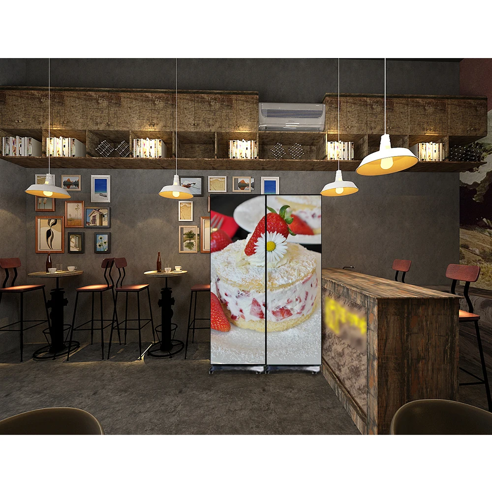
Retail is a strong match because movement and attention are already part of how the space functions. A curved screen can turn a product area into a more immersive brand zone. A corner screen can catch traffic coming from two directions. A custom-shaped wall can help one area feel premium without forcing the whole store into an oversized digital build. In good retail work, the screen does not overpower the merchandise. Instead, it helps frame the part of the store that matters most.
Showrooms and lobbies are also natural fits, but for a different reason. These spaces often want a calmer form of visual power. They need the screen to feel designed into the room. A curve can soften a hard architectural line. A custom proportion can make the wall feel more integrated. An irregular outline can echo the brand language or interior geometry. In those projects, the value is not only visibility. It is the way the screen changes the atmosphere.
Exhibition projects gain from custom shapes because so many booths still rely on predictable rectangles. A shaped LED wall can quickly make the space look considered and site-specific instead of temporary. That is especially useful in aisles crowded with similar structures, where the goal is to gain attention without looking noisy. The most effective booth screens do not only play content. They help the whole booth read as a designed environment.
The same logic can apply to selected outdoor or semi-outdoor branded corners, particularly when a building turn, façade edge, or threshold area needs stronger visibility than one flat sign can provide. Even then, the shape should still be judged against the actual viewing pattern. If the real reading direction stays straightforward, a simpler signage route may still be the better answer.
When curved screens make sense
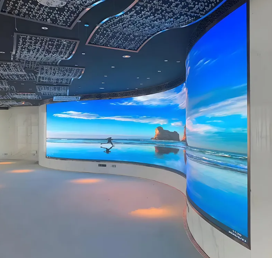
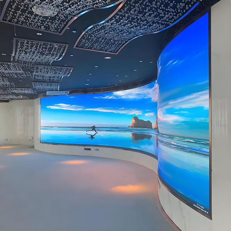
Curved screens make the most sense when the project wants movement, softness, and immersion instead of a strict front-facing read. A flat wall stops the image at the frame. A curve keeps the eye traveling. That difference is subtle in a drawing, but very noticeable in a real interior. The space feels less static. The content feels more environmental. And the room often feels more premium because the digital surface behaves more like architecture than equipment.
This is why curves work so well in branded showrooms, museum corridors, experience centers, automotive display environments, and hospitality interiors where the goal is to make the visitor feel surrounded by a visual story rather than simply informed by one. In a long room, a gentle curve can help connect one end of the space to the other. In a premium showroom, it can make product storytelling feel more cinematic. In a presentation room, it can keep the content engaging across a wider viewing zone.
Curves also work because they soften hard architecture. Commercial interiors often contain many straight lines: shelves, ceiling grids, glazing, counters, and walls. A curved screen introduces a different rhythm. That shift can be especially effective when the space risks feeling too rigid or too technical. The result is often not louder. It is simply more fluid.
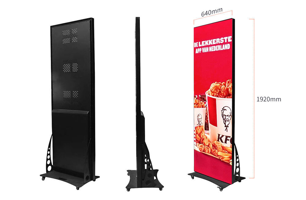
A cleaner visual fit for retail corners, entrance branding, and flexible display zones where the installation should stay light and adaptable.
View ProductEven so, a curve is not automatically the better choice. It earns its complexity when the project benefits from a longer viewing path, a softer visual language, or a more immersive content style. If most of the content is dense text, dashboard layouts, menus, or schedule information, the curve may not provide enough practical gain. It can still work, but it is no longer making full use of why it was chosen.
A useful test is to imagine the screen after the launch film is gone. Will the wall still look intentional with calmer daily content? Will it still make the space feel stronger when the motion is slower and the message is simpler? If the answer is yes, the curve is probably grounded in the reality of the project, not only in the excitement of the concept stage.
When corner screens create real value
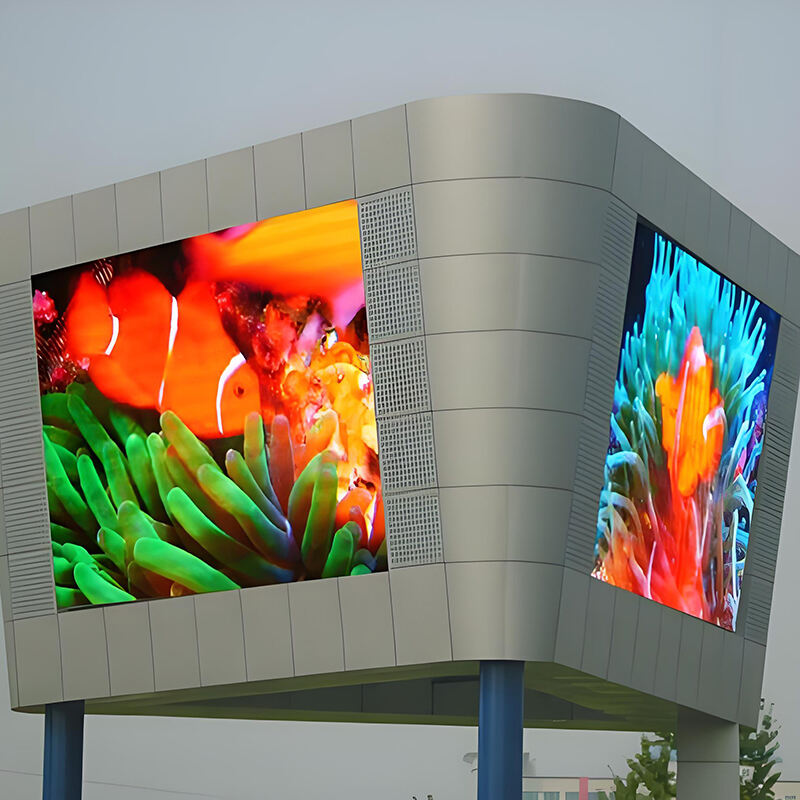
Corner screens are easy to underestimate because they sound like a modest variation. In fact, they can solve one of the most common visibility problems in commercial environments. A front-facing screen gives the message one clear direction. A corner screen can open that message to two directions at once. That changes how the wall works in motion, especially in places where people do not approach from a single path.
This matters in retail corners near escalators, store edges beside a corridor, booth turns in a busy exhibition hall, branded thresholds in showrooms, and selected building corners where the wall should stay visible before the viewer fully arrives. In those cases, a rectangle may look strong from one angle and almost disappear from another. The corner screen helps the message stay alive during the turn, not only after it.
There is also a practical architectural benefit. Corners often feel underused. They are hard to merchandise, hard to brand, and easy to ignore. A corner screen can transform that weakness into one of the most active parts of the environment. Instead of ending the visual story at the edge, the screen carries it around the edge. That small change can make the whole space feel more custom.
However, the value comes from the turn itself. If the project does not truly need two-direction visibility, the corner format may add complexity without enough return. That is why corner screens should be linked to real movement patterns, not just to the idea that corners “look interesting” in design proposals.
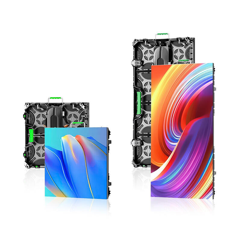
A stronger visual match for premium indoor projects where finer image detail and shaped integration matter more than simple screen area.
View ProductFor sign-led projects where outward visibility matters more than immersive experience, it is often helpful to compare the corner idea against a clearer signage route such as an LED sign board. If the message mainly needs one strong public face, the simpler sign solution may be enough. If the brand truly needs to engage movement around a turn, the corner screen becomes much easier to justify.
In short, a corner screen is not valuable because it is unusual. It is valuable because it keeps visibility alive where geometry would otherwise interrupt it.
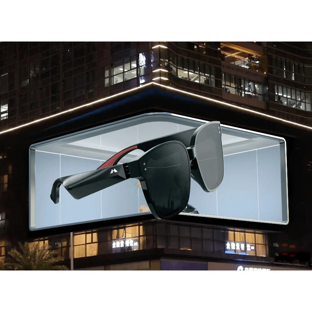
When irregular shapes are worth it
Irregular shapes are the most tempting option and the one that needs the most discipline. They look distinctive immediately. A plain rectangle turns into a ribbon, an angled cut, a sculptural outline, or a more expressive brand form. In the right project, that can create a memorable visual asset. In the wrong project, it creates a screen that looks dramatic for a few minutes and difficult for the rest of its life.
Irregular screens are strongest when the shape itself carries real value. That may happen in an exhibition booth that needs to stop looking rented. It may happen in a museum where the screen should support the narrative instead of feeling like an inserted monitor. It may happen in a luxury showroom where the visual form should echo the architecture or product language. In these situations, the screen is not only showing content. It is also acting as a designed object in the space.
They are also useful when architecture gives no clean rectangle to work with. Sloped ceilings, broken wall openings, scenic builds, and unusual façade lines sometimes make a standard proportion feel wrong. Here, the irregular shape is not trying to impress. It is trying to fit. That is a much healthier reason to choose it.
A better match for curved, corner, concave, and convex compositions where shape freedom matters more than a plain rectangular build.
View ProductStill, irregular shapes demand stricter judgment than any other option. The easiest way to test the idea is with one blunt question: if the exact same content were played on a clean, well-sized rectangle, would the project feel much weaker? If the honest answer is no, the irregular outline may be more decorative than strategic.
Another good test is content pressure. Rectangles are forgiving. Most content fits them easily. Irregular shapes are less forgiving. They ask more from motion design, framing, pacing, and use of negative space. If the project has no content plan beyond one dramatic concept video, the irregular geometry may create more long-term pressure than value.
That does not mean irregular shapes should be avoided. It means they should be earned. When the brand, architecture, and content system all point toward the same form, the result can be much more memorable than a standard wall. When only the moodboard points there, the project often becomes harder than it needs to be.
How to tell whether it is worth buying
The easiest way to judge a custom shape is to stop thinking about the hero rendering and start thinking about the week after installation. Who walks by the wall every day? From what angles? How often does the content change? What happens when the launch campaign is over? Will the screen still look intentional with calmer material? Will maintenance feel manageable once surrounding finishes are complete? Those questions usually reveal the truth much faster than a dramatic visualization.
In general, a shaped screen is worth buying when it does several useful things at once. It improves visibility. It makes the space feel more finished. It creates a better viewing path. It helps the brand stand out. It supports a type of content that benefits from immersion or wraparound presentation. And it still feels strong when the visual treatment is simple rather than theatrical.
It is usually not worth buying when the shape only makes the proposal feel more expensive or more creative without changing how the space really performs. That can happen in retail when the screen becomes too sculptural for the merchandise around it. It can happen in showrooms when the screen starts competing with the product. And it can happen in exhibitions when the booth looks strong in photos but becomes awkward to build, service, or content-manage.
Another strong test is content adaptability. A standard wall accepts almost any layout. A shaped wall asks more from the content system. If the project team has not yet thought through logo treatment, motion pacing, information zones, or what the wall should do on a quiet weekday, the shape may be moving ahead of the real planning. That is a sign to slow down, not necessarily to abandon the idea, but to ground it more honestly.
Quick decision lens
- If the shape improves the space even when the content is calm, it is worth exploring.
- If the shape only works when the screen is overloaded with motion, simplify the concept.
- If the team still cannot explain the day-to-day content plan, do not lock the geometry too early.
Cost should also be judged in terms of visible value, not only price difference. A curve that transforms a bland showroom into an immersive presentation surface may justify itself. A corner that doubles the visibility of a retail threshold may justify itself. An irregular outline that still behaves like a flat screen after installation probably will not.
| Situation | Best shape logic | Why it helps | When to avoid it |
|---|---|---|---|
| Long showroom wall with immersive content | Curved | Adds flow and turns viewing into a spatial experience | If most content is dense text or dashboard-style information |
| Retail corner with traffic from two directions | Corner | Improves visibility during movement and turning | If the wall mainly needs one direct front view |
| Exhibition booth needing a signature silhouette | Irregular | Makes the booth feel designed, not rented | If the team has no content system or no installation buffer |
| Premium lobby needing calm architectural presence | Gentle curve or custom proportion | Feels built in rather than attached | If the screen is mainly a practical information board |
A small early inquiry is often enough to clarify the right direction: room photos, rough dimensions, viewing path, and a short note on what the screen should improve. That usually leads to a better conversation than asking for a fast price on a geometry that has not yet been tested against real use.
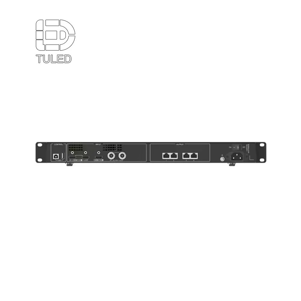
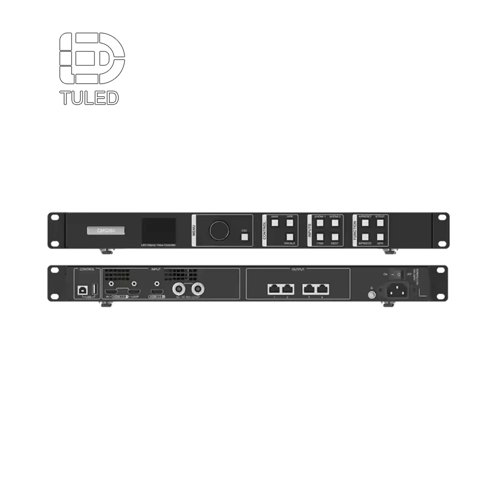
What technical points really change the decision
Specifications matter, but only when they change how the finished wall feels, performs, or ages in use. The problem is not talking about specifications. The problem is letting them take over too early.
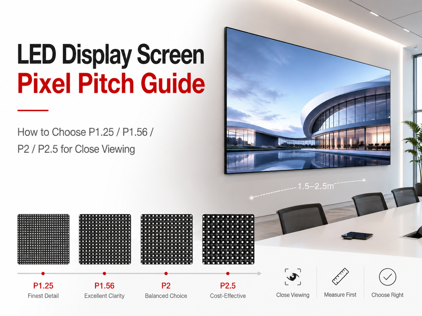
Pixel pitch matters because it changes how refined the image looks at actual viewing distance. On a shaped wall, that matters even more because the form already attracts attention. In close-view retail, showroom, and lobby work, a coarse pitch can make a beautiful shape feel less premium than expected. The important question is not simply what pitch is available. It is what pitch matches the real distance and content type of the project.
Brightness matters because shaped screens often sit in more complicated conditions than plain walls. Glass, skylights, open storefronts, glossy flooring, and reflective finishes can all change how the screen reads. The useful question is not only about peak brightness. It is whether the wall will still feel balanced and comfortable in the real room throughout the day.
Cabinet logic matters because custom geometry exposes seams, edges, and transitions more clearly. That directly affects the visual finish of the wall. The practical question is how the perimeter is resolved, how the edges are handled, and whether the screen still looks intentional once the hardware reality is visible.
Maintenance direction matters because a shaped screen is often harder to service than a flat rectangle. The real impact shows up later: downtime, access constraints, and construction coordination around finished materials. The right question is simple and concrete: after the space is built, how will the wall actually be maintained?
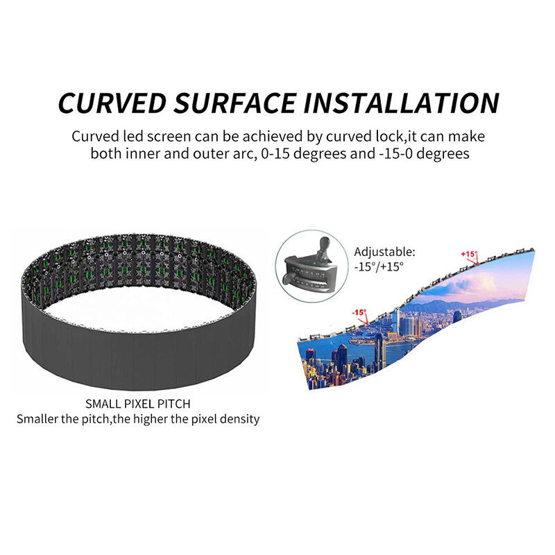
Weight and structure matter because curves, wraps, suspended sections, and non-standard outlines ask more from the support strategy than simple rectangles do. The decision should not stop at whether the screen can be mounted. It should include how early the support path must be coordinated and how that affects the rest of the build.
Control and content workflow matter because custom shapes often increase content demands. A standard playlist may still be enough in some projects. In others, the motion design has to respect the geometry. The useful question is not what controller is included. It is who will update the wall, how often, and what kind of content the space really expects after opening.
Rental-style hardware features become important when the project is scenic, temporary, or event-based. Fast locks, flexible stacking, service access, and repeat assembly matter because the wall has to travel, install, align, and repeat without creating recovery time on site. That is why it can be helpful to compare the concept against a solution like a 500×1000 rental LED display before the final scenic shape is locked.
A more relevant fit for stage-scale and larger modular builds where cabinet format, repeat assembly, and scenic flexibility all matter.
View ProductThe overall rule is straightforward: parameters matter most when they change viewing comfort, surface finish, service access, or operational reliability. Outside of that, they should support the decision, not replace it.
Common mistakes
The first common mistake is choosing the shape before defining the role. Teams fall in love with a curve, a wrap, or an irregular outline before they have clearly described what the wall is meant to improve. Once that happens, the project starts trying to justify the form instead of letting the form emerge from the need.
The second mistake is assuming bigger automatically means stronger. Large digital surfaces can look impressive in a rendering, but they often weaken premium spaces when scale is not controlled. In retail, they can overpower the merchandise. In lobbies, they can reduce calm. In exhibitions, they can consume budget that should have gone into better spatial design and content quality. Proportion usually matters more than sheer area.
The third mistake is using launch content as the only design reference. Launch films are made to flatter the screen. Everyday content is not always like that. Product storytelling loops, welcome sequences, ambient motion, and routine updates can be much quieter. If the wall only looks convincing with one polished hero video, the concept may not be strong enough for daily life.
The fourth mistake is treating maintenance like an invisible technical issue. On shaped screens, service direction, edge finishing, and replacement logic all become visible realities sooner or later. If those questions are solved late, the project may still function, but it rarely feels as clean and comfortable as it should.
The fifth mistake is letting complexity become the brand. This happens especially with irregular shapes. The outline becomes so expressive that the content has no room to breathe. The screen starts talking louder than the brand itself. In a strong project, the form supports the message. It should not constantly compete with it.
The sixth mistake is ignoring human movement. People do not experience digital walls as front-on drawings. They pass them while walking, glance from the side, photograph from imperfect angles, and sometimes only pause for a few seconds. A shape that looks exciting only from one perfect viewpoint usually does not perform as well as expected once the space begins operating normally.
In short, the usual failure is not technical impossibility. It is approving the geometry before movement, content, scale, and service are grounded in real use.
How to use it well after installation
A custom shape has to keep working after the opening week. That means the content style should respect the geometry. Curved walls usually benefit from broader imagery, smoother motion, and slower transitions. Corner screens benefit from content that acknowledges the turn instead of ignoring it. Irregular screens often need stronger framing discipline and more negative space so the content does not feel cramped or clipped.
It also helps to think in layers. One layer may carry the brand mood. Another may carry the informational message. Another may handle campaign changes. When everything is forced into one visual voice, shaped screens can feel busy very quickly. Better results usually come from deciding what the wall should do in calm mode, campaign mode, and event mode instead of expecting one design treatment to do everything.
The strongest daily-use strategy is usually restraint. A custom shape already gives the wall presence. That means the content often does not need to fight for attention. In fact, calmer motion and cleaner hierarchy often look more premium because they let the form and the space breathe.
For teams moving from idea to build planning, it is often useful to continue into related reading such as Custom LED Display: From Concept to CAD Drawing in 7 Steps and Custom LED Display Screen for Events: Fast Setup Rental Features. Both help connect the visual idea to real planning and execution.
What to confirm before quotation
Before asking for pricing, it helps to lock a few basics that make the conversation much more useful. These do not need to be perfect. They only need to be clear enough to prevent the wrong assumptions.
- What should the screen improve: visibility, immersion, architectural fit, or booth identity?
- What are the actual viewing paths and likely pause points?
- Will the content be cinematic, informational, promotional, or mixed?
- Is the screen permanent, semi-permanent, or repeatedly assembled?
- How much of the geometry is essential and how much is optional styling?
- What maintenance direction is realistically possible once finishes are complete?
- Will the screen still make sense with normal daily content, not only launch visuals?
Once those points are clear, quotation becomes far more productive. The discussion shifts away from “what is possible?” and toward “what shape logic fits this space best?”
Extended reading
-
Custom Led Screen Solutions From A Professional Led Display Factory
Useful for comparing a standard custom route against more shape-led options. -
Indoor Small Pitch LED Screen
Helpful when premium indoor image refinement matters more than unusual geometry. -
Floorstanding LED Poster Display Video Wall
A strong comparison point for retail and temporary branded zones needing flexibility. -
Custom LED Display: From Concept to CAD Drawing in 7 Steps
Useful for teams moving from concept into drawings and coordination. -
Custom LED Display Screen for Events: Fast Setup Rental Features
Recommended when the project is scenic, temporary, or event-oriented.
FAQ
Is a custom-shaped LED screen always better than a standard rectangle?
What is the safest starting point for a curved or irregular project?
Which spaces usually gain the most from non-standard shapes?
What usually goes wrong in shape-led LED projects?
What is enough information for an early discussion?
A custom size LED screen should feel inevitable once the project is defined clearly. The shape should help the space read better, feel better, or perform better. If the same result could be achieved with a simpler wall, simplicity is often the stronger move. However, when a room truly needs curvature, corner visibility, or a more custom silhouette, the right geometry can turn a normal digital surface into one of the most memorable visual assets in the environment.
When the concept is already moving from inspiration into planning, the cleanest next step is usually a short review of the site condition, target content, and preferred geometry before the structure is locked. For project discussion, dimensions, or layout feedback, contact us.