At 9:10 a.m., a meeting room can look “bright” and still feel visually flat. Downlights bounce off a white table, blinds leak daylight, and a slide deck needs to stay readable from the back row. In that exact mix of lighting and distance, a properly matched indoor led display usually feels effortless—no dimming the room, no squinting at charts, no bezels cutting through faces on video calls.
Still, most long-term frustration comes from one or two specs being mismatched to the space. This guide is practical: seven specs that determine whether the wall performs reliably for years, plus the pre-purchase steps that prevent surprises. You’ll also get RFQ-ready quote lines, acceptance wording, and the real-world trade-offs that are often skipped.
Quick checklist: the 7 specs at a glance (contract-friendly)
This is a five-minute sanity check—short by design and easy to paste into an RFQ or spec appendix.
| Spec | What “right” looks like | What tends to go wrong | Quote line to include |
|---|---|---|---|
| Pixel pitch | Chosen from the closest real viewing spot | Paying for ultra-fine pitch nobody uses | Pitch (mm), screen size (W×H), total pixels (W×H), cabinet/module size |
| Brightness | Tuned to room lighting, with headroom | Running too bright and creating glare | Min/typical brightness (nits), dimming range, uniformity target |
| Refresh + scan | Stable motion and stable low-gray video | “3840Hz” listed, but low-brightness bands appear | Refresh rate, scan method, low-brightness performance note |
| Grayscale + color | Neutral whites, natural skin tones, no seams | “Calibrated once” with no re-cal plan | Gray depth, color temp range, calibration data delivery |
| Cabinets + service | Tight seams, planned access, fast swaps | No removal path in tight installs | Front/rear service, cabinet material, spare modules/PSU list |
| Power + thermal | Average power understood, heat managed quietly | Peak only, HVAC surprises later | Max + average power, operating range, ventilation approach |
| Control + workflow | Inputs and scheduling planned, labels done | Great hardware with messy signal chain | Sync/async mode, processor topology, cable plan, monitoring/backup |
Spec 1 — Pixel pitch: plan from the closest seat, not the brochure
Pixel pitch is measured in millimeters. In plain terms, it defines when the picture stops looking like “dots” and starts looking like a continuous surface. The catch is budget: pitch changes cost fast, so “just in case” decisions pile up quickly.
A grounded way to plan pitch is to translate physical size into pixel targets. Start with width in millimeters, then divide by pitch. A 4.8 m wide wall is 4800 mm. At P1.5, that becomes 4800 ÷ 1.5 ≈ 3200 pixels wide. Add a 2.7 m height (2700 ÷ 1.5 ≈ 1800 pixels high) and the wall lands near a 16:9 canvas that feels crisp for charts and faces.
That math matters because it avoids vague “looks HD” talk. In real rooms, a pitch that seems “fine” on paper can still feel soft when content includes spreadsheets, CAD, or a dashboard with thin grid lines. On the other hand, a pitch that’s too fine for a far-view room becomes an expensive way to display big typography.
A small, practical rule keeps decisions honest: the closest normal viewing point should drive pitch. Not the occasional “walk right up to it” moment. In a boardroom, that closest point is often the first row seat at 2–3 meters. In a showroom, it might be a product bay where people stand within arm’s reach for a minute, then move on.
If the project needs a fine-pitch wall for close viewing and text clarity, the small-pixel cabinet approach is worth understanding because it makes aspect ratios predictable. The UHD small pixel product line shows a consistent cabinet format and spec framing that helps with planning.
Related product page: UHD Small Pixel LED Display
![]()
Quote lines that prevent confusion
Pitch (mm), screen size (W×H), total resolution (W×H pixels)
Cabinet size and module size (so the aspect ratio can’t drift)
Statement of closest viewing distance used for selection (one line)
A quick “human” takeaway
If only one thing sticks here: pitch should be chosen from the closest seat that matters daily, not the fanciest spec sheet.
Spec 2 — Brightness: comfortable by day, not harsh at night
Brightness is where indoor installations quietly go wrong. The spec sheet pushes “more is better,” yet indoor spaces punish glare. Polished floors, glass walls, and white tables reflect light back into the viewing angle. So the goal is comfortable brightness with headroom, not permanent maximum output.
A practical way to treat brightness is to anchor it to the room’s lighting baseline. In a training room, ceiling lights are often fixed, and content is mostly light backgrounds. In that scenario, smooth dimming and uniformity matter more than a high peak number. In brighter zones—like a lobby near windows—headroom matters because midday light can be harsh and unpredictable.
Common indoor brightness capability ranges often land in the several-hundred to low-thousand nits, depending on product family and pitch. For example, the UHD small pixel specs list brightness capability at ≥600 nits, which fits meeting rooms and close-view spaces where comfort matters. Meanwhile, indoor fixed cabinet lines can list 1000–1200 cd/m², which suits brighter indoor zones when glare is managed well.
Uniformity deserves a real test, not a promise. A wall can hit a high number and still look “patched” on a flat white slide background. On site, a simple white field at 30%, 60%, and 100% usually tells the truth within two minutes.
Quote lines that prevent surprises
Brightness (nits) measured at a stated condition, plus dimming range
Uniformity target and acceptance method (“white field check at 30/60/100”)
Surface reflection note (matte / low reflection) if glass or stone is present
A quick “human” takeaway
Brightness that’s too high at 7 p.m. makes rooms feel tense. Comfortable light wins long-term.
Spec 3 — Refresh rate & scan: the difference between “fine” and “camera-safe”
Refresh rate often gets treated like a single magic number. Real-world performance depends on more than a single headline number. Higher refresh helps motion look cleaner, and it reduces visible flicker for many cameras. Still, camera artifacts can appear even when the sheet lists a big number, especially at low brightness and mid-gray tones. That’s why scan method, driver behavior, and grayscale control deserve attention, not just the headline.
A simple phone test catches a lot early. Start with a 20–30% gray full screen. Record a 10-second slow pan. Then drop brightness to 20–30% and repeat. Rolling bars or banding show up quickly in that low-brightness range, which is exactly where meeting rooms run after dark.
This isn’t a lab procedure—it’s a quick field check that catches most camera issues early. It’s to avoid the awkward moment during a quarterly town hall recording when the wall looks perfect in person but strange on video.
Quote lines that tighten expectations
Refresh rate and scan method
Note on low-brightness stability (gray performance, not only full-white performance)
Acceptance clips list: gray ramp + moving gradient + slow-pan recording
A quick “human” takeaway
If filming happens even occasionally, the low-gray test matters more than the biggest Hz number.
Spec 4 — Grayscale & calibration: keeping skin tones and whites neutral
Color specs sound abstract until faces look slightly sunburnt or gray. Indoors, mixed lighting makes this happen quickly: warm downlights, cool daylight, and screen light collide. So grayscale depth and calibration decide whether the image feels natural in everyday use.
Many fine-pitch spec tables list high grayscale depth, and the UHD small pixel line includes 16-bit gray level and a wide color temperature range in the spec framing. That range isn’t for extremes. It’s there to match the screen to the room’s lighting temperature so whites don’t fight the ceiling lights.
Calibration also needs a maintenance story. Modules get replaced over time. If calibration data isn’t saved and reapplied, the result is usually a faint rectangle—visible on light gray slides and dashboard backgrounds. That’s the classic “it looked perfect on handover day” problem.
Quote lines that keep quality consistent
Gray depth, color temperature range, and target commissioning settings
Factory calibration data delivery method (file, backup location, reapply steps)
Procedure for module replacement and local re-calibration
A quick “human” takeaway
A wall that handles skin tones well tends to handle everything else well too.
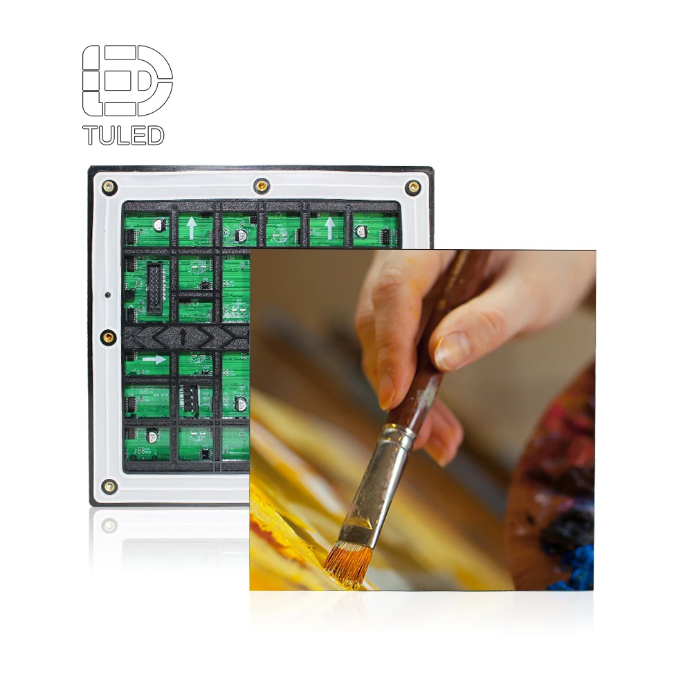
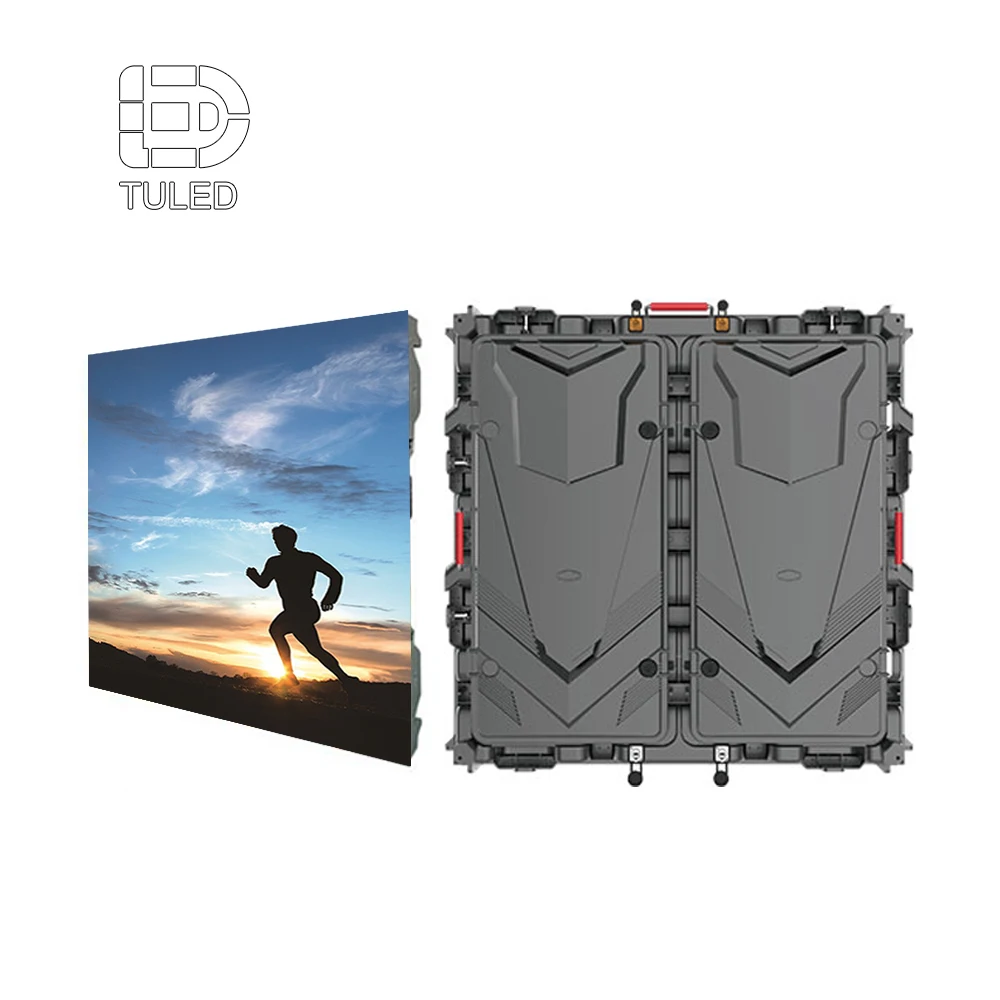
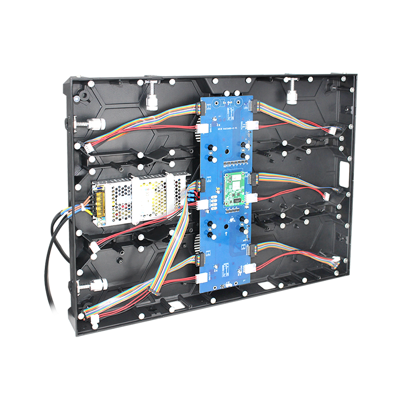
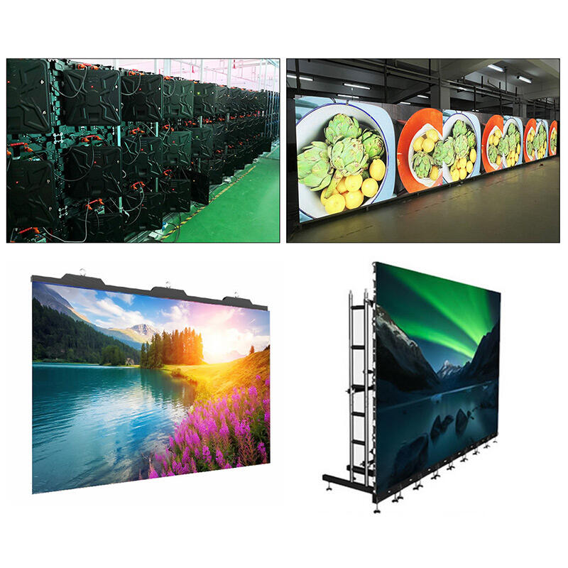
Spec 5 — Cabinets & service: seams, rigidity, and Tuesday maintenance
Cabinet design doesn’t feel exciting. It’s still the part that decides whether maintenance takes 12 minutes or half a day. In tight indoor installs—flush to a wall, built into millwork, surrounded by glass—service access is the difference between “routine” and “disruptive.”
Two cabinet formats show up often indoors because they simplify layout planning:
16:9-style cabinets (commonly used in small pixel lines) fit modern content and make wall proportions predictable.
Standard indoor cabinets like 640×480 mm systems often emphasize compatibility, flexible ratios, and service access.
The 640×480 product framing highlights a practical combination: full front service plus an indoor brightness range that fits brighter interiors. Front service matters when rear access isn’t available, which happens more often than renderings suggest.
Structure planning belongs here too. A wall can look perfect in a 3D mockup but show seam shadows if mounting flatness isn’t controlled. A straightedge check across the mounting plane, followed by a mid-gray field test after installation, catches problems early.
Related product page: 640×480 LED Display
Quote lines that prevent “access regrets”
Cabinet dimensions and material (die-cast / aluminum details if relevant)
Front/rear service method and minimum clearance needed for removal
Spare modules and spare power supplies list (percentages and quantities)
A quick “human” takeaway
The wall that’s easiest to service is usually the wall that stays looking “new.”
Spec 6 — Power & thermal: average power is the real operating cost
Power is where “paper specs” can mislead. Peak power shows worst-case full-white behavior. Average power predicts everyday operation, HVAC load, and comfort in the first row. In quiet rooms, it also affects noise, because aggressive cooling can become audible during a silent training session.
The UHD small pixel spec framing lists both max power and average power per square meter, which is exactly the kind of clarity that prevents surprises later. When only peak power is listed, HVAC planning tends to overshoot. When only average is listed, full-white content during special events can surprise the room.
Thermal behavior also affects perceived quality. If cabinet temperatures vary across the wall, brightness and color can drift slightly. That drift becomes visible on flat colors, which is what dashboards and slides use all day.
Quote lines that keep expectations grounded
Max and average power (same unit basis: per cabinet or per m²)
Operating temperature/humidity range
Ventilation plan (rear clearance, side channels, room airflow assumptions)
A quick “human” takeaway
Average power is the number that decides daily comfort, not the peak headline.
Spec 7 — Control & workflow: the screen is only as easy as the signal chain
A wall can have great hardware and still frustrate daily operation if the signal chain is messy. Control planning is where a “nice demo” becomes “easy daily use.” Indoor projects typically fall into three workflow styles:
Live-input driven (sync)
Meeting rooms and lecture halls often switch between a laptop, a video call feed, and a media player. In that setup, stable switching, clean scaling, and a documented input map reduce awkward pauses.
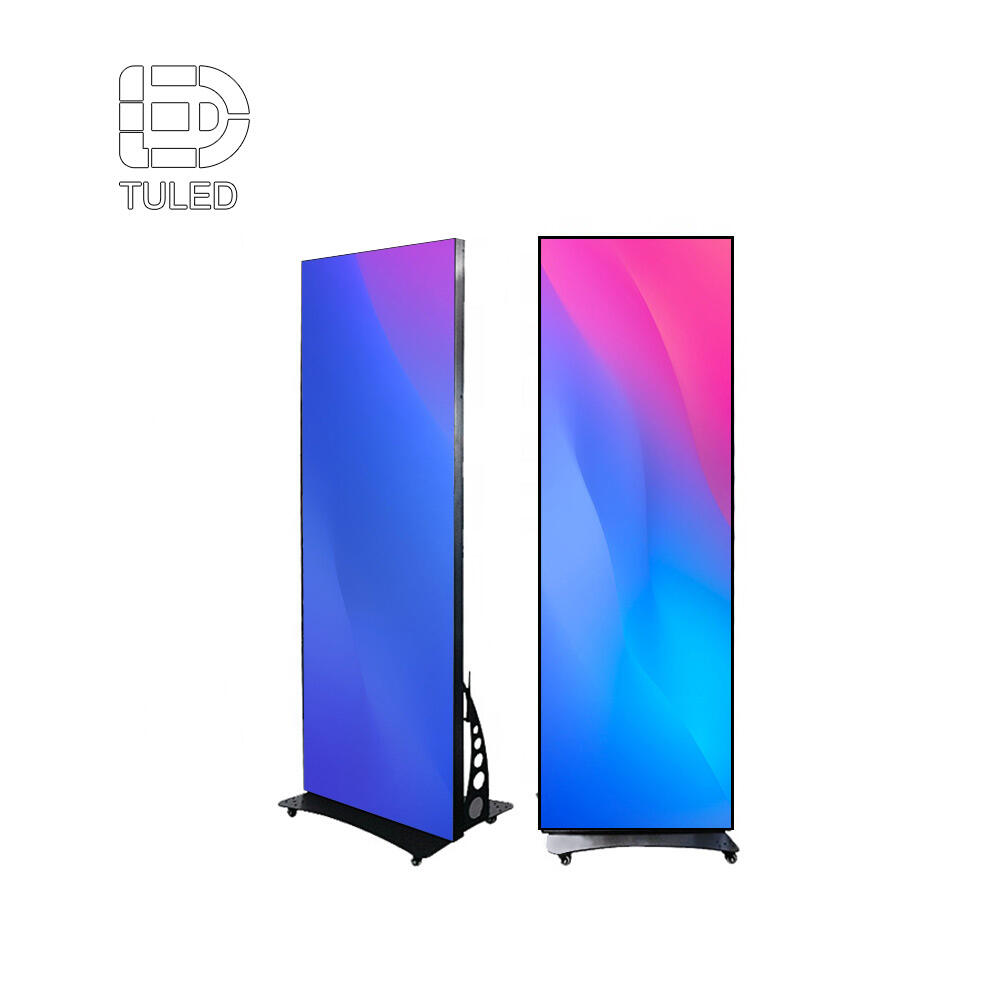
Scheduled playback (async)
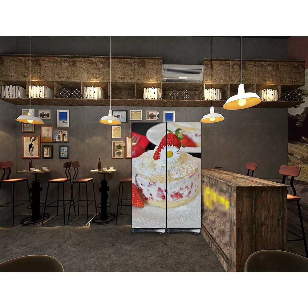
Lobbies and corridor signage often run scheduled loops and timed campaigns. Poster-style formats fit these spaces well because the vertical canvas matches walking sightlines, and brightness can be tuned to avoid harsh nighttime glare.
Related product page: LED Poster Display
Hybrid
Many spaces mix both. A lobby wall might run branding loops most days and switch to live announcements during events. That hybrid plan benefits from a clear “default state,” a fast switch-back routine, and a simple checklist taped inside the equipment rack door.
A good control plan also includes labeling discipline. Port numbers, cable lengths, and a “known-good” configuration snapshot prevent the classic situation where everything works on day one and becomes confusing after the first room change.
For a broader overview of display types and selection thinking, this page supports internal navigation without pulling attention away from the main guide:
Why LED Display? Which LED Display Type Is Best
A quick “human” takeaway
The easiest wall to run is the wall with a boring, well-labeled signal plan.
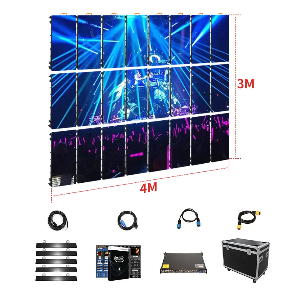
Budget trade-offs: where money should go (and where it often gets wasted)
This is the part that usually gets whispered after the second meeting. Budget isn’t unlimited, so priorities matter. The mistake is spending big on one glamorous spec while the daily-use specs get underfunded.
Meeting rooms and control rooms usually benefit most from spending on pixel density, calibration, and reflection control. Text clarity is the daily test. A wall that makes spreadsheets readable at 4 p.m. is a better “upgrade” than a wall that only shines during demo videos.
Showrooms and lobbies often benefit from brightness headroom and reflection control, plus reliable playback. In a bright lobby at noon, a wall that holds contrast without looking harsh becomes the centerpiece naturally. In that environment, stable content scheduling can matter more than extreme pixel density.
Event rooms and indoor jumbotron layouts tend to reward spending on motion stability, camera behavior, and redundancy. Fast switching and backup inputs prevent the “one cable fails, everything pauses” moment. That’s not glamorous spending, but it’s the spending that avoids stress on event days.
A final budget note is easy to miss: service access is a cost multiplier. When service is painful, every small repair costs more time and disrupts the space longer.
Before buying: quote checklist + 10 procurement questions
A strong plan can still fail if the quote hides assumptions. The goal here is to make the quote reflect the real room, not the vendor’s default template.
Quote items that should appear (clean and complete)
Screen basics: pitch, total size, total resolution, cabinet count, module size
Optics: brightness range, dimming range, viewing angle, uniformity targets
Motion: refresh rate, scan method, grayscale depth
Color: color temperature range, calibration method, calibration data delivery
Service: front/rear service method, minimum access space, spare module/PSU list
Power: max and average power, input voltage range, grounding approach
Control: sync/async mode, processor/controller model, inputs list, cable length assumptions
Acceptance: required test patterns, seam inspection method, camera check method if relevant
Ten questions that prevent “we assumed…” later
What brightness setting is recommended for a standard meeting room, not just max output?
Does dimming stay smooth at low brightness, or does dark gray band?
What refresh behavior is measured at 20–30% brightness, not only at full output?
What scan method is used at the selected pitch, and what trade-offs come with it?
Is grayscale depth specified clearly, and does near-black detail stay visible?
Is factory calibration data delivered, and how is it reapplied after module replacement?
What cabinet alignment method controls seam flatness over time?
What is average power during mixed content, not only peak full-white?
What spare parts ship with the order (modules, receiving cards, PSUs), and how many?
What acceptance tests are required on installation day, and what is the pass language?
Dead pixels and “bad point” acceptance language (the part that stops arguments)
Acceptance testing is only half the story. The other half is defining what “pass” means in words that can’t be bent later. Dead pixels, stuck pixels, and color-shift pixels happen eventually in any large LED system. The practical goal is to define thresholds, classify defect types, and lock in the remedy process.
A clean acceptance section usually includes three defect types:
Dead pixel: not emitting light.
Stuck pixel: always on or always lit in one color channel.
Color-shift pixel: emitting, but visibly off-color compared with neighbors.
Next comes the measurement basis. The most common ways are per module, per square meter, or per total pixel count. The exact number varies by project expectations, but the language should define the basis clearly, then specify an allowable threshold. It also helps to state that defects are evaluated at a defined viewing distance and brightness setting, because a defect visible at 1 meter may not be visible at 5 meters.
Finally, the clause that avoids the biggest fight: module replacement and recalibration. Replacement should require local calibration so the new module matches surrounding panels. Otherwise, a “repair” creates a new visible rectangle on light-gray content, which is often worse than a single tiny defect.
A compact example of “contract style” wording:
“Bad pixels are classified as dead, stuck, or color-shift.”
“Acceptance evaluation uses a full white, full black, and mid-gray pattern at the commissioning brightness setting.”
“If a module is replaced, local calibration is performed to match the wall’s stored calibration profile.”
This section isn’t about being strict. It’s about preventing ambiguity when the wall is already installed and the room is booked.
Size and resolution planning: from room measurements to a screen that fits content
This planning method works across boardrooms, showrooms, and indoor jumbotron layouts because it starts with distance and content, not with a product name.
Measure the three distances that matter
Closest normal viewing point (often the first row seat or reception desk)
Typical viewing lane (where people stand or sit most of the time)
Farthest point (back row or entrance-to-screen distance)
Those three numbers shape pitch, brightness, and viewing angle needs. A boardroom might be 2.2 m closest and 7 m farthest. A showroom might be 1.5 m closest and 12 m farthest. A hall might be 6 m closest and 40 m farthest.
Decide the dominant content type
This part changes everything:
Text-heavy: dashboards, spreadsheets, agendas, CAD
People-heavy: video calls, keynote speakers, interviews
Motion-heavy: brand films, sports footage, dynamic backgrounds
Mixed multi-window: main canvas + side panels + tickers
Text-heavy content punishes low resolution quickly. People-heavy content punishes poor calibration. Motion-heavy content punishes weak refresh behavior and grayscale stability.
Pick the aspect ratio that matches use
16:9 works because laptops and conferencing outputs are built around it. Ultra-wide ratios can look great in lobbies, yet they demand content designed for the full canvas. Poster formats work in corridors because the vertical layout matches how people walk and glance.
Translate physical size into pixel targets
Use the straightforward pixel math:
Width pixels ≈ (screen width in mm) ÷ (pitch in mm)
Height pixels ≈ (screen height in mm) ÷ (pitch in mm)
Then compare the result to content canvases used daily. Standard presentation and conferencing workflows sit comfortably around 1080p-class canvases. Multi-window dashboards and detailed data walls often benefit from higher pixel density.
Commissioning and acceptance tests: what to check on install day
Acceptance testing doesn’t need to be complicated. It does need to be repeatable. The goal is to catch issues while the installation crew is still on site and the configuration is still fresh.
A tight acceptance checklist that works in most indoor installs
Visual uniformity checks (about 5 minutes)
Full white at 30%, 60%, 100%
Full mid-gray (around 20–30%)
Solid red, green, blue fields
Pass criteria: uniform color with no visible tinted blocks across cabinet boundaries.
Seam and flatness checks (about 5 minutes)
Show a light gray field and walk diagonally across the room
Look for corner lift or seam shadow lines
Pass criteria: the wall reads as a single plane with no visible seam shadow lines.
Motion checks (about 5 minutes)
Slow gradient video
Fine text crawl line
Pass criteria: stable motion with no shimmer, judder, or scan artifacts.
Camera check when filming happens (about 5 minutes)
Record the wall on a phone while panning slowly
Repeat at lower brightness
Rolling bands indicate low-brightness stability needs attention.
Control workflow checks (about 10 minutes)
Switch inputs (laptop → media player → conferencing feed)
Confirm audio/video sync if the wall pairs with a room audio system
Confirm the “default state” returns cleanly after switching
A small operational tip helps: keep a “test clip folder” on the control PC. It saves time when the room is busy and questions come up.
Where indoor LED walls fit best (and pairing ideas that actually work)
Conference rooms and boardrooms
Text clarity becomes the daily benchmark. Fine-pitch planning supports small fonts and clean charts, while stable whites make slide backgrounds look normal instead of tinted. Pairing tends to work best when the processor supports predictable scaling and input switching, so the wall behaves like a giant monitor.
Retail and showrooms
Reflections show everything. A glossy floor can throw light back into eyes, and bright packaging reveals uniformity issues quickly. In that setting, controlled brightness and low-reflection surfaces matter more than peak numbers.
Events and indoor jumbotron layouts
An indoor jumbotron setup is less about “big” and more about “predictable.” Motion content, filming, and fast switching show up together. That combination raises the value of stable refresh behavior, a labeled signal path, and a backup input plan that’s actually wired.
Control rooms and monitoring centers
Dashboards use flat colors, thin lines, and repeated layouts. That’s where seam alignment and uniformity become daily-visible. Grid-friendly cabinet planning helps too, especially when the room may expand later.
A square cabinet format can support grid-based planning in some layouts. The 640×640 display line shows standardized panel framing that fits modular expansion thinking.
FAQ: practical answers that come up again and again
What pixel pitch works for mixed use?
Mixed use usually means mixed distances. The safest approach is to pick pitch from the closest normal viewing point, then control readability with content design (font sizes, contrast, layout discipline).
What brightness range is typical indoors?
Indoor capability often ranges from several hundred nits into the low-thousand nits depending on product family and use zone. Fine-pitch specs can list ≥600 nits capability, while some indoor cabinets list 1000–1200 cd/m², and poster units can list 800–1000 nits.
Why does a wall sometimes flicker on camera even if it looks fine in person?
Cameras sample light differently than eyes. Low-brightness gray performance is where issues show first, so the gray test and slow-pan check should be part of commissioning.
What makes seams show up on flat colors?
Mounting flatness and cabinet alignment usually cause seam shadows. A mid-gray field reveals alignment issues faster than colorful demo loops.
What should be included for long-term color consistency?
Calibration data delivery and a module replacement re-calibration process keep walls consistent. Without that, replacements can create visible tint blocks.
Does front service matter for fixed indoor installs?
Front service matters whenever rear clearance is limited. Without it, even small repairs can become disruptive.
What is the simplest way to reduce day-to-day operational friction?
A documented input map, labeled cables, and a known-good configuration snapshot reduce confusion after room changes.
Is “indoor LED screen” the same as an LED wall or LED video wall?
It’s often used as a broader phrase. In practice, it can refer to fixed LED walls, poster signage, and other indoor LED formats.
What makes an indoor jumbotron feel professional?
Stable motion, clean camera behavior when filming happens, and a signal chain that switches sources without drama.
Wrap-up: a tighter way to choose, plus three next actions
A good plan ties pitch, brightness, motion stability, and service access to the real room—chairs, lights, and daily content. Once that match is clear, the remaining work becomes paperwork and proof: write the quote precisely, then confirm it during commissioning. In day-to-day use, that’s what makes an indoor led display feel like a reliable tool instead of a constant tweak project.
Add the quote checklist to the RFQ so every response uses the same spec fields.
Run the acceptance clips on-site (mid-gray, white field, gradient, camera pan if needed).
Document the signal map (inputs, processor settings, cable labels) before the crew leaves.
For projects that need a seamless wall for meetings, showrooms, and indoor jumbotron applications, a well-matched indoor led display tends to solve more problems than it creates—especially when the “before buying” steps are treated as part of the spec, not an afterthought.