
At first glance, a feature wall, a glass storefront screen, and a landmark corner facade all seem to begin with the same move: pick a size, ask for a price, and wait for a drawing. In practice, that shortcut is exactly what creates long email threads, drifting quotations, and drawings that look neat but solve the wrong problem. A strong custom led display project starts much earlier, with clearer project facts, better visual intent, and a factory-side conversation that turns a nice idea into something a site team can actually build.
So, this article is written for architects, brand experience teams, consultants, and project managers who need more than a product introduction. The goal here is simple. Show the real workflow. Make the decision points easier to judge. Help the next design-stage inquiry feel shorter, calmer, and more useful.
The mistake that slows good ideas even when the concept looks strong
Most stalled LED projects do not stall because the visual direction is weak. Instead, they stall because the concept arrives alone. There is a hero render, a mood image, or a message like “something similar to this,” but there is no clear note on service access, structural limits, power entry, finish relationship, or how the screen will be used day after day.
Meanwhile, the planning side often assumes the first drawing will answer those questions automatically. However, a drawing cannot answer what the brief never defined. It can only turn assumptions into lines. If the assumptions are wrong, the drawing still looks complete, yet the next review round becomes a correction exercise.
That is why this stage feels frustrating in real life. A brand team imagines a clean seamless wall. The site team worries about depth. The electrical side asks where the feed enters. The structural side asks what the wall can carry. Then everyone is suddenly discussing installation logic before agreeing on what the display is supposed to do in the first place.
In other words, the expensive part is usually not fabrication. It is confusion. A well-prepared concept package removes that confusion early, so the design side and the engineering side are reacting to the same project, not to two different versions of it.
A useful rule: when the first conversation is only about size and price, the second conversation usually becomes about what was missing. When the first conversation includes use, site, service, and finish, the second conversation becomes much more productive.
What should be ready before the first drawing starts
Fortunately, the preparation list is not complicated. It simply needs to reflect how projects actually move. The best early inquiry is rarely the longest one. Instead, it is the one that gives the engineering side enough context to stop guessing.
For that reason, the drawing stage should begin with a compact handoff package. Not a full tender. Not a polished presentation. Just the few project facts that shape real feasibility. Once those are present, a first CAD drawing can start serving as a decision tool rather than a placeholder.
Just as importantly, this package should reflect the real room experience, not only the drawing sheet. A screen near a reception desk behaves differently from a screen high above a retail entry. A transparent media surface on glass feels different at 11 a.m. sunlight than it does at dusk. A corner spectacle behaves differently when most foot traffic approaches from one side rather than from the front.
That living context is what many technical conversations forget. Yet that context is exactly what makes the final installation feel obvious and well-placed instead of forced into the architecture.
The real 7-step workflow from concept to CAD drawing
Below is the workflow that tends to reduce revision loops. It is not theoretical. It reflects how strong commercial installations usually move when the design side and the factory side start working from the same facts.
Step 1: name the job of the screen before naming the product
First, the planning team should decide what this screen is meant to do in daily life. A luxury lobby wall that supports mood and brand memory needs a different visual rhythm from a transport concourse screen that must stay legible from farther away. Likewise, a corner 3D facade works very differently from a quiet gallery installation.
That sounds simple, yet it is the foundation of every later choice. When the job of the screen is unclear, every recommendation stays half-right. One group asks for visual impact. Another asks for low maintenance. A third asks for a cleaner edge. Without one agreed priority, all three requests start competing inside the same drawing.
A practical tip helps here. Write one sentence that begins with “This screen must mainly…” and force the team to finish it. That sentence often reveals whether the project is about atmosphere, visibility, storytelling, attention, information, or multi-purpose use.
Step 2: translate the site into real constraints
Next, the concept should meet the building as it actually exists. That means dimensions, nearby finishes, service routes, glazing lines, ceiling details, circulation paths, and any hidden condition that will matter once metalwork begins. If that sounds unglamorous, it is. Still, this is the stage that prevents elegant ideas from turning into awkward retrofits.
For example, a wall that looks broad and empty in one site photo may actually contain access panels, fire devices, stone joints, or a narrow cavity depth that changes everything. Similarly, a storefront may look flat in elevation but behave very differently once sun direction and interior sightlines are considered.
At this point, the most useful deliverables are often the simplest ones: marked-up photos, an elevation, a rough plan, and notes on what cannot be touched. Those materials give the drawing team a believable ground to stand on.
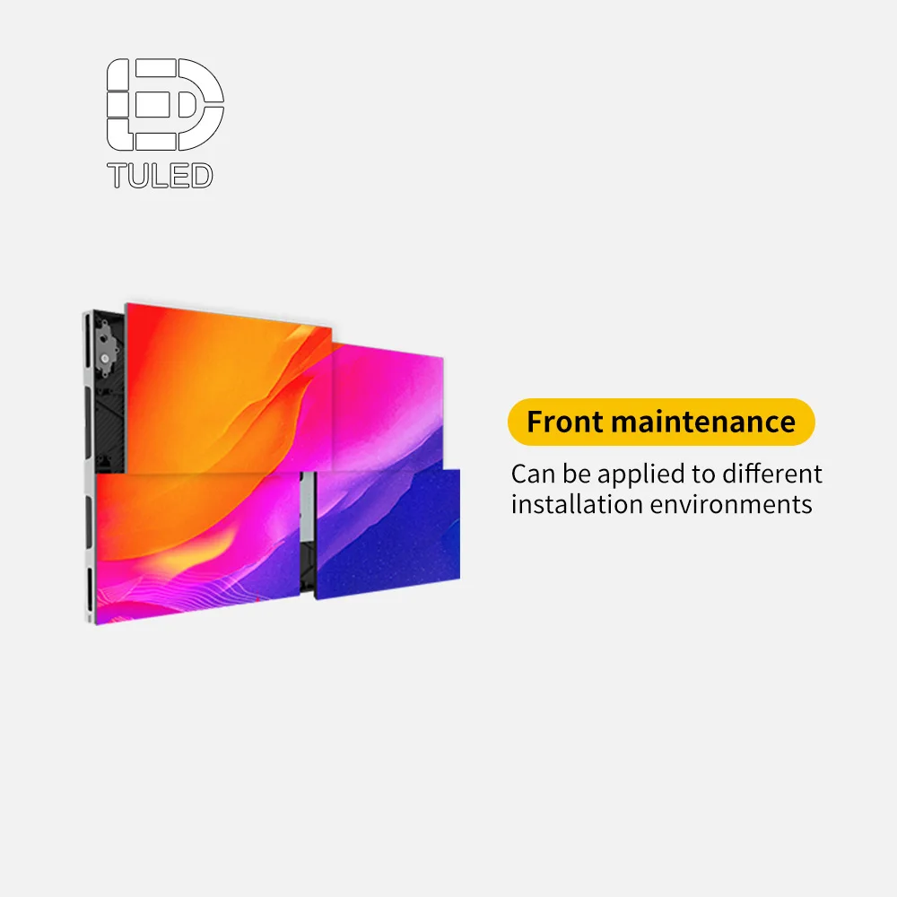
Step 3: decide how the screen will be supported and serviced
Now the installation method needs to move to the front of the conversation. This is where many concept reviews become much clearer. A flush wall detail may look beautiful, but it can become difficult if the back side offers no service corridor. A suspended piece may open great sightlines, yet it adds load-path and access questions. A freestanding outdoor structure may simplify some architectural conflicts while creating new foundation and cable decisions.
Service logic matters just as much. Front access tends to help when there is little or no rear clearance. Rear access can work well when a proper service zone already exists. Mixed access sometimes gives the cleanest result in complicated builds, especially when one side is visually sensitive and the other side is less public.
In practice, the smartest question at this stage is not “Which maintenance method is best?” It is “Which maintenance method protects the space, the daily operation, and the future replacement routine with the least disruption?” That question is far closer to real project life.
Step 4: lock the visible geometry without over-locking the concept
After support and service are named, the visible geometry can become more disciplined. This is the point where size, edge conditions, returns, corners, and surrounding trim should begin to settle. However, the concept should not be frozen so early that reasonable engineering improvements become impossible.
That balance matters. Some elements are sacred. A pure rectangle, a flush reveal, a thin black edge, or a seamless corner may define the whole design. Other elements can flex. Width can shift slightly. Module rhythm can adapt. Surround detailing can change if it preserves the visual read and makes fabrication cleaner.
Strong teams often mark the concept in two colors at this stage: “must stay” and “can adjust.” That small habit saves a surprising amount of time. It also helps the engineering side know where to protect the design intent and where to improve the build logic.
Step 5: test the idea in a 3D render that checks fit, not only beauty
Then, the render should stop behaving like a sales image and start behaving like a design filter. A useful 3D render asks better questions than a glamorous one. Does the screen overpower the material palette? Does it sit comfortably against glass, stone, or metal? Does it still feel right from oblique angles? Does it block something more important than itself?
This is also where content mood becomes practical. Slow atmospheric motion in a boutique environment feels different from bold motion in a public plaza. A soft reflective lobby may need calmer visual behavior than a nightlife facade. If the render only shows a spectacular hero frame, it can hide these everyday realities instead of revealing them.
As a result, the render should test a few real views: approach view, side view, human-height view, and near-distance view. Those angles usually reveal proportion issues much faster than polished perspective shots do.
Step 6: build the first CAD drawing around assumptions that are openly stated
Once the concept, site, service, and render logic are aligned, the CAD drawing can finally work as intended. At this stage, the drawing should describe not only the visible screen but also the conditions that make it feasible: overall dimensions, wall build-up or frame intent, service method, likely power and signal entry, and the basic relationship to surrounding finishes.
Equally important, the drawing should state its assumptions openly. If final site dimensions are still pending, say so. If local structural reinforcement is still under review, say so. If control equipment location is provisional, say so. Clear assumptions are not a weakness. They are what make revision rounds faster and calmer.
This is also where a custom LED screen conversation becomes much more useful than a generic product conversation. The discussion is no longer about a broad product family. It becomes about this wall, this corner, this frame, this cable route, and this service method.
Step 7: freeze the design checkpoints before quotation becomes “final”
Finally, the project needs a drawing freeze point. Without one, every “small adjustment” keeps reopening structure, routing, or edge conditions. That is how teams lose momentum. A change that seems harmless in a mood review can become major once fabrication assumptions have already formed around it.
Therefore, the drawing stage should end with a short checklist: what is fixed, what is provisional, what local site confirmation is still needed, and what would count as a genuine scope change. That list makes the next quotation far more comparable and far more honest.
In short, a quotation should follow a clarified design. It should not be expected to create one.
How the same idea changes once it enters real spaces
Although the workflow stays consistent, the logic of the drawing changes a lot from one setting to another. This is where scene-based judgment becomes more useful than parameter memorizing. The same display category can feel completely right in one place and completely wrong in another because the architecture, light, audience path, and operating rhythm are different.
Lobby wall: the screen must belong to the room, not just fill the wall
In a lobby, people rarely stare at the screen from one fixed point. They pass through, slow down, glance sideways, look up while speaking, and notice reflections on surrounding surfaces. Because of that, proportion and finish relationship often matter more than pure size. A screen that is slightly smaller but better aligned with stone joints, joinery lines, or a reception desk can feel far more premium than a larger one that simply dominates the wall.
Moreover, the use method is usually quieter than teams first imagine. Most lobby content works best when it supports atmosphere, brand tone, and light movement rather than shouting for attention every second. That means the design should protect a refined visual edge, good close-range comfort, and maintenance access that does not disrupt the front-of-house experience.
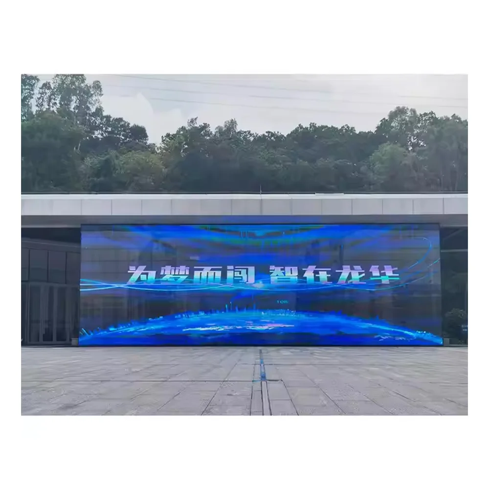
Glass-facing retail or transparent media wall: visibility is only half the story
On glass, the display becomes part of the facade language. It is not just content anymore. It is a layer between inside and outside, daylight and reflection, message and merchandise. For that reason, the planning side should judge transparent solutions by how they behave in the full day cycle, not just by how they look in one promotional image.
During the day, reflections can compete with content. At night, interior lighting can change the reading again. Inside the store, the question is whether the screen preserves enough openness and product visibility. Outside the store, the question is whether the message still feels clean rather than cluttered. That is why transparent media surfaces work best when the drawing stage studies both architectural fit and visual rhythm together.
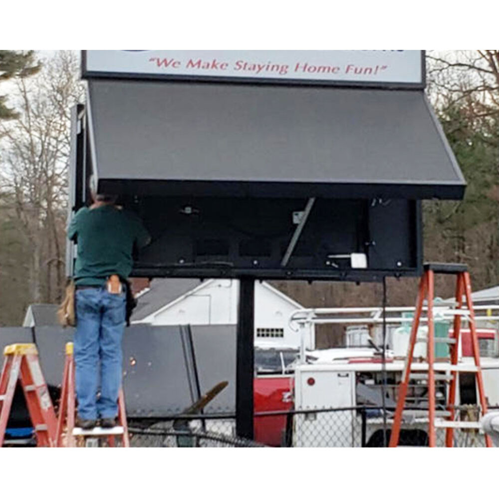
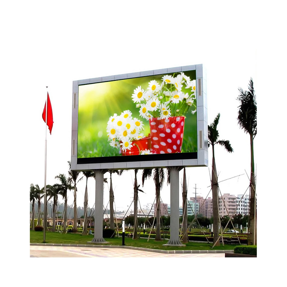
Outdoor landmark wall or billboard-style installation: the support system matters almost as much as the face
Outdoors, the screen may look like the main event, yet the support logic often decides whether the installation feels dependable. A facade piece, a freestanding sign, and a plaza-facing wall each bring different structural and maintenance realities. Wind exposure, drainage, access, projection depth, and service reach quickly stop being background topics and become the project itself.
Besides, the use pattern is usually more demanding. Long operating hours, changing light conditions, public visibility, and harder service environments all raise the cost of poor early decisions. For that reason, outdoor work benefits from earlier factory involvement, earlier route planning, and earlier agreement on what local teams will supply versus what should come as part of the screen package.
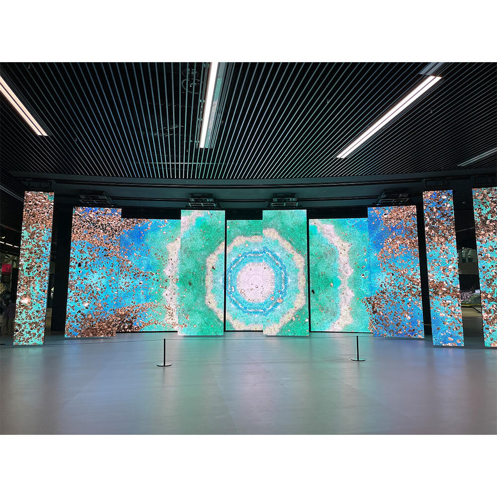
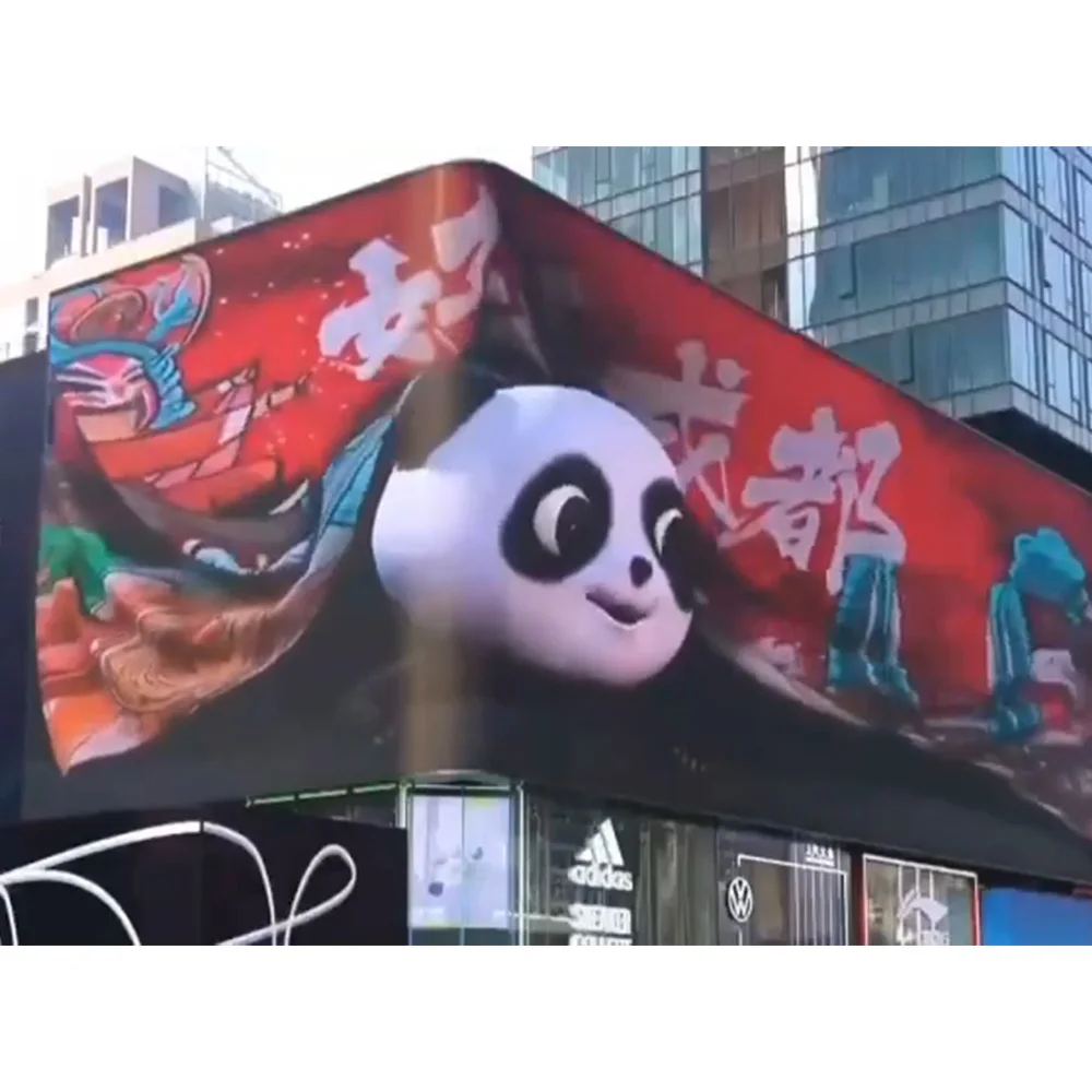
Corner 3D facade: the illusion only works when geometry and audience path agree
A 3D corner display often attracts attention first and planning discipline second. However, the effect only feels convincing when the corner geometry, approach path, and content perspective are in sync. If the main audience approaches from the wrong angle, the illusion loses strength. If the corner is too visually busy, the content effect becomes diluted. If the facade depth is ignored, the edge condition can weaken the read.
Therefore, the best time to involve the factory is usually earlier than many teams expect. A corner spectacular is not just a content project. It is a perspective project, an edge project, and a visibility project all at once. The render, the drawing, and the content test frames should all support the same illusion strategy.
These scene differences are exactly why early concept conversations should feel more spatial and less catalog-driven. A strong project does not begin by picking a favorite spec line. It begins by understanding how the screen will live inside the site.
Decision table: how to judge a proposal before round two becomes expensive
Once the first drawing or quotation appears, the planning team needs a fast way to separate clear proposals from risky ones. The table below is designed for that moment. It is not a parameter chart. Instead, it shows what good project thinking looks like on paper.
| Decision point | What a strong proposal usually shows | Why it matters in real project life | What should raise concern |
|---|---|---|---|
| Scope clarity | Screen, structure intent, service method, control assumptions, and accessory boundaries are clearly listed. | It becomes much easier to compare proposals fairly and assign local responsibilities without confusion. | A low-friction price with broad wording and no boundary notes. |
| Site understanding | The reply reflects actual wall, glass, facade, or support conditions instead of only generic product language. | That usually means the engineering side is solving the real installation, not a template project. | Advice that would be identical for a lobby, a storefront, and an outdoor corner. |
| Service logic | Access direction, likely clearance, and replacement routine are acknowledged early. | Future maintenance is one of the fastest ways for a beautiful build to become inconvenient. | Service is mentioned only after design approval, or not mentioned at all. |
| Visual protection | The proposal distinguishes between must-keep design features and flexible dimensions. | That balance protects the design intent while still improving buildability. | Either extreme: rigidly copying the sketch or changing the look without explanation. |
| Revision discipline | Assumptions are stated, and the team can see which changes would affect structure or routing. | This keeps the project moving instead of re-opening everything during each review. | No freeze logic, no stated assumptions, and no sense of what would count as a scope change. |
| Operational thinking | Content behavior, day-to-night use, control needs, and likely maintenance rhythm are considered. | A screen that looks right on day one can still feel wrong after months of real use if this is ignored. | A proposal that treats the installation as a one-time object rather than a daily system. |
Meanwhile, one small habit improves evaluation very quickly: ask each proposal to explain not only what is included, but also what was assumed. Those two lists often tell far more than the total number alone.
How to use the first CAD drawing inside the project team
A first CAD drawing is not just something to approve or reject. It is something to use. In well-run projects, the first drawing becomes a working tool for coordination across design, operations, structure, and site execution. When treated that way, it saves time well beyond the display package itself.
First, the drawing should be marked up by discipline, not just discussed in one combined meeting. The design side can comment on visible edges, trim alignment, and sightline comfort. The site team can comment on access, installation reach, and practical build sequence. The electrical side can mark the route logic. The operations side can confirm how the screen will actually be used once it goes live.
Second, the drawing should be paired with a content sample. This is one of the most helpful tricks in the entire process. A blank rectangle rarely reveals enough. A sample frame or short mock content layout shows where text will sit, how motion will read, and whether the screen proportion truly supports the intended use. Suddenly, a minor size adjustment or a small edge trim change becomes much easier to judge.
Third, the drawing should be used to confirm responsibilities in plain language. Who signs off final site dimensions? Who supplies local steel if needed? Who runs power to the handoff point? Who installs the surrounding finish? Who handles control equipment placement? Those questions often feel administrative, yet they are what keep the project from bouncing between teams later.
Best way to review a first drawing
Print or export one version for visual review, one for installation review, and one for coordination notes. Mixed-purpose markups usually become messy and slow.
Best way to reduce rounds
Attach one content mockup, one site photo sheet, and one “fixed vs flexible” note to the drawing review. That trio answers many later questions before they appear.
As a result, the first CAD package becomes more than a technical deliverable. It becomes the shared language of the project. That is exactly why it deserves more preparation than a quick “please quote” email.
When factory involvement saves time instead of adding another layer
Many teams wait to involve the factory until the concept feels nearly settled. Sometimes that works. However, in more complex installations, the better moment is often earlier. Not at the loose brainstorming stage, but at the point where the idea has shape and the site has enough facts to support a serious feasibility conversation.
That timing matters because a factory-side discussion can connect things that otherwise stay split: cabinet logic, edge conditions, structure intent, service access, accessories, control assumptions, and test readiness. The result is not just a faster answer. It is usually a more realistic one.
On the support side, the site pages point toward practical strengths that help during this phase: complete system support, installation structure guidance, OEM/ODM support, 110 Countries Solutions, a 2-year warranty, strict testing before delivery, and 24/7 support. Those points matter most when the project still needs engineering coordination rather than only product browsing. More detail can be checked on the about us page.
In the same way, application-oriented references often help the conversation stay grounded. Rather than discussing only product families, it becomes easier to discuss environments, use cases, and installation logic. That is why it often helps to pair the concept review with a quick look at the application custom LED display examples before locking assumptions.
What usually delays progress before quotation or production
Even strong concepts lose time in familiar ways. Fortunately, most of those delays are avoidable once they are named clearly.
Unclear scope boundary
One of the biggest delays happens when the visible screen is defined but the surrounding package is not. The planning side assumes structure is included. The local site team assumes it is excluded. The electrical side assumes someone else has already confirmed entry points. Then, quotation review becomes a negotiation over assumptions instead of a comparison of real solutions.
Late discussion of service access
This issue appears again and again. The concept looks excellent from the front, so the front gets all the attention. Later, someone asks how modules, power supplies, or control parts will actually be serviced. Suddenly, the recess is too tight, the corridor is too narrow, or the finish detail blocks access. At that point, even a small correction feels painful because the visual story is already emotionally approved.
Content uncertainty
A screen meant for calm branded motion behaves differently from a screen meant for split layouts, text-heavy messaging, or live feeds. If that content logic stays vague, then size, proportion, and control thinking often stay vague too. The screen may still be buildable, yet it may not be comfortable in use.
Too many decision-makers, no drawing owner
Sometimes the design is not blocked by engineering at all. It is blocked by review structure. Architecture comments arrive first. Brand comments arrive later. Operations comments arrive after both. Then the drawing team is asked to merge three rounds of feedback that were never aligned with each other. A named drawing owner can reduce that problem immediately.
Comparing numbers without comparing assumptions
Finally, some delays come from trying to reconcile quotations that were never priced on the same basis. One proposal may include accessories, testing, and clearer support notes. Another may strip the scope back to a bare hardware number. Those two proposals are not really competing on equal ground, so the review takes longer and produces more uncertainty.
The fastest way to move a project forward is usually not to push for a quicker number. It is to remove one layer of ambiguity before the next drawing or quotation round begins.
Conclusion: better preparation creates calmer projects
In the end, the most useful LED projects are rarely the ones that begin with the loudest concept. They are the ones that become clear early. The site is understood. The installation method is named. The service logic is realistic. The render tests fit rather than fantasy. The drawing states what is fixed and what is still assumed.
That is what makes the path from concept to CAD feel shorter, even when the project itself is complex. Clarity cuts more time than speed ever does. And once the drawing stage becomes stable, quotation, production planning, and installation coordination all become easier to trust.
Three practical actions for the next inquiry:
- Send a compact package with concept images, real site photos, target size, installation intent, and service preference instead of only a reference picture.
- Ask the engineering side to label assumptions directly on the first drawing so the whole team can see what still depends on site confirmation.
- Compare proposals by scope clarity, service logic, and revision discipline before comparing total price.
Further reading
Custom LED screen solutions
Useful for projects that need more flexibility in shape, structure, and installation approach after the concept stage starts tightening up.
Application references
Helpful when the planning side wants to compare how different environments change the display logic before the drawing direction is frozen.
Factory-side design support
A good place to review support scope, warranty direction, system assistance, and why early engineering input often improves design-stage efficiency.
Project inquiry page
Best used when the concept package is ready and the next step is a practical conversation about feasibility, drawing direction, and scope alignment.
FAQ
What information is needed before a custom drawing can begin?
How do concept, site condition, and installation method affect the design process?
What slows custom LED projects before quotation or production most often?
When is the right moment to involve the factory?
Is a 3D render enough to move straight into quotation?
CTA
For teams already holding a concept sketch, a marked-up site photo set, or a preliminary layout, the most useful next move is often a drawing-stage conversation rather than another round of generic browsing. That is especially true when the project involves glass, complex edges, limited service space, or multiple stakeholders across design and site delivery. A focused inquiry through the contact us page can help turn an attractive idea into a cleaner first drawing, a clearer scope boundary, and a more realistic next quotation. In that final review stage, a custom led display decision becomes easier when the discussion stays centered on site reality, service logic, and long-term use rather than on isolated product lines alone.
Start a Design-Stage Inquiry