EN
EN

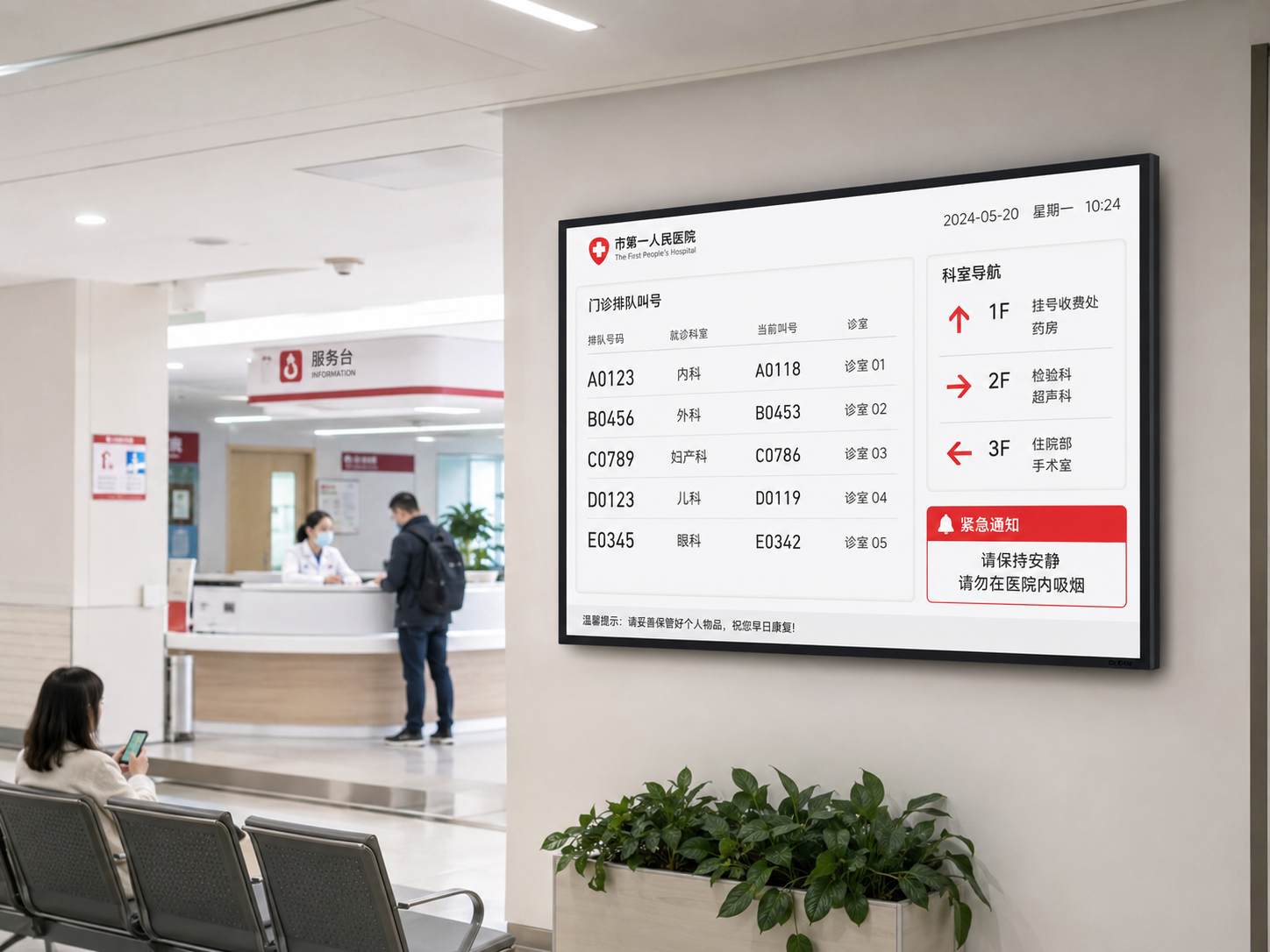
A hospital led display board project starts with information flow, not a list of panel specifications.
Queue calls, room directions, temporary notices and emergency instructions follow different operating rules. Each location also has its own viewing distance, ambient light, acoustic limit, installation condition and service workflow.
The planning task is to connect those conditions with readable text, controlled publishing rights, reliable interfaces, quiet thermal behaviour and tested recovery. This guide covers registration halls, waiting areas, department corridors, outpatient lobbies, pharmacy zones and urgent-message scenarios. It also provides an area matrix, an interface and permission checklist, a resilience test matrix and a complete site-acceptance checklist.
Area Planning
1. Match Each Hospital Area With the Right Message
Hospital buildings contain several information environments. A single screen template rarely works across all of them. Registration counters manage arrivals and service steps. Waiting areas manage live calls. Corridors support quick route decisions. Large halls may combine orientation, service changes and urgent instructions.
Start with an area-by-area inventory before discussing panel specifications. For every location, record the primary task, source system, viewing pattern, operating hours and responsible department. This approach prevents routine notices, queue updates and emergency messages from competing for the same space.
Core planning rule
Each screen needs one primary task. Secondary information can remain only when it does not weaken queue recognition, route decisions or urgent instructions.
Registration and Payment Areas
Registration zones need short and immediate information. Common fields include the active queue code, counter number, service state and temporary counter closure. Brief process guidance can appear in a separate area, but it should not compete with the current call.
Screen position can matter more than nominal dimensions. A display placed directly behind staff may be blocked by standing lines. A higher position improves visibility, although excessive height can make small text difficult to read. The survey should check both standing and seated sightlines.
Payment and discharge areas may follow similar queue logic. Their terminology and workflow can still differ. A payment screen may need counter availability and document reminders, while a discharge screen may focus on collection steps or service windows.
Public content should use only approved identifiers. A queue code and destination are often enough. Personal details, appointment data and clinical information should remain outside the public template unless a documented policy permits their use.
General Waiting Areas
Waiting areas need a calm and stable layout. The active queue call should stay in a fixed position. Recent calls can appear below it for a limited period. Supporting notices may occupy another zone, but the layout should not move whenever the playlist changes.
Long dwell time changes the visual approach. Fast animation, large white fields and repeated flashing may become tiring. A restrained content cycle usually works better. Short transitions can highlight a new call without making the entire screen pulse.
The template should distinguish between an active call, a recent call and a delayed queue. Those states need clear labels or positions. A colour change alone is not enough because the meaning may be missed from side seats.
Audio requires its own plan. Some areas may need a short tone or spoken call. Others may work better with visual-only notification. Speaker zones, volume ranges, repeat rules and quiet periods should be agreed before integration testing.
Department Corridors and Clinic Entrances
Corridor information must work while people are moving. Destination names, arrows, floor references and room numbers should form one clear visual group. Longer explanations belong on a directory, printed sign or nearby information terminal.
Naming must remain consistent across the building. A department should not appear under a full name at the entrance and an unexplained abbreviation near the clinic. One approved destination list should feed printed signs, digital directories and display templates.
A junction screen should answer one immediate question: which route leads to the required destination? Additional service information can appear only when it does not reduce the size or visibility of that answer.
Clinic entrance screens may show room status, a queue range or a temporary notice. Their layout can be more compact because viewing distance is shorter. Even so, essential text should remain visible when people stand near the doorway.
Main Outpatient Halls
Large halls often combine several functions. Typical content includes department orientation, multi-department queue summaries, temporary service changes and emergency directions. The layout should make those functions visually separate.
Screen size does not justify filling every area with content. Extra space is more useful when it increases text size, margins and separation. A simple three-zone layout can communicate more clearly than a dense mosaic of notices.
A central hall screen may need several operating modes. Normal mode can show directions and queue summaries. A busy-period mode may enlarge live queue information. Emergency mode should replace the normal grid through an approved override.
Viewing paths may begin at entrances, lifts, escalators or side corridors. Mark each main approach as a separate checkpoint on the floor plan. A display that works from the centre may still fail from a side entrance.
Pharmacy, Imaging and Laboratory Zones
Pharmacy screens may show collection codes, window assignments and service status. The active call should remain dominant, while recent calls should expire according to the local workflow. An unlimited call history quickly makes the layout difficult to scan.
Imaging and laboratory areas may also require preparation reminders, changing-room directions or delay notices. Those areas often have longer dwell times, so motion and audio should remain controlled.
Public displays should avoid unnecessary medical details. Where identifiers are required, the field format should follow the approved privacy and information-security policy.
Room mapping must be treated as configuration data. When a room changes, every relevant display should update without changing unrelated departments. A controlled location map reduces manual editing and inconsistent directions.
Hospital Area, Content, Distance and Display Requirement Matrix
The following matrix supports early scoping. Site measurements should replace all assumptions before the final pixel pitch, dimensions and mounting height are approved.
| Area | Main Content | Viewing Pattern | Measurements to Record | Display Requirements |
|---|---|---|---|---|
| Entrance lobby | Building orientation, department groups, service changes and urgent notices | Mixed walking and standing traffic from several directions | Main entrance line, side approaches, nearest point and far lobby edge | Clear hierarchy, broad usable viewing and full-screen override mode |
| Registration hall | Queue code, counter number, service state and temporary closure | Standing traffic with short viewing time | Front and rear of the line, side waiting area and likely obstructions | Large identifiers, short labels and fast event updates |
| General waiting area | Active call, recent calls, room direction and clinic notices | Seated viewing over a longer period | Nearest seat, farthest row, side seats and doorway position | Comfortable low-output mode, stable zones and local audio control |
| Department corridor | Destination, arrow, room number, floor reference and relocation notice | Walking traffic with brief recognition time | Junction, lift exit, turn point and side approach | Short text, strong direction cues and consistent naming |
| Central outpatient hall | Orientation, queue summaries, operational notices and emergency content | Wide-angle movement from multiple routes | Main routes, upper levels when present and side corridors | Zoned layout, strong spacing and controlled priority switching |
| Pharmacy | Collection code, window assignment and service status | Mixed seated and standing traffic | Waiting seats, collection windows and queue line | Clear collection identifiers, accurate window mapping and restrained audio |
| Imaging or laboratory zone | Queue calls, preparation reminders, room status and delay notices | Longer dwell with periodic movement | Seating rows, room entrance and changing-area route | Calm motion, privacy controls and accurate room mapping |
| Emergency public zone | Restricted routes, evacuation direction and urgent public instructions | Fast movement under pressure | Entrance, security point, waiting zone and escape route | Immediate override, concise action text and tested fallback behaviour |
Add a screen ID, drawing reference, content owner and technical source to every matrix row. This turns the table into a working project document rather than a general recommendation.
The matrix should also identify the longest destination name and largest queue format expected in each area. Those values feed directly into the readability test in the next section.
Readability
2. Set Character Size From Viewing Distance and Task Speed
Readable text depends on distance, character height, weight, spacing, mounting height and movement speed. Pixel pitch affects image detail, but it does not solve a weak content layout. A fine-pitch screen can still fail when the queue number is too small.
Record both the closest useful position and the farthest meaningful position. The nearest physical point may not matter when a person walks directly below the screen. The useful position is where information must be recognised and acted upon.
Measure the Complete Viewing Zone
Mark entrance thresholds, queue lines, seat rows, lift exits and corridor junctions on the floor plan. Add columns, hanging signs, counters and likely standing crowds. These obstructions can change the usable display area.
Mounting height changes effective distance. A high installation can improve visibility above a crowd, but it also increases the vertical angle. A low installation can be easier to read while remaining vulnerable to obstruction.
Walking speed also changes the amount of information that can be read. A corridor instruction may remain visible for only a few seconds. A seated queue call may stay within view for several minutes.
A temporary printed outline can reveal these problems before installation. Place a full-size rectangle at the planned height. Then mark the queue number, destination line and emergency text at their proposed physical sizes.
Viewing-distance test map
Give Each Text Level a Defined Task
An active queue code needs immediate recognition. It should dominate the layout. The assigned counter or room should appear beside it, using clear alignment. Supporting instructions should remain separate and smaller.
Wayfinding uses another hierarchy. The destination, arrow and floor reference should read as one unit. A viewer should not need to search across the screen to connect an arrow with its destination.
Emergency messages need an action line before explanation. “Use East Exit” communicates the required action faster than a paragraph describing why another route is unavailable. Additional context can appear below when space permits.
Supporting content should not compete with the primary task. Preparation reminders can sit below a queue area, but the active call should remain larger, clearer and spatially separate.
Use Typography That Supports Fast Recognition
A clean sans-serif typeface usually supports short information fields. The chosen font must also support every required language, number format and symbol. A fallback font should be tested before commissioning.
Heavy text may improve visibility, but excessive weight can close small spaces inside letters. Condensed text saves width, although it can slow recognition. Short labels and adequate spacing often produce a better result than narrow characters.
Sentence case suits most instructions. Capital letters remain useful for short codes or zone identifiers. Long instructions in full capitals are harder to scan, especially from side positions.
Numbers and letters should also be tested together. Queue formats may contain characters such as zero and the letter O. The selected font should keep those combinations distinct.
Line count should remain limited. Two short lines usually read faster than one crowded line. Safe margins also matter because edge-to-edge text can feel compressed after installation.
Run a Full-Scale Readability Test
Test content should use the longest department name, largest queue code, multilingual text and actual direction arrows. A convenient short label cannot reveal whether the final template will overflow.
Run the same test under daytime and evening settings. Bright output can make thin strokes appear wider. Low output can reduce separation between dark shades. Typography and operating level must be approved together.
Ask observers to identify the active code, destination and required action from each marked position. Record missed characters, slow recognition, clipped words and unclear arrows. The template should change before the screen specification is locked.
Readability worksheet
- Area name, screen ID and drawing reference
- Nearest and farthest useful viewing positions
- Main side angle and likely obstruction points
- Mounting height, tilt and screen dimensions
- Longest destination and largest queue format
- Required languages and fallback font
- Primary and secondary character heights
- Maximum line count and safe margins
- Day and evening operating profiles
- Observer positions, results and correction record
Keep the worksheet linked to the approved template version. Later design changes should not reduce the character height or spacing that passed the original test.
Visual Comfort
3. Balance High Contrast, Low-Level Output and Side Viewing
Indoor information screens rarely need maximum light output. They need stable readability under the actual room lighting. A glass entrance lobby, a general waiting zone and a dim imaging corridor require different operating profiles.
Strong contrast can support readable text without excessive output. Dark or neutral backgrounds often reduce the total emitted light. Text colours must still remain distinct at the lowest approved operating level.
Approve the Lowest Operating Level
Low-level operation is more than reducing a brightness control. The screen must preserve small strokes, colour balance and uniformity. Acceptance should include the quietest evening condition, not only a bright daytime demonstration.
Large white areas may feel harsh in nearby seating. A darker layout can reduce visual load, but dark backgrounds must not hide blue, gray or red text. Every approved colour pair should be tested at real scale.
Scheduled profiles can support day, evening and overnight operation. Automatic control may also be considered. Sensor position, response speed, manual override and failure behaviour must be defined for the selected system.
Profile changes should remain smooth. A sudden shift can attract attention or make the screen briefly uncomfortable. Access to output controls should also remain restricted after commissioning.
Test Side Viewing From Real Paths
A quoted viewing angle does not replace a site check. Text weight, colour and contrast may change before the image becomes technically invisible. The useful viewing limit is where the information still works.
Check the active queue code, arrows, destination names and emergency colours from each marked position. High-mounted screens should also be viewed from below. This test can reveal thin strokes or reflections that are not visible from the centre.
Mechanical alignment belongs in the same test. Cabinet seams and small height differences often become more noticeable from an angle. Flatness and calibration should be evaluated with final information content, not only a test video.
Glass walls, polished floors and overhead lighting can create reflections at specific positions. A daytime and evening walk-through helps identify those points before final acceptance.
Use Colour as Support, Not as the Only Signal
Queue states, route groups and urgent messages may use different colours. Each colour should also have a word, icon or fixed layout position. A status cannot depend on colour alone.
Routine content should use a restrained palette. When every notice looks urgent, a true emergency page loses impact. Reserve the strongest treatment for approved urgent and emergency templates.
Test the approved palette with white text, gray text, arrows and multilingual characters. The review should cover daytime, evening and side viewing. A generic colour demonstration cannot replace that content set.
Visual performance schedule
Select the Product Family After the Content Test
Close viewing, dense text and restricted service space may point toward a fine-pitch indoor system. Larger viewing distances and simpler queue content may allow another configuration. Final selection should balance text detail, screen dimensions, service access and control architecture.
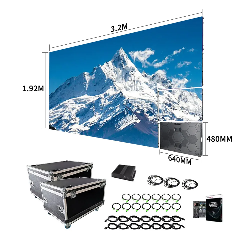
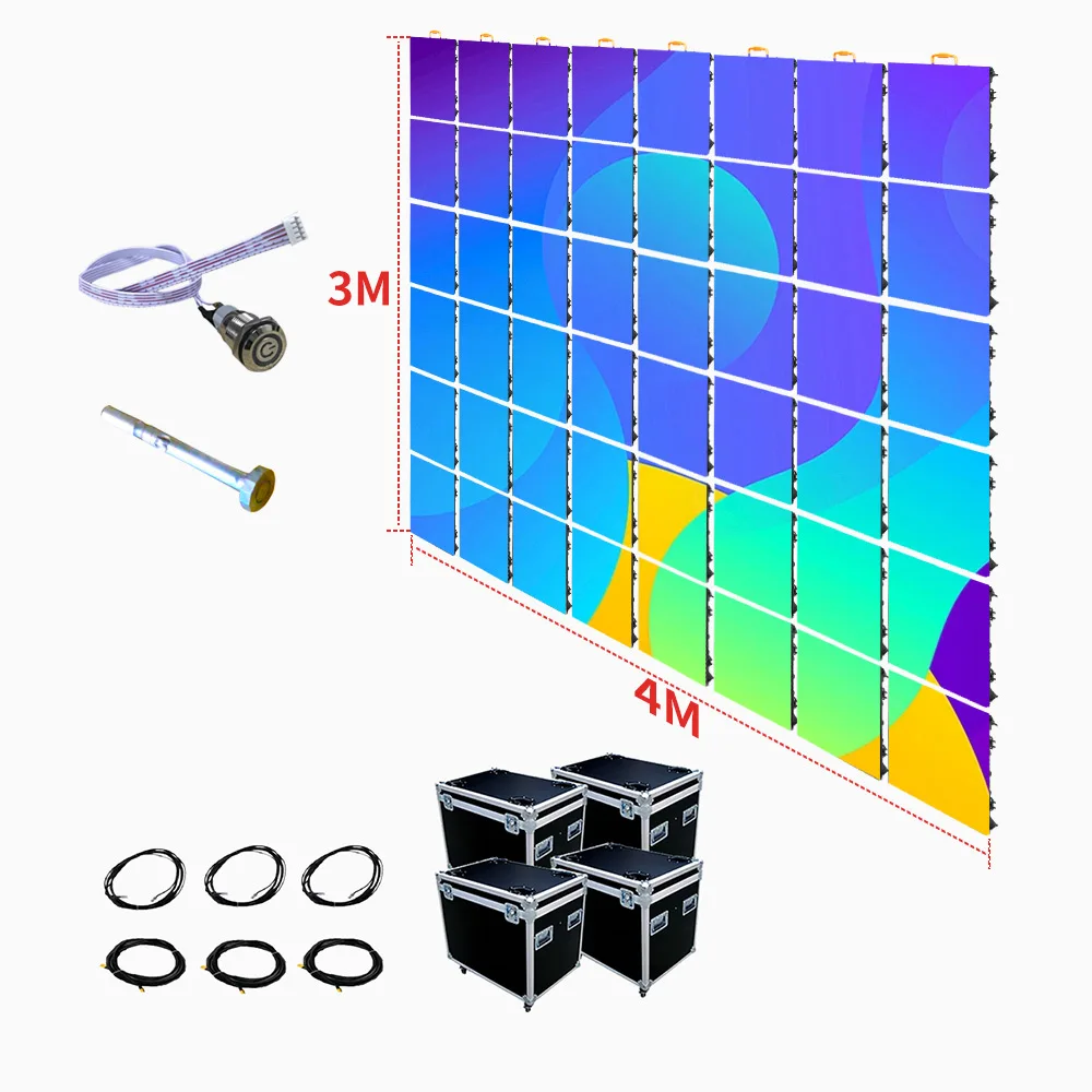
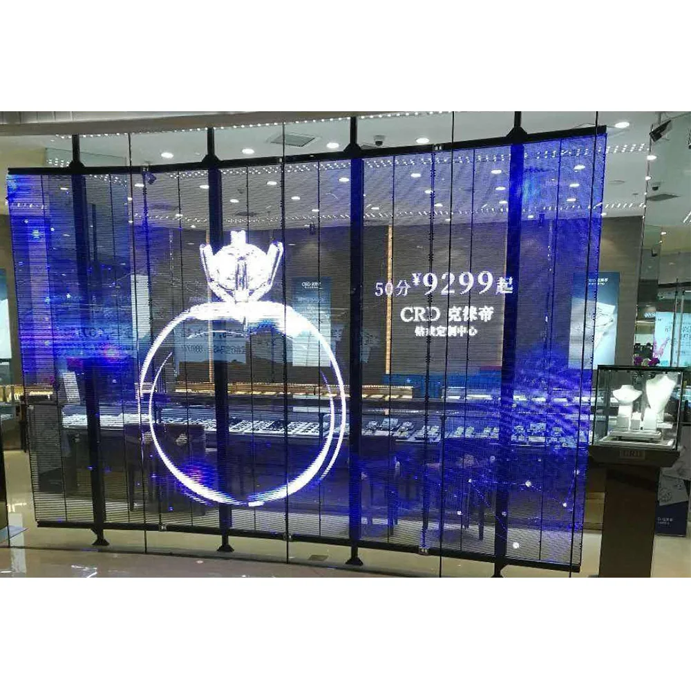
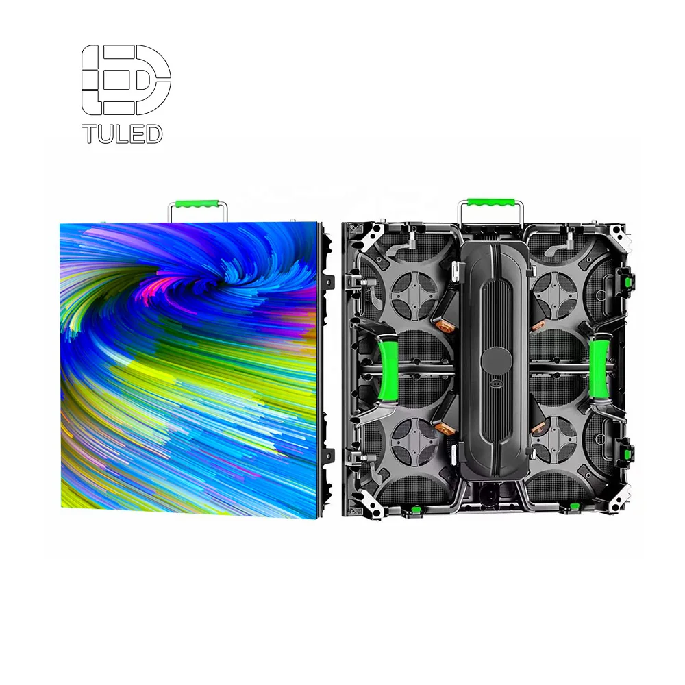
The following images show a verified small-pixel indoor product reference. They do not represent a completed hospital case. Final pitch, cabinet layout, operating profile and controller design should be confirmed against the project drawings and sample test.

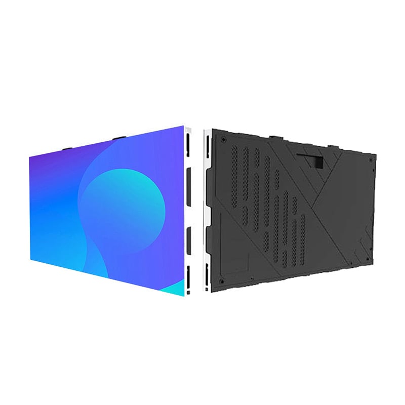
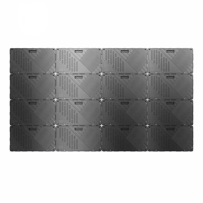 Product reference for close-view indoor projects. Final suitability depends on the approved viewing, maintenance and control requirements. View Product Details
 System Integration
4. Define Queue Interfaces, HIS Boundaries and Publishing Rights
A display cannot support the workflow when system ownership remains unclear. Queue software, appointment platforms, signage software, players, controllers and emergency tools may all touch the same project.
Begin with a data-flow drawing. Name the source of every message and the component that formats it for the screen. This prevents vague claims such as “HIS compatible” from replacing a real interface definition.
Separate Source Systems From Display Control
Queue status may come from a registration platform. Room status may come from a local console. Scheduled notices may come from signage software. Emergency content may come from a restricted command interface.
Those sources should pass through an agreed control layer. Middleware, a media server or signage software can validate fields, apply templates and map events to the correct screen zone.
The exact architecture depends on the supported interface. Some queue systems offer an application programming interface. Others use a database view, file exchange, network stream, video output or dedicated terminal application.
The design should also state where formatting occurs. A source may send raw values that middleware places into a template. Another source may provide a complete rendered output. Those approaches require different testing and maintenance responsibilities.
Queue-to-screen information flow
Treat HIS Access as a Specific Scope
A hospital information system, often shortened to HIS, can cover many functions. It does not describe one universal protocol. Any integration statement should name the exact source, interface, fields, security method and test procedure.
In some projects, the queue platform already receives the required information. The display then connects only to that queue platform. Other projects may use middleware that receives approved fields from several systems.
Public screens should receive only the minimum data needed. Common fields may include queue code, counter, room, department, call time, language and status.
Each field should be marked as required, optional or prohibited. Maximum length, character format and missing-field behaviour should also be documented before template approval.
Match the Update Method to the Message
Scheduled notices can use a content publishing platform. Queue calls normally need an event-driven update. Temporary route changes need a target area, start time, expiry time and responsible role.
Emergency messages need a faster and more restricted path. Preapproved templates reduce editing during an incident. The release process should remain simple enough for trained operators to use under pressure.
Every message type also needs a cancellation rule. Queue calls may expire automatically. Temporary notices may end at a scheduled time. Emergency content may require authorised manual cancellation.
Destination mapping needs version control. When a department or room moves, the system should record who changed the map, when the change occurred and which displays received the new configuration.
System Interface and Permission Checklist
Source system
- System name and deployment version
- Operational owner
- Technical contact role
- Test environment
- Change-control process
Data scope
- Required event types
- Required and prohibited fields
- Maximum field length
- Language encoding
- Missing and duplicate event rules
Interface method
- API, file, database, stream or video output
- Authentication and encryption
- Network segment and firewall path
- Timeout and retry behaviour
- Health check and offline buffer
Display layer
- Middleware or signage platform
- Player and controller roles
- Screen and zone identifiers
- Template versions
- Fallback and restart behaviour
Permissions
- Routine editing role
- Department publishing role
- Emergency release role
- Emergency cancellation role
- Output and restart permissions
Audit and support
- Publish and delivery logs
- Configuration backup
- Fault notification route
- Remote-access approval
- Rollback and escalation method
Define Failure Behaviour Before Testing
A queue feed can fail while the display remains powered. The screen should not show old calls indefinitely. The agreed response may be an offline notice, a timestamp, a fallback page or removal of the queue zone.
The correct response varies by area. A corridor screen can keep static directions. A pharmacy screen may need a clear service message. A central hall may keep wayfinding while removing only the unavailable feed.
Public error messages should remain understandable. Technical error codes can stay in the monitoring interface rather than appearing on the main screen.
Include source loss, middleware failure, blocked network access and player restart in the interface test. The result should state what appears publicly and how normal service resumes.
Operations and Maintenance
5. Plan Quiet Cooling, Long Operating Hours and Cleaning Access
Displays may sit beside consultation rooms, waiting areas or administrative workspaces. Fan noise, airflow turbulence, loose panels and power-supply vibration can become noticeable during quiet periods.
Acoustic planning should begin with the complete installation. Cabinet design, wall cavity, ventilation, room temperature and operating profile all affect the result. A simple fanless label cannot replace that review.
Check Noise Where the Screen Operates
Test noise at nearby seats, workstations and room boundaries. A measurement beside the cabinet alone may miss reflections from walls or ceilings. Recessed structures can also amplify vibration.
Run realistic content during the check. A bright full-field pattern may create a different thermal load from normal queue content. The emergency template should also be included when it uses a larger bright area.
The normal background condition should be recorded. A display that seems quiet during construction may become more noticeable after the building opens and temporary equipment is removed.
A longer operating test can reveal intermittent sounds from cables, locks or frame movement. Those faults may not appear during a short factory demonstration.
Protect Airflow and Service Space
Recessed screens need a defined intake, exhaust path and service opening. Decorative panels should not cover ventilation areas. Warm air should not enter an unplanned sealed cavity.
Nearby air-conditioning outlets should appear on the drawing. Strong direct airflow can create uneven conditions across the screen. Cable bundles should also remain clear of ventilation paths.
Ventilation paths should not direct dust toward nearby seating or sensitive rooms. Intake and exhaust locations should be reviewed together with the architectural finish.
Any filter or removable cover needs an inspection method. The maintenance plan should follow confirmed product instructions rather than a universal cleaning interval.
Design for Practical Maintenance
Front service can help in corridors and flush wall installations. The wall finish must still leave enough room for module removal. Trim, ceiling features and nearby signage should not block the service path.
Rear service may suit a technical room or accessible cavity. That route requires safe access, working clearance and clear isolation points. The architectural and electrical drawings should show these conditions.
Extended operation also needs a restart policy. Some displays may remain active throughout the day. Others may follow a controlled shutdown schedule. The operating method should align with department hours and emergency use.
Maintenance drawing should identify
- Cabinet grid and module labels
- Power-supply and receiving-card positions
- Data routes and port allocations
- Power circuits and isolation points
- Front or rear service direction
- Removal clearance and access-panel size
- Controller, player and spare storage location
Confirm Cleaning Boundaries
Hospital cleaning routines can involve frequent surface care. Not every liquid or disinfecting product suits LED masks, coatings, cabinet finishes or seals. Cleaning instructions must match the selected product.
The handover procedure should state whether power isolation is required, which cloth is suitable and how fluid entry is prevented. It should also define who may open electrical compartments.
Nearby walls may tolerate stronger products than the screen surface. Mark the cleaning boundary clearly. A simple illustrated instruction is often more useful for routine care than a technical cabinet drawing.
Cleaning personnel should also know how to respond to an accidental splash. The procedure should identify the isolation step, reporting route and authorised inspection role.
Prepare Spares and Recovery Files
The spare plan should match the installed bill of materials. Possible items include modules, power units, receiving hardware, data cables and controller components. Quantities and compatibility require project confirmation.
Spare modules should remain traceable to the installed configuration. Calibration data and storage conditions can affect replacement quality. The handover file should describe the replacement and recalibration process.
Digital recovery files are equally important. Keep the controller mapping, templates, output schedules, interface settings and network records in an approved location. Commissioning should include one supervised restore test.
Emergency and Resilience
6. Give Emergency Messages Priority and Test Power Recovery
An emergency message must override routine content in a predictable way. The override may replace one content zone, cover the full canvas, mute queue audio or target only selected areas.
Those behaviours should be documented before software configuration begins. A vague instruction to “show emergencies first” does not define target groups, audio behaviour, cancellation or recovery.
Use a Clear Message Priority Model
Routine information
Service hours, standard directions and scheduled notices.
Operational priority
Queue calls, counter changes, closures and temporary routes.
Urgent instruction
Restricted access and local urgent movement instructions.
Emergency override
Approved full-screen or selected-zone emergency content.
The project may use different names, but it needs an equivalent hierarchy. Equal-level conflicts should also have a rule based on location, message type or release time.
Preapprove Templates and Target Groups
Emergency templates should use fixed fields and approved wording structures. A template may contain an alert type, action line, route, affected area and update time.
Multilingual versions should be prepared before commissioning. A live emergency is not the right time to discover that a translated line no longer fits.
A full-screen template should remove routine queue lists, promotional graphics and decorative motion. Only information required for the urgent action should remain.
Target groups should use clear location names or codes. Similar screen-group names create a risk of sending content to the wrong building or department.
Control Emergency Publishing Rights
A local department role may need access only to nearby screens. A central role may control several buildings. Release rights and cancellation rights should be listed separately.
A confirmation step can reduce accidental release, but too many screens and approvals can slow action. Supervised drills should test the balance between control and speed.
The publishing interface should display the chosen target group clearly before release. A location hierarchy or verified group code can reduce selection errors.
Where the platform supports logs, record the role, template, target group, release time and cancellation. The same records can support later exercise reviews.
Coordinate Visual and Audio Priority
Visual override does not always require audio in every area. A large entrance hall may need an audible prompt. A quiet clinic may require another approach. Audio should follow approved zones and volume ranges.
Queue tones should not compete with emergency audio. During an override, routine calls may need to pause. Once the message is cleared, the system should return to the current state without replaying expired calls.
Test the selected speakers, tone clarity, speech intelligibility, delay, mute action and restoration. Use representative background conditions where practical.
Define Power-Loss and Restart Behaviour
Backup operation depends on the electrical design. The project should identify whether the screen, controller, player, network equipment and audio system use normal power, emergency circuits, an uninterruptible power supply or generator-backed supply.
No backup duration should be assumed. The required outcome should be defined first. Electrical load and runtime can then be checked against the selected equipment.
Restart behaviour needs equal attention. The screen should not return with a test pattern, maximum output, stale queue calls or an old emergency page. The approved map, profile and source connection should return in a controlled sequence.
Network devices, players and controllers may restart at different speeds. A local fallback page can cover the temporary gap. Public screens should not expose raw technical error messages.
Emergency and Recovery Test Matrix
| Scenario | Visual Result | Audio Result | Recovery Evidence |
|---|---|---|---|
| Routine queue call | Queue zone updates without covering essential directions | Local call audio follows the approved zone rule | Call and visible update are recorded where supported |
| Temporary route closure | Affected screens show the approved alternative route | Local prompt appears only when approved | Expiry or cancellation restores the normal page |
| Emergency override | Selected screens replace routine content with the approved template | Emergency audio follows the zone plan and routine audio pauses | Release, target and cancellation records are checked |
| Queue interface loss | The queue area shows an approved offline or fallback state | Old queue audio stops | Reconnection clears stale data and resumes current calls |
| Controller restart | Correct mapping, content and output profile return | No unintended tone or announcement occurs | Configuration and source connection recover correctly |
| Sudden power loss | Shutdown and backup behaviour follow the electrical scope | Audio follows the approved backup design | Restoration returns the current approved operating state |
Commissioning and Procurement
7. Accept the Project With Real Text, Events, Audio and Recovery Tests
A vivid video demonstration does not prove that a queue and wayfinding system works. Final approval should use real destination names, queue formats, interface events, audio zones and emergency templates.
Divide acceptance into document review, visual checks, integrated system tests and recovery tests. Each failed item should have an owner, correction date and defined retest.
Review the Handover File Before Live Testing
Missing drawings and backups can turn a small fault into a long interruption. The document set should match the final installed configuration, not an earlier design revision.
Complete Project Acceptance Checklist
Text and layout
- Queue codes are readable from all approved positions.
- Long destination names fit without clipping.
- Arrows match the correct route.
- Required languages display correctly.
- Active calls remain visually dominant.
- No unapproved field appears publicly.
Colour and comfort
- Daytime content remains readable.
- Evening output remains comfortable.
- White text keeps clear edges.
- Gray text remains distinct.
- Warning colours differ from routine colours.
- Restart restores the correct operating profile.
Sound and noise
- Queue audio reaches the intended area.
- Volume remains clear without unnecessary disturbance.
- Emergency audio has defined priority.
- Routine audio pauses during override.
- Cancellation restores the correct state.
- No unacceptable cabinet or fan noise remains.
System integration
- Every test event reaches the correct screen zone.
- Room and counter mapping are correct.
- Update timing meets the approved requirement.
- Duplicate and cancelled calls follow defined rules.
- Offline conditions remove misleading data.
- Publishing permissions match the approved matrix.
Emergency switching
- The correct role can trigger the correct group.
- Urgent content replaces routine content as designed.
- Queue updates cannot cover the emergency page.
- Audio follows the approved zone plan.
- Cancellation returns the correct prior state.
- A supervised drill confirms the full workflow.
Power and recovery
- Power loss follows the approved backup scope.
- The restart sequence works correctly.
- Screen mapping remains unchanged.
- Queue integration reconnects without stale calls.
- Emergency persistence follows the agreed rule.
- Recovery files can be restored by an authorised role.
Run End-to-End Operational Scripts
Begin with a real queue action from the approved terminal. Confirm the destination screen, content zone, text, audio and update time. Then cancel or expire the event and check the final state.
Change a room mapping and confirm that every related screen updates. Unrelated departments should remain unchanged. Publish a temporary closure with an expiry time and verify automatic removal.
Use an approved drill for emergency testing. Check target selection, template priority, audio priority, cancellation and return to normal operation. Follow the drill with a controlled network or power interruption.
Record the expected result, actual result, evidence, defect level, responsible function and retest date. A photograph alone cannot prove interface timing, permission control or recovery.
Rank Defects by Operational Effect
A minor colour difference and an incorrect room map do not have the same consequence. Critical items may include unsafe mounting, exposed private data, failed emergency switching or uncontrolled publishing rights.
Major items can include unreadable queue text, disruptive noise, incorrect destination mapping or blocked maintenance access. Cosmetic issues can follow an agreed correction plan when they do not affect operation.
Every retest should repeat the failed step. A general product demonstration does not confirm that a specific integration or recovery defect has been corrected.
Prepare the Quotation and Procurement Data Pack
A useful quotation request should contain more than screen width and height. It should explain what the display must show, where the information originates and how the system will be maintained.
The package should include floor plans, elevation drawings, viewing positions, proposed mounting height, nearby services, operating hours, content examples and source-system details.
The interface section should name the queue platform, available documentation, test environment, required fields and expected event flow. Where those details are not yet available, the quotation should identify the integration allowance separately.
The acceptance section should state who provides the test events, who approves the templates and who signs off the audio, power and recovery results. This creates a clearer boundary between display supply, integration work and hospital-side approvals.
Project FAQ
Frequently Asked Questions
What information should a hospital information screen show?
The content should match the location. Registration areas need queue codes, counter numbers and service states. Waiting areas need active and recent calls. Corridors need destinations and arrows. Large halls may combine orientation, service changes and urgent instructions. Every public template should exclude unapproved private fields.
How large should queue numbers and supporting text be?
Character size should come from the closest and farthest useful viewing positions. Mounting height, side angle, movement speed and obstructions also matter. A full-scale test should use the real queue format, longest department name and required languages before the layout is approved.
Can an LED information display connect to a hospital queue system?
Integration may be possible when the exact queue platform provides a supported output or documented interface. The project must confirm authentication, fields, event timing, destination mapping, failure behaviour and test access. Compatibility should not be assumed from a general product description.
How should emergency messages override normal content?
The control system should use a documented priority model. An approved template can replace a selected zone or the full screen. Queue audio may pause while emergency audio activates in approved areas. Release rights, target groups, cancellation and recovery should be tested in a supervised drill.
Project Handoff
Turn the Requirements Into a Testable Display Plan
A hospital led display board should be approved as part of the queue, wayfinding, audio, power and recovery workflow. Panel dimensions alone cannot confirm that the complete information system will work.
Send department layout, viewing distance and queue-system interface needs for a display plan. Include proposed dimensions, mounting environment, content sources, audio requirements and expected operating hours.