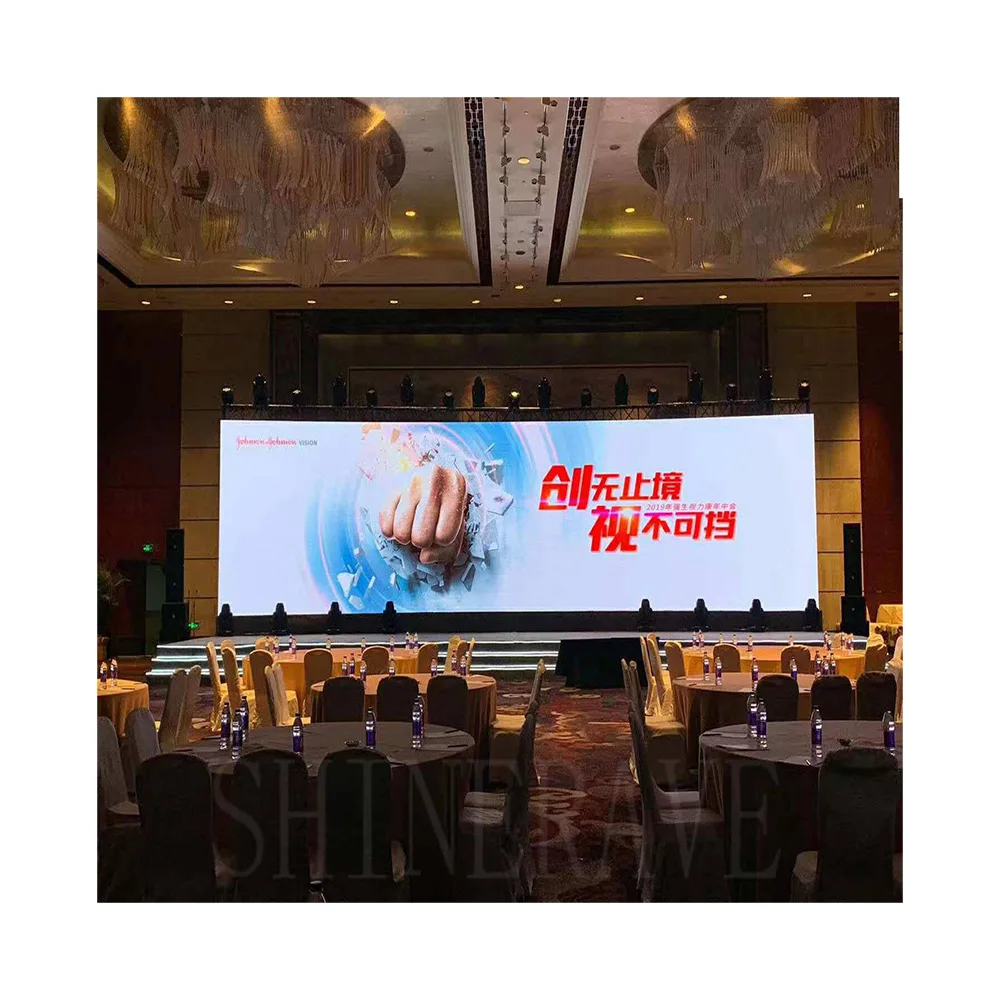
A store sign usually gets judged before anyone asks about specifications. In real projects, the questions are much more immediate: will it fit the fascia cleanly, will it still read through front glass at noon, and can it be serviced without turning a tidy storefront into a construction zone? That is why store LED projects are rarely about the screen alone. They are about the storefront, the lighting condition, and the installation path from the beginning. For teams comparing wholesale LED sign options, the useful decision is not “which screen is best” in general. It is “which screen fits this store layout best.” That kind of decision gets easier when the options are separated by actual store use, not just by screen specifications.
Most retail projects also need a tighter selection logic than general LED jobs. A street-facing entrance, a mall unit, a glass storefront, and an indoor campaign zone do not ask for the same thing. Some need visibility from across the road. Some need cleaner detail from a short distance. Some need the display to stay visually light so the architecture still works. That is why the product direction becomes much clearer once the store setting is clear: indoor LED display for close-view interiors, outdoor LED display for exposed storefronts, LED poster display for flexible campaign positions, and transparent LED display for glass-front concepts.
Start with the storefront, not the screen
The easiest way to get a store sign wrong is to choose the screen first and study the frontage later. On paper, a larger display can look like the safer option. On the building, it can crowd the door, break the façade rhythm, or leave no clean space for trim and service. A better first move is simpler: measure the visible fascia, note the door and glass positions, and decide where the message needs to be read from first.
For a street-facing entrance, width usually matters more than height. A sign above the door is read in passing, often from an angle, so it needs a clear horizontal presence without swallowing the whole frontage. In a mall corridor, the same idea shifts a little. Viewing distance is shorter, foot traffic slows down, and the display can carry more detail, but it still needs to sit comfortably within the storefront lines.
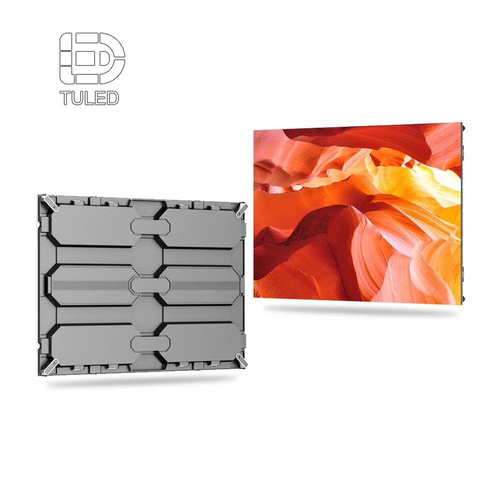
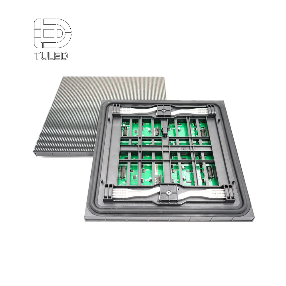
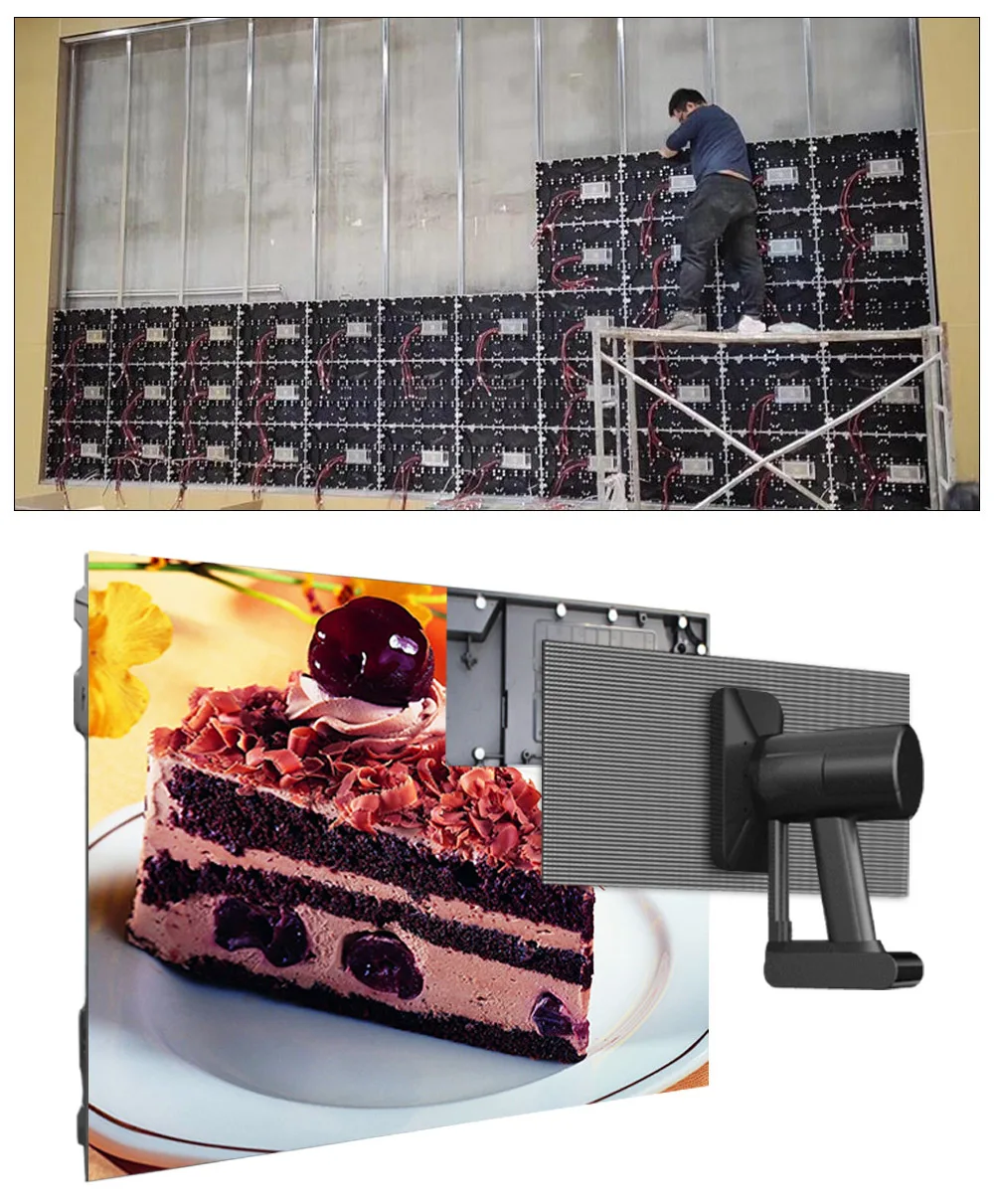
Another practical point is cabinet logic. LED screens are built from modules and cabinet sizes, not from unlimited custom proportions. So even when the storefront opening is unusual, it often makes sense to adjust the final display size toward a standard cabinet format. That modular approach usually leads to cleaner seams, easier installation, and simpler future replacement.
Store sign size is not just a square-meter decision. It is mainly a question of reading distance, frontage balance, and message density. A compact sign can work very well when the content is clean and the position is right, while a larger sign can still underperform if it feels oversized for the façade or tries to carry too much information.
Brightness also needs to be judged by the actual light condition, not by one number alone. A screen placed deep inside the store usually needs a different approach from one sitting behind glass or fully exposed to daylight. In store projects, the useful distinction is often not simply bright or dim, but interior, window-facing, or exterior.
Common store layouts and the screen setups that usually fit them
Some store layouts point to a sensible screen setup much faster than others. Once the frontage type is clear, the shortlist usually gets much smaller.
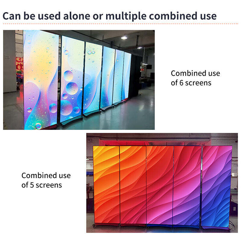
A small street-facing store usually works best with one compact outdoor LED display above the entrance, especially when the fascia is narrow and the job is mainly to catch passing traffic. In this kind of layout, the sign needs to be readable from the street without making the storefront feel crowded. If the store also runs frequent launches or short promotions, a small interior screen or LED poster display near the entrance can support campaign content without forcing the exterior sign to do every job at once.
A glass-front boutique usually needs a lighter touch. If the window is part of the visual identity, a transparent LED display on the glass line is often the better fit because it keeps the frontage open while still giving the store a moving visual layer. Inside, a compact indoor LED display can carry sharper brand content, lookbooks, or launch visuals once people step into the space. That pairing tends to work better than placing one solid screen behind the window and hoping it solves both visibility and presentation.
A mall unit or promo-heavy store usually benefits from flexibility more than from one permanent statement wall. In that setting, LED poster display often makes the most sense near the entrance, beside hero products, or along the traffic edge of the unit. It is a cleaner match for seasonal promotions, short campaign cycles, and frequent merchandising changes. If the store also wants a more stable brand backdrop deeper inside, a compact indoor LED display can handle that role while the poster stays focused on traffic-facing promotions.
Mounting is where the project becomes real
A store sign always looks easy in a render. The real questions start when someone asks how it is actually going to be fixed, wired, and serviced.
Wall mounting is the most common choice for store façades and interior feature walls. It keeps the display visually connected to the architecture and usually gives the cleanest result. For entrance signs and built-in interior walls, it is often the first option worth testing. The trade-off is access. If the screen sits tight to the wall, maintenance has to be planned from the front and cable routing has to stay neat. In retail installations, that often makes front service a practical requirement rather than a nice extra.
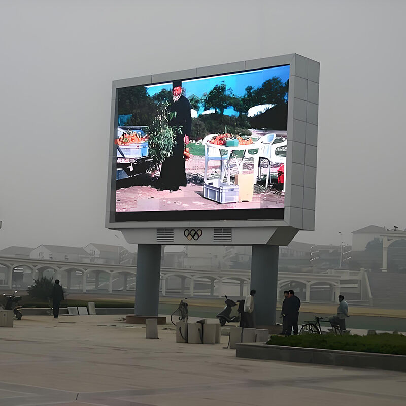
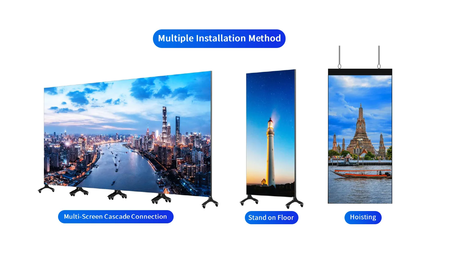
Single-pole mounting is less common for a compact shopfront, but it does make sense for roadside entries, setback stores, and parking-lot approaches. It creates earlier visibility when the building itself is not seen soon enough from the road. Double-pole mounting suits wider freestanding signs and larger site entries where the screen needs more width or more structural balance. In both cases, the support system becomes part of the project from day one.
When one screen is enough and when two screens work better
Not every store needs a multi-screen package. In many smaller projects, one screen is enough when the layout is simple and the message has one clear job. A compact street shop with limited fascia space, a single entrance, and a straightforward need for visibility can often do the job well with one outdoor LED display. The same goes for a small interior retail unit where the main goal is one close-view brand wall; in that case, one indoor LED display may be all the store really needs.
Two screens tend to work better when the store is trying to do two different jobs at once. A common example is exterior traffic capture plus interior campaign storytelling. In that case, an exterior sign gets attention from outside, while a second interior screen handles richer content once people are already at the door or inside the store. That split usually feels cleaner than asking one screen to serve both long-distance visibility and close-range product messaging.
A two-screen setup also makes sense when the store has a strong glass frontage. One transparent LED display can work at the window line without blocking the storefront, while an indoor LED display or feature screen handles more detailed visuals inside. In this situation, the pairing is not about adding more hardware for the sake of it. It is about giving each screen a clear role.
There is also a third case worth separating: when a buyer is deciding between a fixed wall screen and a poster. A poster is usually more sensible than a fixed wall screen when the campaign area changes often, the merchandising plan moves with the season, or the store is in a mall environment where flexibility matters more than permanence. A fixed wall screen makes more sense when the content position is stable and the store wants that display to become part of the interior architecture. If the content zone may move in six months, LED poster display is often the safer decision.
What often gets missed before installation
This is where many decent projects get messy. Depth clearance gets underestimated. The wall structure is not checked early enough. Power and data routes are treated like something that can be solved later. Service access is assumed instead of confirmed. None of these points are dramatic on their own, but together they can turn a clean store sign into a frustrating install.
Glass projects need one more layer of care. It is not just about whether the screen can physically sit behind the window. The team also needs to look at reflections, direct sun, visible cabling, and how the display reads from both outside and inside the store. A clean mockup on its own does not answer those questions.
For exterior signs, the easy mistake is focusing only on visibility and forgetting how the sign will actually be maintained. For interior projects, it is often the opposite: the display looks refined, but no one has really planned service clearance. That is why front service keeps coming up in retail applications. It is not a buzzword here. It is often the difference between a screen that fits the store and one that complicates it.
Maintenance should influence the buying decision
A store sign is easy to approve when it is shown as a finished visual. The harder question comes later: what happens when a module needs service, opening hours are tight, and there is no rear access behind the façade?
Front service matters more in store projects than many buyers expect. If the screen is integrated into a neat wall opening, mounted tightly to the façade, or placed where rear clearance is limited, service access from the front can save a great deal of trouble later. In many store projects, front service is not a bonus feature. It is part of what makes the installation workable over time.
A second maintenance point is standardization. A sign built around common cabinet families is usually easier to support later than a one-off shape with awkward proportions. That does not mean every project should look generic. It just means repeatable structure tends to help, especially for multi-store rollouts. That kind of packaged planning becomes much easier when the product direction is already separated by store condition, viewing distance, and installation logic.
What to compare before asking for a quote
A better inquiry usually leads to a better recommendation. For store signage, the most useful input is not a long wish list. It is a short site package: frontage photos, sign location, maximum width and height, whether the screen is indoors or outdoors, whether it sits behind glass, and what kind of mounting is possible. Add one note on service access and the conversation becomes much more grounded.
It also helps to compare suppliers by how clearly they connect product type to installation reality. A good store-sign discussion should move naturally from storefront scene to product family to mounting detail, without turning into a pile of disconnected specifications. For a practical next step, review the relevant category first, then send frontage photos, mounting limits, and use conditions through the contact page.
A useful buyer-side shortcut is to prepare just a few things before sending the inquiry: one front photo, one side-angle photo, the rough sign area, whether the screen is fully outside or behind glass, and whether the content is mostly branding, promotions, or product storytelling. That small package usually does more for quotation quality than a long message asking only for screen size and price.
Final takeaway
A good store LED project usually comes down to a few practical choices. Match the screen to the storefront condition early. Separate indoor, behind-glass, and fully exposed use before comparing formats. Decide whether the store needs one clear screen role or two different screen roles. Once those choices are clear, the product direction becomes much easier to judge.
For a practical next step, review the relevant category first, then prepare frontage photos, mounting limits, and use conditions before asking for a quote. That usually leads to a much more useful quote than starting with screen size alone. For repeat projects or chain-store layouts, it also helps to keep screen role, service direction, and layout logic consistent from one store to the next.
FAQs
What size LED sign is usually right for a store entrance?
The best size is usually set by the fascia width, the doorway position, and the main approach distance. A sign should read clearly without filling the entire frontage edge to edge. In most cases, a well-proportioned horizontal format works better than an oversized block that crowds the entrance. The final size should still follow the site condition and cabinet layout.
How should brightness be judged for a screen behind the shop window?
A screen behind glass should be judged as a window-facing display, not as a deep interior screen. Daylight and reflection can reduce visibility very quickly. If the storefront depends on open glazing, a transparent LED display is often the most practical format to compare first because it keeps the window lighter while still carrying content.
When is LED poster display a better choice than a fixed screen?
It is usually the better fit for campaign corners, seasonal promotions, mall corridors, and launch positions that may change over time. That is why LED poster display usually fits retail promotions, mall environments, and other store scenes where the content position may change over time.
Is front service important for store projects?
In many cases, yes. It matters most when the display is mounted close to a wall, integrated into a façade opening, or installed where rear access is limited. That makes front service a practical project decision rather than a minor technical extra.
What information should be prepared before sending an inquiry?
The most useful basics are frontage photos, sign location, indoor or outdoor use, whether the display is behind glass, approximate width and height limits, and the preferred mounting method. Sending those details with the inquiry gives a much better starting point than asking for a generic price without the store context.