The strongest indoor LED projects are rarely remembered because a specification sheet looked impressive. They are remembered because the wall made the room feel clearer, more current, and easier to use. In a boardroom, that usually means quiet authority. In a lobby, it means scale and atmosphere. In a showroom, it means product storytelling that feels deliberate rather than noisy. And in a training or control-style space, it means long-session clarity that does not turn into visual fatigue.
This guide takes that room-first view. Instead of treating pixel pitch like an isolated number, it connects indoor LED choices to the kinds of spaces people actually build and use. The goal is not to turn the article into a technical manual. The goal is to help teams judge what kind of wall will feel right in a real interior, with real furniture, real lighting, real sight lines, and real content that changes through the day. That shift in perspective often makes selection easier, because the right answer usually becomes visible once the room is described honestly.
It also improves the buying process. A better indoor brief leads to better quotations, cleaner comparisons, and fewer surprises after installation. When the room comes first, it becomes easier to decide whether the space needs refinement, flexibility, or architectural scale. It also becomes easier to decide whether the stronger move is a finer surface, a larger wall, a cleaner cabinet format, or a more service-friendly fixed-install approach.
Why indoor LED should start with the room, not with the spec sheet
An indoor LED wall is always judged together with the interior around it. That simple fact explains why some walls feel premium and others feel strangely out of place even when the paper specification seems similar. The screen is seen beside stone, timber, glass, carpet, ceiling lights, conference tables, soft seating, and people who may look toward it for only seconds or for several hours. Because of that, indoor planning should begin with the role the wall plays in the room. Is it there to support decision-making? Is it there to shape first impression? Is it there to guide, explain, train, or monitor? Those answers matter more than many comparison sheets suggest.
A boardroom wall usually lives close to people and close to decision-making. It needs to feel steady. A lobby wall often lives at a greater distance and inside a larger volume, so it needs visual presence first. A showroom wall often has to support products, materials, or brand imagery nearby, so it needs visual control rather than raw intensity. A training wall must stay comfortable over time. A control-style wall must reduce visual friction in a space that is already information-heavy. Once those roles are described clearly, the selection path becomes easier and the discussion becomes more useful.
This room-first approach also improves station-to-station communication inside a project. Procurement can compare quotations more accurately. Engineering can freeze structure and service mode earlier. Marketing can decide how the screen should support content rather than simply fill a wall. Interior teams can treat the wall as part of the finished space instead of a late-stage addition. In short, better early judgment often saves more time than any minor product adjustment made later.
Rooms that need refinement
Boardrooms, executive briefing spaces, and close-view collaboration rooms usually need a surface that feels smooth, calm, and reliable during long sessions.
Rooms that need balance
Conference rooms, training rooms, and flexible multi-use interiors often benefit most from a display that handles many content styles without becoming tiring.
Rooms that need scale
Lobbies, showrooms, and public interiors usually gain more from proportion and presence than from pushing density beyond what the space will actually reveal.
Another advantage of this approach is that it brings “judgment” back into the process. Readers and project teams do not only want to know which pitch is smaller. They want to know what that choice will actually do in a room. Will the screen feel sharp in a good way or sharp in a harsh way? Will a broader pitch make the wall feel less premium, or will it simply make the space more balanced? Will the room benefit more from a larger visual canvas than from a denser one? Those are the questions people actually care about once the conversation becomes practical.
What pixel pitch actually feels like in an indoor space
Pixel pitch is usually introduced as a technical measurement. Indoors, however, it is often felt before it is understood. People notice whether the image feels smooth or slightly textured. They notice whether text looks calm or a little brittle. They notice whether a face on a video call looks natural and easy to read. They notice whether motion graphics feel like part of the wall or like a bright digital layer placed on top of it. That is why it helps to talk about pitch in terms of visual texture rather than only numbers.
A finer surface usually creates a more unified image at shorter viewing distances. It suits spaces where people sit close, where smaller content appears often, and where the wall is expected to feel premium under prolonged attention. That is why finer-pitch indoor products are often considered for executive interiors, detail-heavy presentation spaces, and close-view information environments. The surface feels more settled. Small graphical elements hold together more cleanly. The room feels more finished.
A broader surface changes the reading experience in a different way. It asks the room for more distance, but it also makes budget available for more visible screen area, stronger spatial impact, or a simpler overall installation strategy. In a larger lobby, for example, a broader pitch can be the smarter decision if it allows the wall to grow and better match the scale of the entrance. In a public-facing brand space, the wall may be judged first by size, composition, and visual confidence long before anybody notices that the density is slightly different.
This is why the question should not be “Which pitch is best?” The better question is “What kind of visual feeling does this room need, and from what distance?” Some interiors need a screen that behaves like a polished working surface. Others need a screen that acts more like digital architecture. Others need flexibility because the content changes constantly. The correct pitch is the one that supports the room’s real behavior, not the one that wins a generic comparison.
Usually a strong fit
- People sit close to the wall.
- Small text or detailed interfaces appear often.
- The space should feel refined and quietly premium.
- Long-session visual comfort matters more than short demo impact.
Usually a different strategy
- Most viewers see the wall from farther away.
- The screen mainly shows visual storytelling or welcome content.
- The room benefits more from wall area than from extra density.
- Scale and atmosphere are more important than tiny detail.
Thinking this way also keeps teams from overspending on the wrong kind of improvement. A finer pitch is not automatically a better project if the room would gain more value from a larger wall, cleaner proportions, better service access, or stronger content design. Indoor LED works best when all those pieces move together. Once the wall is judged as part of a complete room, the best decision is often more balanced than the most aggressive product comparison suggests.
The boardroom: refined, quiet, and easy to trust
A boardroom is one of the easiest places to see the difference between a screen that merely works and a screen that truly belongs. This is not a room where people usually stand back and admire visual spectacle. Instead, they talk, decide, present, listen, share documents, and read each other’s reactions. The wall sits at the center of attention but cannot dominate the room. If it feels too aggressive, the room becomes harder to live with. If it feels too coarse, the room loses some of its sense of polish. So the right boardroom wall is almost always one that feels composed.
In practice, that usually means the screen should be easy to read without looking harsh. Slide decks should look stable. Shared desktop content should not feel fragile. Remote speakers should look natural enough that the wall supports communication rather than complicates it. This is where a more refined indoor surface often proves its value. The wall feels more like a calm working surface and less like a bright digital panel inserted into the space.
However, the strongest boardroom choice is not always the most extreme fine-pitch option. Some rooms are compact and regularly show detailed material, which clearly benefits from a tighter visual surface. Other rooms are deeper, rely more on presentation graphics than small text, and would gain more from a balanced solution that keeps the room comfortable over time. The room’s actual behavior should decide the wall, not the prestige of a number.
Open related product page
The emotional side of this decision matters more than most indoor guides admit. A boardroom should feel orderly. It should feel like a place where information is clear and where people can focus without fighting the environment. That is why a boardroom display should be judged by the tone it sets in the room, not only by a data table. A wall that makes the room feel clearer and calmer usually creates more long-term value than a wall that is simply able to claim a stronger specification.
Another useful judgment point is how the wall interacts with furniture and finishes. Dark timber, metal detailing, stone surfaces, glass partitions, and indirect lighting can either be supported or undermined by the wrong display character. A calm, more refined surface usually strengthens these interiors. An overly intense wall can make even a premium room feel less resolved. So if the boardroom is meant to communicate confidence and maturity, the best screen is often the one that feels integrated rather than attention-seeking.
For this kind of room, the most helpful internal starting points are the current Indoor LED Display range and the more meeting-focused LED Screen for Conference Room page. Together, they help separate premium close-view direction from broader indoor fixed-install options.
The conference room: flexible, readable, and calm through the day
Conference rooms rarely use the wall for only one thing. A room that begins the day with an internal review may move into a video call, then a training session, then a visiting presentation. That changing pattern is exactly why many conference-room choices fail when they are judged too narrowly. If the wall is chosen only for one kind of content, the room may feel excellent in one moment and ordinary in all the others. The stronger decision is usually the one that stays balanced.
A good conference-room wall should feel flexible. It should hold presentations cleanly, support shared desktop content, look stable on camera, and stay comfortable in normal working light. That combination often matters more than maximum image intensity. In real indoor use, people care less about how spectacular the wall looks in a short demo than how smoothly it handles ordinary work on an ordinary afternoon. That is why many successful conference-room projects live in the balanced middle of the indoor market rather than at its extremes.
This also changes how the room itself feels. A well-matched conference wall makes meetings look more organized. Slides feel easier to follow. Shared content stops feeling like a compromise. Hybrid calls look more deliberate. The room gains confidence without losing calm. That is why a sensible pitch and a clean cabinet strategy usually matter more here than trying to squeeze every possible performance headline into the same wall.

View conference-room page
Another reason the conference room deserves its own judgment is that installation practicality matters more than it first appears. A wall that looks simple in a brochure can become awkward if it sits against a finished structural surface and requires more rear access than the room actually allows. So the “right” screen is not only about what appears on the front face. It is also about how cleanly the system fits the space and how quietly it can be maintained later. This is where front-service thinking and cabinet proportion become part of the user experience even though they are not visible in daily use.
The most helpful question in a conference-room project is usually this: will the display still feel comfortable, reliable, and easy to read when the content changes three times in one day? If the answer is yes, the room is moving in the right direction. If the wall only looks strong in one narrow scenario, the room is probably being asked to adapt to the screen rather than the other way around.
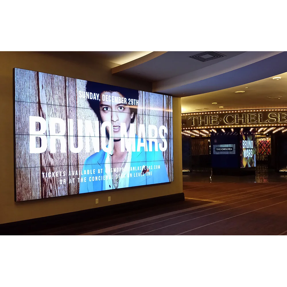
The lobby: scale, atmosphere, and first impression
A lobby wall plays by different rules. People usually see it while moving. They approach from changing angles. They read the room before they read the content. For that reason, a lobby screen is judged first by presence, proportion, and atmosphere. It needs to support the architecture and strengthen the arrival experience. A screen that would feel ideal in a boardroom can feel too careful or too small in a large lobby. A wall that feels exactly right in a reception volume may look far too strong for a meeting space. The room decides the answer.
In many lobby projects, the most meaningful improvement is not the finest possible density. It is the right amount of wall area. A larger visual surface often gives the entrance more confidence. It can anchor a reception zone, provide a cleaner brand moment, and make the architecture feel more deliberate. When people mostly see the wall from several meters away, they usually respond first to scale, clean motion, color control, and overall visual confidence. That is why broader indoor solutions can sometimes create the more premium result in public spaces.
At the same time, a lobby wall still needs discipline. It should not feel like a giant monitor placed in a circulation space. The strongest lobby displays behave more like digital architecture. They work well with slower content pacing, cleaner compositions, welcome content, brand campaigns, and broad storytelling. They create mood without turning the entrance into visual clutter. That kind of confidence often matters more than raw detail.

See indoor installation examples
This is also why lobby LED should be judged in relation to dwell time. If most viewers are passing through, the wall must communicate quickly and cleanly. If the space includes waiting zones, the content can support a slower rhythm. In both cases, the wall should make the room feel more memorable within seconds while still looking like it belongs there when the content pauses. A good lobby display supports the building’s identity. It does not feel like a separate media object competing with it.
For teams planning this kind of interior, it often helps to compare the category-level Indoor LED Display range with the broader use-case framing on the LED Video Wall application page. That comparison helps decide whether the space is being treated as a working wall, a branding wall, or a hybrid of the two.
The showroom: texture, product storytelling, and controlled impact
Showrooms ask more from an LED wall than simple visibility. The screen has to support the product story around it. Sometimes that means adding movement and atmosphere behind a hero item. Sometimes it means carrying texture, lifestyle footage, or branded content beside physical samples. In either case, the wall cannot simply be bright. It needs visual discipline. If it feels too harsh, it can make the whole space feel cheaper. If it feels too weak, the room loses energy. That is why showroom LED is often closer to set design than to standard display planning.
The best showroom walls usually feel edited. They leave room around the message. They support pacing instead of chasing constant motion. They let the product stay at the center while the LED wall deepens the atmosphere. This is where content style matters as much as hardware choice. A well-matched showroom wall can make the brand feel more confident. A mismatched wall can turn a sophisticated interior into a noisy one.
This is also where teams need to judge distance honestly. If viewers are expected to approach the wall closely, a more refined indoor surface may help the content hold together and feel more premium. If the wall works mainly as a backdrop to the broader room, then the better choice may be a larger canvas that supports scale and immersion. In other words, the screen should be selected for the way the room tells its story, not only for how sharp an image looks in isolation.

Open related indoor installation page
A useful showroom test is straightforward: does the wall make the physical product story feel stronger, or does it distract from it? If the screen behaves like a stage for the product, the installation is moving in the right direction. If the screen becomes the only thing people remember, the balance may be off. Strong showroom LED is not passive, but it is disciplined. It knows when to support and when to lead.
That makes the showroom one of the most interesting indoor environments for pixel-pitch judgment. A refined surface can add polish, especially when close-up detail matters. A larger wall can add atmosphere and confidence when the room wants immersion. Neither route is universally better. The answer depends on what the room is trying to make people feel.
The training space: long-session clarity matters more than short-term wow factor
Training rooms reveal display quality more honestly than many glamorous spaces do. People spend longer periods looking at the wall. They compare layouts. They watch walkthroughs. They follow text, diagrams, shared software views, and presentation decks for extended sessions. Because of that, comfort matters deeply here. A wall that feels exciting for five minutes can become tiring after an hour. This is why training spaces often benefit from balanced indoor choices rather than extreme ones.
A good training-room wall should feel dependable. It should keep content readable, but it should also keep the room calm. That balance changes the whole learning experience. When the image feels settled, people focus on the material instead of subconsciously adjusting to the display. When the wall feels overly intense, even perfectly visible content can become harder to live with over time. So the stronger choice is usually the one that supports attention rather than trying to impress it.
This is also where indoor LED often outperforms older expectations associated with projection. The room does not need to lose energy in order for the content to be seen. Training can happen in a real working environment rather than in a dimmed compromise. That shift is one reason indoor LED has become more attractive in corporate learning, workshop spaces, and hybrid meeting-training rooms. The screen improves not only image quality but also how the room can be used throughout the day.
Another reason training rooms deserve a separate judgment is that flexibility matters. These spaces may alternate between instructor-led use, collaborative use, guest presentations, and remote sessions. The best screen is therefore the one that remains easy to use, easy to read, and architecturally quiet across all those conditions. It does not need to prove itself in one dramatic moment. It needs to keep working well, day after day, without becoming a source of visual fatigue.
If the room will be used for long workshops, recurring internal education, or mixed presentation styles, a balanced indoor direction from the Indoor LED Display category is often a practical starting point. That page makes it easier to compare more standard indoor fixed-install options against finer close-view directions before the brief becomes too narrow.
The control-style space: when precision becomes a form of comfort
Some indoor spaces are less about atmosphere and more about sustained visual work. In these rooms, the wall behaves more like a working surface than a feature display. Dashboards, maps, timelines, windows, monitoring feeds, and data layers may remain in view for long periods. Small changes matter. Small labels matter. Long-session comfort matters even more. That is why control-style rooms often reveal the value of a more refined indoor surface more clearly than other environments do.
In a room like this, the real benefit of a cleaner visual surface is not prestige. It is reduced effort. When the image holds together more smoothly, people do not need to fight it. The wall becomes easier to read at a glance. The room feels calmer even though the information load may be heavy. This kind of comfort is easy to underestimate in early planning because it does not always show up in a flashy way. However, it matters every hour the room is in use.
That is why the right control-style wall often feels less like a presentation screen and more like a stable visual instrument. It supports work. It reduces friction. It stays consistent in a room where the wall is not a background detail but part of the operational environment. This is exactly where finer-pitch thinking earns its place, not because it sounds advanced, but because it can make real information work easier and less tiring over time.

Open indoor command-style examples
It also helps to judge these rooms by working rhythm rather than by room label. Not every operations room needs the same solution. Some are watched continuously. Others are used more intermittently. Some rely on small interface details. Others use larger status windows and broader visuals. The best decision comes from describing that real pattern first, then matching the wall to it. When the planning starts from actual viewing behavior, the line between “necessary refinement” and “unnecessary overspecification” becomes much clearer.
For this reason, control-style interiors are often where teams most clearly see the value of asking not just what the screen can do, but what it helps the room do better. If the wall lowers effort and improves clarity, it is doing the right job.
Comparison table for indoor planning
The table below is built for quicker judgment rather than for raw specification comparison. It is meant to help narrow the direction of a project before formal quotation and detailed engineering begin.
| Spec | Option | Best for | Cost impact | Notes |
|---|---|---|---|---|
| Visual texture | Fine and polished | Boardrooms, premium collaboration rooms, close-view information spaces | Higher | Usually the right direction when the wall must feel calm and refined at shorter distance. |
| Visual texture | Balanced and adaptable | Conference rooms, training spaces, mixed-use corporate rooms | Medium | Often the safest all-round path when content changes through the day. |
| Visual texture | Scale-first and architectural | Lobbies, showrooms, reception areas, public interiors | Medium to lower | Often stronger when the room gains more value from wall area and presence than from extra density. |
| Room role | Working wall | Shared documents, charts, dashboards, software demos | Varies | The closer the seats and the denser the content, the more the surface quality affects comfort. |
| Room role | Brand wall | Welcome content, loops, showroom storytelling, lifestyle visuals | Varies | Scale, pacing, composition, and wall proportion often matter more than maximum density. |
| Installation style | Front-service fixed wall | Finished interiors, conference rooms, slim wall integrations | Medium | Useful when the room cannot comfortably support rear maintenance access. |
| Decision priority | Refinement | Executive rooms, close-view decision spaces | Higher | Choose when the wall must quietly support long sessions and detailed content. |
| Decision priority | Scale | Entrance zones, atriums, large public interiors | Often more efficient | Choose when the space benefits more from presence, reach, and atmosphere than from small-detail performance. |
One of the most useful things about this comparison is that it shifts the discussion from “Which option sounds best?” to “Which option fits the room best?” That is exactly the change that tends to produce better indoor projects and cleaner internal approvals.
Checklist before quotation, layout approval, and internal comparison
Many indoor mismatches happen because a project moves too quickly from interest to quotation without fully describing the room. The checklist below is designed to slow that moment down in a useful way. It helps procurement, engineering, and planning teams compare options based on real use rather than on generic product language.
Used properly, this checklist makes it easier to move from vague interest to a practical shortlist. It also reduces the risk of choosing a wall that sounds ideal in product language but behaves awkwardly once it is placed into the actual interior.
Common indoor selection mistakes that make the wall feel wrong later
The first common mistake is treating the wall like a prestige object rather than a space-making element. That usually leads to the wrong kind of upgrade. A room may end up with more density than it can reveal but not enough scale to feel convincing. Or it may end up with a large wall that still feels under-resolved because the closest viewers sit too near it. The solution is not to think less about performance. It is to think about performance in relation to the room’s actual job.
The second mistake is selecting based only on sharpness. Sharpness matters, especially in close-view or detail-heavy environments. Yet indoors, comfort matters too. A screen that feels calm and integrated over time often creates more value than one that seems impressive only in a brief comparison. This is especially true in boardrooms, training rooms, and other spaces where people sit with the wall for long periods rather than glance at it in passing.
Another mistake is overlooking scale as a design variable. In many lobbies and public interiors, the meaningful improvement is not another move toward refinement. It is a wall size that finally suits the room. When that is missed, projects can feel oddly timid even though the product itself is technically strong. Large interiors often reveal very quickly whether the display was planned with architectural confidence or simply chosen from a product list.
There is also the mistake of ignoring the content itself. Some rooms truly show small text and dense interfaces every day. Others are dominated by welcome content, loops, presentation graphics, or lifestyle visuals. If those patterns are not identified early, the wall can end up solving the wrong problem. A content-led room needs comfort and clarity. A storytelling-led room often needs scale and composition first. Those are different jobs, and the wall should be allowed to respond accordingly.
Finally, some projects move into quotation mode too early. Once that happens, teams may compare prices that are not even solving the same room. The better path is to freeze the room story first: viewing pattern, content type, spatial mood, maintenance expectation, and the level of visual polish the room is supposed to carry. Only then does a quotation become truly comparable.
Conclusion: the best indoor wall is the one that makes the room feel right
Indoor LED selection becomes easier when the room is allowed to lead. A boardroom usually needs quiet authority. A conference room usually needs balance and adaptability. A lobby usually needs scale and presence. A showroom usually needs atmosphere that strengthens the product story. A training room usually needs calm readability. A control-style space usually needs precision that lowers effort. Once the room is described in those terms, the wall begins to make sense.
The result is better than a cleaner specification sheet. It is a better finished space. That is the difference that matters when teams are comparing led video wall suppliers for real indoor projects. The stronger next step is not to compare prices in isolation, but to submit room photos, approximate wall size, content priority, and service requirements through the contact form, then compare the reply against the current indoor range and application examples.
FAQs
1. What matters more indoors: pixel pitch or room type?
Room type should come first because it determines how the wall is actually used. Pixel pitch matters, but only in relation to viewing distance, content style, dwell time, and the mood the room should create. A boardroom, lobby, showroom, and command-style room may all use indoor LED, yet each one asks for a different kind of visual result.
2. Why do some indoor LED walls feel premium before the content even starts?
That usually comes from a combination of proportion, surface refinement, calm brightness behavior, and clean integration into the architecture. The wall feels premium because it belongs to the room. It supports the finishes, the furniture, and the spatial rhythm instead of fighting them. That kind of fit is often more important than trying to maximize a single product number.
3. Is a finer pitch always the right upgrade for indoor spaces?
No. A finer surface helps when viewers sit close or when the wall regularly shows smaller details. However, in larger interiors the stronger move may be more wall area, better layout proportions, or a more architectural installation. The best upgrade is the one that solves the room’s real visual problem, not simply the one that sounds more advanced.
4. What usually makes a conference-room wall feel comfortable in daily use?
Comfort usually comes from balance. The display should be clear without feeling harsh, stable without looking lifeless, and flexible enough to handle presentations, shared content, and video calls in the same room. A conference-room wall becomes successful when people trust it and stop thinking about the technology during normal work.
5. How should indoor LED options be compared before ordering?
The strongest comparison looks at room fit, content fit, installation method, service expectations, and internal-link product direction together. Price matters, but it should not be the only filter. The better question is which option will feel most right once it becomes part of the finished space.
Extended reading
These internal paths continue the topic naturally and help turn this blog article into a stronger internal-link hub instead of a single isolated post.
Indoor LED Display
Use this page to compare the broader indoor product family before narrowing the brief. It works well as the next stop after reading the room-based selection logic above.
Use caseLED Screen for Conference Room
Useful when the project is moving toward meeting spaces, fixed-install walls, and indoor examples such as boardroom, lobby, hotel, and command-style applications.
ApplicationsLED Video Wall
Best for broadening the conversation from single products to actual project scenarios. This page supports readers who are still deciding what kind of indoor wall they need.
Next stepContact for quote or spec sheet
Useful once the room direction is clear enough to request pricing, recommended configuration, and layout guidance without sending a vague inquiry.