Veiledning for oppløsningsplanlegging
En tilleggs led-skjerm bør ikke velges utelukkende basert på det høyeste tallet på et tilbudsdokument. I reelle prosjekter må skjermen fungere inne i et rom, langs en vegg, på tvers av en lobby, over en scene eller utendørs i åpen dagslys. Folk opplever den ikke som en spesifikasjonsliste. De opplever den som en presentasjon som føles tydelig, en merkevarevegg som føles premium, en sportsdisplay som føles kraftfull, eller en offentlig skjerm som føles lett å lese. Derfor er seavstand der bildokvaliteten møter budsjettvirkeligheten.
Det er derfor oppløsningsvalg føles vanskeligere enn de burde være. Et rom kan se imponerende ut i renderinger, men den egentlige spørsmålet er enklere: fra den plassen der folk faktisk står eller sitter, hvor mye detaljnivå er det verdt å betale for? I noen miljøer gir finere detaljer skjermen et polert, glatt og behagelig inntrykk. I andre tilfeller legger samme oppgradering til kostnad uten å endre det som faktisk blir sett av noen.
I tillegg er oppløsning bare en del av historien. Innholdstypen endrer svaret. Skjermens form endrer svaret. Daglig bruk endrer svaret. En mottaksvegg som viser merkevarefilm hele dagen trenger ikke å vurderes på samme måte som en konferanseroms-skjerm med små etiketter og diagrammer. På samme måte bør en scenebakgrunn eller en sportsdisplay ikke vurderes som om seerne står rett foran den. Den smarteste måten å planlegge en skjerm på, er derfor å koble sammen avstand, innhold og formål før man sammenligner produktalternativer.
Hvorfor oppløsningsvalg ofte går galt
Mange LED-prosjekter starter på feil sted i samtalen. Tilbudet kommer inn, teamet ser pitch-alternativene, og beslutningen blir raskt en sammenligning av tall. Det føles effektivt i første omgang, men fører ofte til et svakere resultat. En vegg kan ende opp skarpere enn rommet krever, eller billigere enn det daglige innholdet kan støtte komfortabelt. I begge tilfeller går prosjektet glipp av poenget, fordi skjermens oppgave aldri ble definert tydelig nok før sammenligningen startet.
I daglig bruk står ingen foran en skjerm og roser spesifikasjonsarket. Den virkelige reaksjonen er mye mer menneskelig. Skjermen føles enten klar eller slitsom. Den føles enten premium eller litt grov. Den støtter enten rommet naturlig, eller den påminner hele tiden om at en kompromissløsning ble gjort et sted. Derfor bør oppløsning vurderes gjennom erfaring først. Tallene betyr noe, men bare etter at rommet, vanene til seere og kommunikasjonsmålet er forstått.
En annen vanlig feil er å behandle hver LED-installasjon som om den følger samme suksessstandard. En visningsromsvegg, en kommandostil-presentasjonsskjerm, en scenebakgrunn, en butikkvindusutstilling og en utendørs sports-skjerm kan alle være fremragende, selv om de bygger på svært ulik logikk. Problemet er ikke at én er «bedre» enn den andre. Problemet er at hver av dem vurderes ut fra et annet seermoment, en annen innholdsstil og en annen budsjettfordeling.
Noen ganger dekker også forespørselen om høyere oppløsning et helt annet problem. I ett prosjekt kan det virkelige problemet være at veggen er for liten. I et annet prosjekt kan innholdet kanskje ikke passe skjermens form. I et tredje prosjekt kan rommets belysning virke mot skjermen. En grundig diskusjon om oppløsning stiller derfor alltid én praktisk spørsmål før alle andre: Hvilket synlig problem prøver denne beslutningen å løse?
Enkelt regel: hvis en anbefaling ikke kan forklare hva folk faktisk vil merke fra den virkelige seposisjonen, så kan prosjektet kanskje drive mot unødvendige kostnader.
Start med det reelle seendeøyeblikket
Hver vellykket skjerm har et hovedvisningsøyeblikk. I noen rom skjer dette øyeblikket et par skritt unna, når folk stopper opp og studerer innholdet. I andre skjer det fra rommets sentrum, der veggen må se balansert og behagelig ut. I større offentlige miljøer skjer det på avstand, der displayet må være lett å lese raskt og ha nok styrke til å holde oppmerksomheten under bevegelse. Når dette øyeblikket er tydelig, blir beslutningen om oppløsning mye lettere å vurdere.
Den smarteste første spørsmålet er ikke «hvilken oppløsning er best?». Det mer intelligente spørsmålet er «hvor vil skjermen faktisk bli brukt fra?». Det høres opplagt ut, men det endrer alt. Det endrer om fine detaljer fortjener budsjettet. Det endrer om skjermen bør prioritere lesbarhet, stemning, størrelse eller holdbarhet. Det endrer også hvordan tilbud skal sammenlignes, fordi en skjerm som er designet for nærværende analyse og en skjerm som er designet for rask offentlig gjenkjenning bør aldri behandles som om de løser samme problem.
En praktisk planleggingssekvens hjelper. Først: identifiser den nærmeste vanlige betraktningsposisjonen. Andre: definer den mest krevende normale innholdoppgaven. Tredje: bekreft den ønskede veggstørrelsen og -formen. Fjerde: sammenlign hva hver oppløsningsnivå endrer fra den betraktningsposisjonen som er relevant. Til slutt: hold budsjettet knyttet til forbedringer som folk virkelig vil se og bruke.
Dette er der en betraktningsavstandskalkulator blir nyttig. Det hjelper til å begrense den fornuftige rekkevidden tidlig og hindrer samtalen i å hoppe mellom for fine og for grove alternativer. Likevel bør det fortsatt være et planleggingsverktøy, ikke et endelig svar. En kalkulator vet ikke om veggen vil vise produktfilm, menyinnhold, talernavn, tidsskjemaer, dashboards eller fullskjermsmerkevareloop. Innholdstypen avgjør om ekstra detaljnivå blir meningsfullt eller bare dyrt.
Det finnes også en menneskelig side ved dette. Folk ser ikke på skjermer som maskiner. De kaster et blikk, stanser, sammenligner, beveger seg og kommer tilbake. En godt planlagt skjerm respekterer at oppførselen. Den føles riktig i bevegelse, riktig i stillstand og riktig fra de stedene der skjermen er mest relevant.
Nærvurdering: når detaljer virkelig gir avkastning
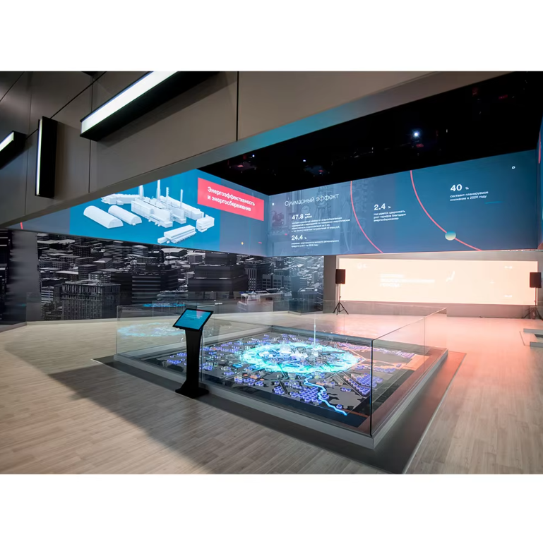
Nærbilde-miljøer er der oppløsningen gir den mest synlige gevinsten. Dette er rom hvor tilskuerne holder seg nær veggen lenge nok til å merke kvaliteten på kanter, komforten ved tekst, hudtoner, fine bilder og det generelle roen i bildet. Styresaler, museer, ledelsesrom, rom for produktbriefinger, undervisningsvegger, designstudioer, premium butikksinteriører og opplevelsesentre faller vanligvis inn under denne kategorien.
I nærbilde-prosjekter blir en tilpasset LED-skjerm ofte en integrert del av rommet. Den kan plasseres bak et talerbor, fungere som sentrum på en utstillingsvegg eller forme det første inntrykket i et mottaksområde. Siden folk oppholder seg lengre og legger mer merke til detaljer, må skjermen gi et inntrykk av ro og finhet, ikke bare være lys.
Dette er grunnen til at skjermer for nærværende bruk ofte føles mer emosjonelle enn tekniske. Hvis bildet er glatt og stabilt, føles rommet mer gjennomtenkt. Hvis innholdet ser ujevnt ut eller teksten er vanskeligere å lese enn forventet, kan veggen stillevis senke kvaliteten på hele omgivelsen. I disse rommene beskytter riktig oppløsningsvalg ikke bare klarheten, men også stemningen.
For innredninger med nærværende visning, som styresaler, utstillingsrom, museer og presentasjonsvegger, inndørs LED-skjerm løsninger gir ofte mer mening, fordi publikum står nærmere og forventer et renere bilde for lengre visningssesjoner. I disse miljøene er det enklere å merke seg feil oppløsningsvalg, fordi tekst, kanter og produktbilder står lenge nok på skjermen til at de kan vurderes nøye.
Pikseldistanse er viktig her fordi det påvirker hvor glatte tekstkanter, visuelle linjer og bilddetaljer ser ut på kort avstand. Forretningsresultatet er praktisk: det endrer om skjermen føles behagelig under lengre visning og tilstrekkelig finjustert for et premiumområde. Prosjekter som bygger på dashboards, presentasjoner, produkt-sammenligninger eller detaljert innhold bør legge størst vekt på dette. Et nyttig spørsmål til leverandøren er: hva slags innhold brytes først på den nærmeste vanlige visningsavstanden hvis en større pitch-løsning velges?
Interiører for nærvisning krever vanligvis mer enn bare lysstyrke. De krever visuell ro, behagelig lesbarhet og en overflate som føles polert også under lengre brukssesjoner.
Klikk for å se produktHvordan vurdere egnet for nærvisning uten å kjøpe for mye
En av de enkleste måtene er å gjennomgå virkelig innhold i stedet for å bare stole på demolooper. En kinematografisk promovideo kan få nesten hvilken som helst vegg til å se overbevisende ut. Virkelige presentasjonslysbilder, mindre tekstblokker, diagrammer, produktsider og sammenligningsoppsett forteller en mye mer ærlig historie. De viser om veggen føles behagelig skarp eller bare teknisk akseptabel.
Oppløsning er viktig i nærmiljøer fordi det påvirker hvor mye informasjon skjermen kan vise tydelig på en gitt størrelse. Dette avgjør om veggen støtter virkelig arbeidsinnhold eller tvinger teamet til å forenkle oppsettene for aggressivt. Presentasjonsrom, produktbriefingsområder og læringsmiljøer bør være mest opptatt av dette. Et godt oppfølgingsspørsmål er: Hvilken nativ lerretstørrelse gir hver løsning ved den planlagte veggstørrelsen, og hva betyr det for faktisk innholdsbruk?
Bildeformat spiller også en rolle fordi det påvirker om presentasjoner, bredskjermsinnhold og merkevarebaserte oppsett passer naturlig eller må tilpasses kontinuerlig. Dette påvirker daglig innholdseffektivitet og det polerte inntrykket av den endelige installasjonen. Et klokt spørsmål er: hvilken veggprosent passer best til de dominerende innholdsformatene og reduserer uvanlig skalering i vanlig bruk?
Planlegging for nærsyn blir kostbar når den styres av frykt. Den blir effektiv når den styres av reelt innhold, reelle seteposisjoner og et tydelig bilde av hvordan rommet vil brukes hver uke etter installasjon.
Mellomavstandsrom: der den smarteste balansen vanligvis vinner
De fleste kommersielle LED-prosjektene befinner seg i mellomsonen. Publikum er ikke nær nok til å inspisere hver enkelt kant, men heller ikke langt nok unna til at detaljer ikke lenger har betydning. Derfor er mellomavstandsrom både de mest vanlige og de letteste å feilvurdere. Foyers, flerformålsaler, steder for religiøs samling, utstillingsboder, områder for gjester, salonger, konferanseanlegg og innendørs områder på campus opererer ofte innenfor dette avstandsintervallet.
Hva som gjør disse rommene utfordrende, er deres mangfoldighet. Samme vegg kan vise merkevarefilm, arrangementstider, velkomstskjermer, hovedforedragsslides, sponsorklipp, talernavn og til tider detaljert innhold. Derfor er den sterkeste løsningen ikke alltid den med fineste struktur. Den er vanligvis den som holder sin overbevisende kvalitet ved blandet bruk uten å tvinge resten av prosjektet inn i kompromisser.
For mange kommersielle interiører er den beste tilpassede LED-skjermen ikke den med fineste mulige pitch. Det er den som forblir klar over blandet innhold, passer naturlig inn på veggen og etterlater nok budsjett til at resten av systemet fungerer ordentlig. Denne balansen skaper vanligvis større langsiktig verdi enn å jage ett enkelt tall i isolasjon.
Her kommer tilbakeholdenhet til syne. En mer aggressiv pitch kan virke beroligende i et tilbud, men samme beløpet kan kanskje skape mer synlig verdi hvis det brukes på skjermstørrelse, form, prosessorkvalitet eller praktisk service. Publikum belønner ikke et tall. Publikum belønner en vegg som føles riktig fra normale posisjoner og som fungerer pålitelig under faktisk bruk.
Kabinet design blir viktig her fordi den påvirker hvor godt skjermen kan tilpasse seg de avsiktede veggdimensjonene, hvor rense sømmene føles og hvordan serviceadgangen vil fungere senere. Arkitektoniske innredninger, innfelt vegger og installasjoner med store formater bør legge vekt på dette. Det riktige spørsmålet til leverandøren er: hvilken kabinettstørrelse gir den reneste veggformen med minst kompromisser og mest praktisk adgang?
Balanserte prosjekter presterer vanligvis best ved å utføre mange oppgaver godt, i stedet for å presse én spesifikasjon hardere enn rommet kan utnytte.
Klikk for å se produktHvordan en balansert vegg føles i daglig bruk
En balansert skjerm proklamerer ikke at den er «høytspesifisert». Den gjør bare rommet lettere å bruke. Presentasjoner føles stabile. Bevegelse ser naturlig ut. Tekst forblir behagelig å lese fra vanlige betraktningsavstander. Veggen støtter arkitekturen i stedet for å gå imot den. I mange kommersielle rom skaper denne følelsen av letthet mer verdi enn én ekstra trinn av teoretisk forfining.
Kontrollsystem planlegging er viktig her, fordi den påvirker hvordan kilder skifter, hvordan innholdet skaleres og hvor stabil veggen føles under arrangementer og daglig drift. Det endrer den reelle bruksmuligheten. Multifunksjonelle lokaler og fleksible interiører bør spørre hvilken kontrolleroppsett passer best til innholdsarbeidsflyten og hvilke begrensninger som må tas hensyn til tidlig.
Oppfriskningsfrekvens er viktig når veggen skal filtres eller ses gjennom kameraer. Det påvirker om displayet ser stabilt ut på direktesendinger, opptak eller scenekapsling. Hybridlokaler, kirkerom og arrangementsmiljøer bør være mest opptatt av dette. Et nyttig oppfølgingsspørsmål er: Hvis kamerakapsling er involvert, hvilken oppfriskningsfrekvens anbefales for den faktiske produksjonsoppsettet?
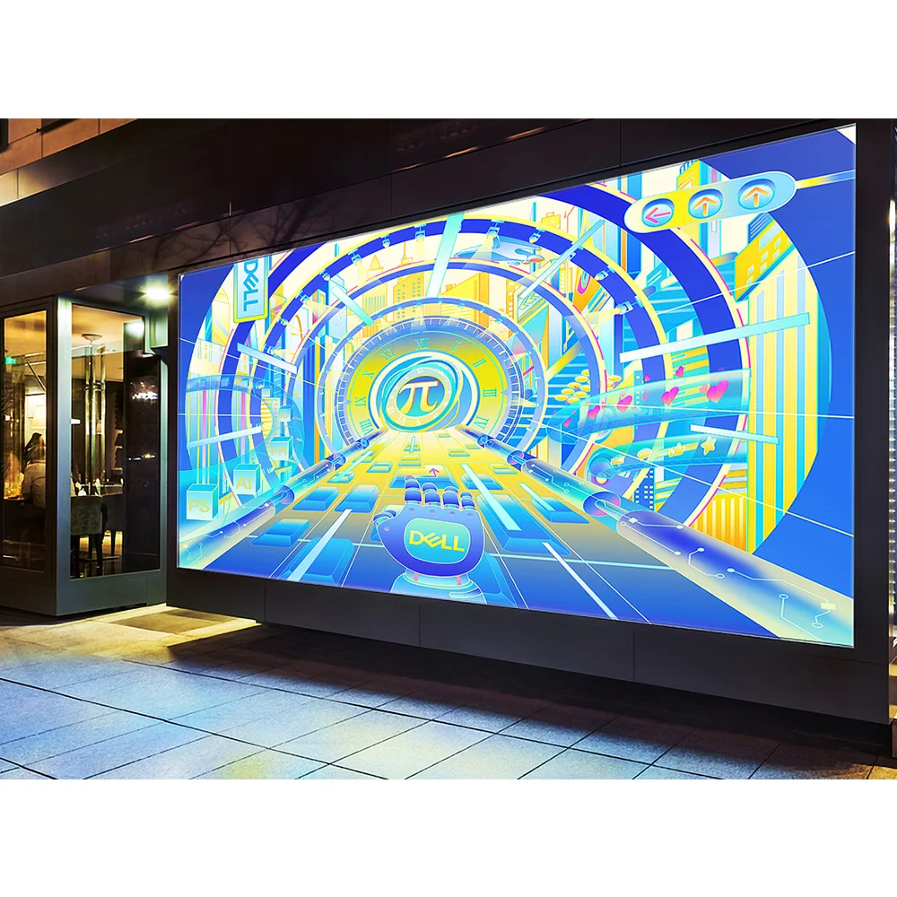
Langt avstand: der bildestyrken er viktigere enn mikroskopisk skarphet
Når publikum beveger seg lenger bort, bør oppløsningen vurderes annerledes. På det tidspunktet lykkes skjermen mindre ved hjelp av fine strukturer og mer ved hjelp av synlighet, gjenkjenningshastighet og tilstrekkelig visuell tydlighet for å holde oppmerksomheten i et større miljø. Dette gjelder sportanlegg, offentlige hallar, transportområder, torger, veikanter og store ytre flater.
I disse omgivelsene kan det raskt bli minst effektive stedet å bruke budsjettet på å gå mot finere oppløsning. Publikum står ikke stille noen få fot unna. De skanner, går, ser opp fra avstand eller ser på fra sitteplasser. De trenger meldingen å komme raskt. De trenger kraftige strukturer, ikke mikroskopisk presisjon.
I miljøer med større avstand endres planeringslogikken. En stadion LED-skjerm vurderes ut fra synlighet, skala og tydlighet fra faktiske seteplasser, ikke ut fra hvor fint den ser ut fra en vedlikeholdsstige. Derfor skaper mange store offentlige prosjekter mer verdi gjennom sterkere synlighet og bedre passform enn gjennom for aggressiv valg av pitch.
Lysstyrke er viktigere i disse prosjektene fordi det påvirker om skjermen forblir overbevisende under dagslys eller sterke omgivelseslysforhold. Forretningsresultatet er åpenbart: hvis bildet mister styrken sin når stedet er lyst, mister også meldingen sin kraft. Utendørs offentlige skjermer, transportmiljøer og sportsinstallasjoner bør fokusere på dette. Et smart leverandørspørsmål er: basert på stedets orientering og faktiske lysforhold, hvilket lysstyrkeområde er virkelig nødvendig – og ikke bare tilgjengelig?
IP-klassifisering er viktig fordi det påvirker motstanden mot vær og eksponering. Dette endrer langsiktig stabilitet, vedlikeholdsbehov og risiko for nedetid. Utendørs- og delvis eksponerte prosjekter bør prioritere dette langt høyere enn små gevinster i fin detaljering.
Langdistanse-skjermer vinner når meldingen er lett å oppfatte og veggen holder seg sterk under reelle forhold, ikke når den ser luksuriøs ut fra en urealistisk vinkel.
Klikk for å se produktHvorfor større virkning ofte er bedre enn ekstra detaljering
Fjernsynsprosjekter blir vanligvis mer effektive når innholdet er designet for hastighet, kontrast og umiddelbar gjenkjenning. I slike tilfeller kan et større skjermbilde, bedre ytelse i dagslys eller en mer praktisk servicestrategi gi bedre resultater enn en oppgradering av finstrukturen. Publikum vil huske om veggen føltes synlig og selvsikker, ikke om pikseltettheten så ut til å være premium fra en ubetydelig vinkel.
Effekt og varmeoppførsel er også viktig, fordi de påvirker planlegging, driftsforhold og langsiktig pålitelighet. Ved prosjekter med stort format, innelukkede strukturer og langvarig drift bør man undersøke hvilke reelle driftsforhold som kan forventes og hvilken støtteplanlegging som må tas opp tidlig.
Når finere pitch er verdt å betale for
Finere pitch fortjener det ekstra budsjettet når det tydelig endrer hva folk ser og føler i det virkelige rommet. Dette skjer vanligtvis når publikum er nær, detaljert innhold vises ofte, og veggen spiller en viktig rolle i en premiummiljø. Under disse forutsetningene kan ekstra finjustering skape en roligere, mer polert og mer pålitelig seeropplevelse.
Det er spesielt verdifullt i rom der folk oppholder seg ved innholdet i lengre perioder. Styresaler, ledelsesrom, high-end butikksinteriører, museer og områder for produktbriefinger er gode eksempler. I disse sammenhengene kaster folk ikke bare et blikk på veggen – de studerer den, sammenligner detaljer og vender tilbake til den gjentatte ganger. Veggen blir en del av rommets autoritet.
En finere løsning kan også være hensiktsmessig når skjermen må erstatte forventninger som er skapt av mer tradisjonelle, høyoppløselige displayformater. Hvis omgivelsene allerede kommuniserer presisjon gjennom arkitektur, materialer, belysning og merkevareidentitet, bør skjermen ikke bli den svakest visuelle overflaten i rommet.
Tegn på at den finere varianten kan være berettiget
- Den nærmeste vanlige seposisjonen er faktisk kort.
- Små tekster, diagrammer, kontrollpaneler eller sammenligningsoppsett vises ofte.
- Veggen støtter lengre seøkter i stedet for korte blikk.
- Rommet er så eksklusivt at bildekvaliteten påvirker hele atmosfæren.
- Produktbilder, ansikter og detaljerte merkevarefortellinger er viktige for opplevelsen.
- Den ekstra utgiften tvinger ikke til svakere beslutninger andre steder i prosjektet.
Det siste punktet er ofte det viktigste. En finere pitch skaper bare reell verdi når den forbedrer veggen uten å trekke for mye fra budsjettet til størrelse, forhold, behandling, kontroll, serviceplanlegging eller installasjonskvalitet. Når den støtter hele systemet, er den verd det. Når den forvrenger hele systemet, er den det ikke.
Når finere pitch blir bortkastet
Svinn i LED-planlegging handler ikke bare om å betale for mye. Det handler også om å betale i feil retning. En vegg kan se teknisk imponerende ut i et tilbud, mens den stille og rolig blir mindre effektiv i faktisk bruk. Dette skjer når pitchen gjøres for fin i forhold til den faktiske seavstanden, og andre deler av prosjektet må gi tapt.
I praksis kan det bety at veggen blir mindre enn den burde være. Det kan bety at den endelige proporsjonen føles mindre naturlig. Det kan bety at tjenestestrategien blir mer ubehagelig. Det kan bety at kontrollbanen blir strammere eller at budsjettet for innholdsfremstilling blir svakere. Plutselig er prosjektet forenklet på papiret, men mindre behagelig og mindre nyttig i rommet.
En finere pitch blir også unødvendig når innholdet i seg selv er tolererende. Hvis skjermen hovedsakelig viser kraftfulle bevegelser, direktesendinger, logoer, stemningsbilder, resultater eller korte meldingsinnhold, kan den synlige gevinsten raskt flate ut. Ved normale seposisjoner vil publikum kanskje ikke merke nok forskjell til å rettferdiggjøre den ekstra kostnaden.
Et annet advarselssignal oppstår når et team designer for den nærmeste mulige observatøren i stedet for den nærmeste vanlige observatøren. En person som står rett under en utendørs skjerm, nær en scenebakgrunn eller tett på en vegg under installasjonen, bør ikke definere hele budsjettet. Det riktige designmålet er posisjonen som er relevant under normal bruk.
Den tydeligste testen er enkel: Hvilken synlig endring vil neste finere trinn skape i det faktiske rommet, og hvor ofte vil denne fordelen være relevant? Hvis svaret er vanskelig å beskrive, kan budsjettet kanskje bedre brukes andre steder.
Hvordan innhold endrer svaret
Selv om to vegger har samme størrelse og samme betraktningsavstand, kan de likevel kreve ulik planlegging fordi innholdet stiller ulike krav til øyet. Derfor kan samtaler om oppløsning som ignorerer innhold ofte bli missvisende. De behandler skjermen som om den bare har én funksjon, mens veggen i virkeligheten kan vise alt fra følelsesladede videoer til tett informasjon.
Innhold om merkevarefortelling er vanligvis mer forstående. Fullskjerms bevegelsesgrafikk, kinematografiske løkker, produktfotografi, kampanjebilder og ambient bevegelse avhenger mer av komposisjon, kontrast og flyt enn av nøyaktighet i små tekstelementer. Når målgruppen ikke er svært nær, fungerer disse formatene ofte godt uten å tvinge prosjektet mot det mest detaljerte nivået.
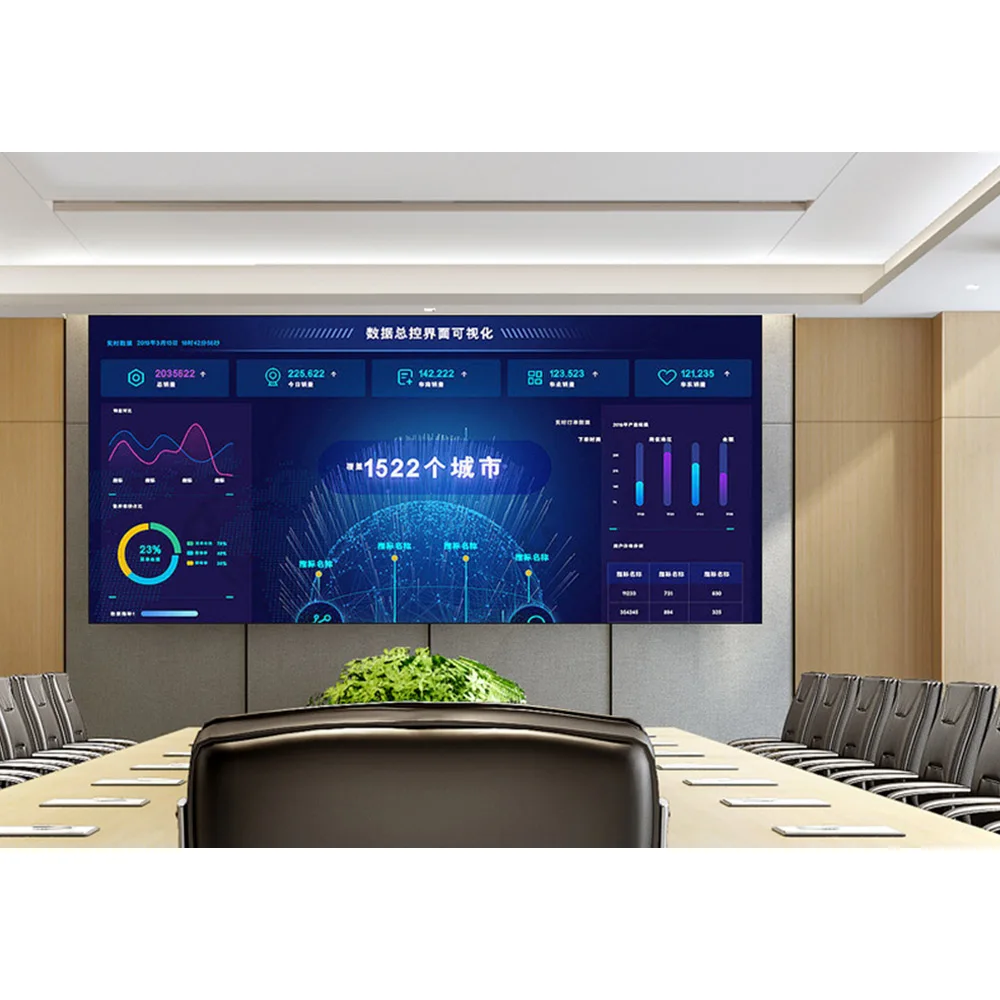
Informasjonsrike innhold oppfører seg annerledes. Oversiktspanel, tidsskjemaer, menyer, campusmeldinger, presentasjonslysark, kart, datatabeller og sammenligningssider avslører en dårlig passform mye raskere. I disse tilfellene er veggen ikke bare et element som tiltrekker oppmerksomhet. Den formidler informasjon som må leses, tillites og absorberes uten anstrengelse.
Rom for blandede bruksområder er de mest krevende, fordi de utfører begge oppgavene. En lobby kan vise en vakker merkevarefilm det meste av dagen, og deretter bytte til programoversikter for arrangementer og sponsoroppsett på ettermiddagen. Et utstillingsrom kan gå fra kinematisk fortelling til teknisk produktpresentasjon. Derfor er den tryggeste rutinen å identifisere den vanskeligste vanlige innholdoppgaven og la den sette det laveste akseptable kravsnivået.
En tydeligere forespørsel gjør det også lettere å sammenligne ett tilpasset LED-skjermforslag med et annet. Når seværdighetsavstand, innholdstype, veggstørrelse og serviceforhold er definert, blir tilbudet mer meningsfullt, fordi hver anbefaling svarer på samme reelle oppgavebeskrivelse.
Hvorfor sideforhold endrer resultatet
Høyde-bredde-forhold behandles ofte som en sekundær designnotat, men det påvirker daglig bruksmulighet mer enn mange team forventer. Selv en godt valgt oppløsning kan føles feil hvis veggenes form strider mot innholdet den skal vise. En dårlig tilpasning fører til kastet plass, uheldig beskjæring, gjentatte omdesigner eller oppsett som aldri ser helt ferdige ut.
Dette blir tydelig i rom som brukes mye til presentasjoner. Hvis lysbilder alltid ser litt kompromissfylte ut, er problemet kanskje ikke bare oppløsningen. Problemet kan være at veggens proporsjoner ikke passer innholdets økosystem. I merkevareorienterte rom kan det motsatte skje. Et bredt bånd, et portrettformat eller en tilpasset arkitektonisk proporsjon kan gi et mer minneverdig resultat enn et konvensjonelt rektangel, fordi det passer historien rommet ønsker å fortelle.
Derfor bør skjermstørrelse og -form diskuteres før den endelige oppløsningen er fastlagt. I mange prosjekter skaper en litt større vegg med et bedre forhold mer verdi enn en mindre vegg som er presset mot en finere løsning. Publikum oppfatter først hele bildet, ikke tallet bak det.
Kabinet valget er avgjørende her, fordi det påvirker om det ønskede forholdet kan realiseres rent og vedlikeholdes praktisk. Dette påvirker kantbehandling, installasjonslogikk og langtidshåndtering. Prosjekter med tilpassede veggdimensjoner, inngraveringer eller krav til arkitektonisk justering bør alltid spørre hvordan kabinettformatet vil påvirke det endelige forholdet og tilgangsveien.
Beslutningstabell
| Prosjektforhold | Hva som er viktigst | Hvor ekstra budsjett ofte hjelper | Hvor ekstra budsjett ofte går tapt | Beste leverandørspørsmål |
|---|---|---|---|---|
| Lukket innendørs vegg for presentasjoner, produktdetaljer eller samarbeid | Lesbarhet, komfort, forfinet bildekvalitet, lett å se på fra avstand | Bedre passform, bedre forhold, reell innholdsvurdering | Betale for urelaterte ekstrautstyr i stedet for den faktiske visningsbehovet | Hva krever den nærmeste vanlige visningsposisjonen virkelig for vårt mest krevende innhold? |
| Vegg for blandet bruk på mellomavstand i en lobby, et arrangementsted eller et utstillingsrom | Balanse, fleksibilitet, visuell tillit | Riktig pikselavstand, praktisk veggform, stabil prosessering | Velge ultrafin detaljering for sjelden nærinspeksjon | Hvilken løsning dekker det mest krevende vanlige innholdet uten å overdimensjonere veggen? |
| Scenebakgrunn eller eventskjerm | Inntrykk, pålitelig drift, kameravennlig ytelse | Oppdateringsplanlegging, håndterbar oppsettprosess, balansert bildestyrke | Betale for detaljer som publikum aldri vil bruke | Hva vil hovedpublikumet faktisk merke fra seteplassene sine? |
| Utendørs skjerm for offentlig bruk | Synlighet, holdbarhet, rask gjenkjenning av meldinger | Lysstyrke, tilgang til service, passform til miljøet | Forbedre detaljnivået utover det vanlige synsnyttet | Hvor slutter synlig forbedring å gi effekt på dette stedet? |
| Skjerm for idrett eller store offentlige arenaer | Lesbarhet, skala, pålitelighet, styrke i dagslys | Skjermstørrelse, robust design, synlighet for tilskuere | Bevege seg finere uten å endre publikumsopplevelsen | Hvilken synlig gevinst skaper neste finere trinn fra de viktigste sitteområdene? |
Denne typen beslutningstabell holder diskusjonen knyttet til reelle resultater. Den gjør også sammenligning av tilbud mer ærlig. Hvis to forslag anbefaler ulike veier, bør neste steg ikke være å gjette hvilken som er «bedre». Det bedre steget er å spørre hvilke antakelser om visning, innhold og veggform som ligger til grunn for hver anbefaling.
Hva som skal forberedes før tilbudet
En sterkere undersøkelse skaper vanligvis en sterkere anbefaling. Den trenger ikke å høres overveldende teknisk ut. Faktisk kan kopierte parameterlister ofte senke prosessen, fordi de beskriver produkter i stedet for bruksområder. Det som betyr mer, er et tydelig bilde av hvor veggen skal plasseres, hvordan den skal ses på og hva den må gjøre hver dag.
En praktisk forespørsel bør omfatte installasjonsscenariet, omtrentlig seavstand, målveggens bredde og høyde, hovedinnholdstyper, om lesbarhet av tekst er viktig, om veggen er innendørs eller utendørs, eventuelle begrensninger for serviceadgang og om det forventes bruk av kamera eller filmopptak. Disse detaljene gir ingeniørsiden tilstrekkelig kontekst til å anbefale en realistisk retning i stedet for å sende et generelt tilbud.
De beste forespørslene om tilpassede LED-skjermer inkluderer også den mest krevende vanlige innholdsoppgaven. Denne enkle detaljen sparer tid, fordi den forteller leverandøren hva som ikke må svikte etter installasjonen. Når dette er klart, blir vurdering av produkttilpasning, skjermform, styringsplanlegging og servicestrategi mye enklere.
Rask forespørselskontrolliste
- Nærmeste vanlige seavstand
- Lengste viktige sezon
- Hovedinnholdskategorier
- Mest krevende vanlige innholdsoppgave
- Målbredd og -høyde, eller tilgjengelig veggareal
- Foretrukken skjermform eller dominerende innholdsformat
- Innendørs eller utendørs bruk
- Monteringsnotater, begrensninger for serviceadgang eller stedsfotografier
- Om kamerakapring eller direktesending er involvert
- Måls marked og forventet tidsramme
For mer strukturerte fabrikksvurderings-spørsmål før prisfastsettelse er Veiledning for leverandører av LED-skjermer en nyttig støttende lesestoff. Den hjelper til å klargjøre hva som bør bekreftes før man binder seg til et tilbud, spesielt når flere alternativer ved første øyekast virker like.
Hvordan den riktige skjermen føles etter montering
De sterkeste LED-prosjektene blir sjelden husket som «det med beste tekniske spesifikasjoner». De huskes som rom som enkelt og greit fungerer. I et møterom føles veggen rolig og lett å følge. I et mottaksområde føles den velpolert og innbydende. I butikker føles den levende uten å bli hard. På en scene føles den dristig og stabil. I offentlige omgivelser føles den synlig uten at det krever innsats.
Denne følelsesmessige virkeligheten er viktig fordi skjermer blir en del av rutinene. De støtter start, velkomst, fremheving, presentasjoner, tidsskjemaer, fortelling og veiføring. Når passformen er riktig, fletter veggen seg naturlig inn i rommet. Når passformen er feil, kan veggen fortsatt fungere, men den føles aldri helt hjemme.
Produktvalg fungerer best når det er knyttet til valg av scene. Det mest overbevisende resultatet oppnås vanligvis når veggens konfigurasjon, innholdsplansen og rommets bruksmønster behandles som én beslutning i stedet for som separate oppgaver. På denne måten slutter en skjerm å være en generell displayløsning og begynner å føles som en formålsmessig bygd løsning.
Et godt resultat oppnås sjelden utelukkende ut fra ett enkelt tall. Det oppnås ved å matche riktig skjermtype med måten skjermen faktisk vil leve i rommet.
Klikk for å se produktI praksis betyr dette at den beste løsningen vanligvis er den som balanserer sevavstand, innholdstype, form, daglig drift og langsiktig bruk. En slik tilpasning skaper mer varig verdi enn å forsterke én spesifikasjon mer enn rommet på en meningsfull måte kan utnytte.
Videre lesning
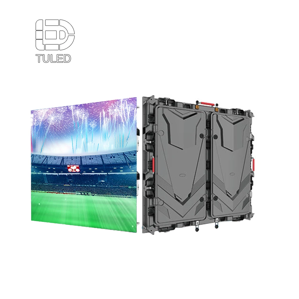
Tilpassede LED-skjermløsninger
Utforsk størrelsestilpassing, layouttilpasning og prosjektbaserte konfigurasjonsidéer for en tilpasset LED-skjerm som bygges rundt reelle sevavstandsbehov.
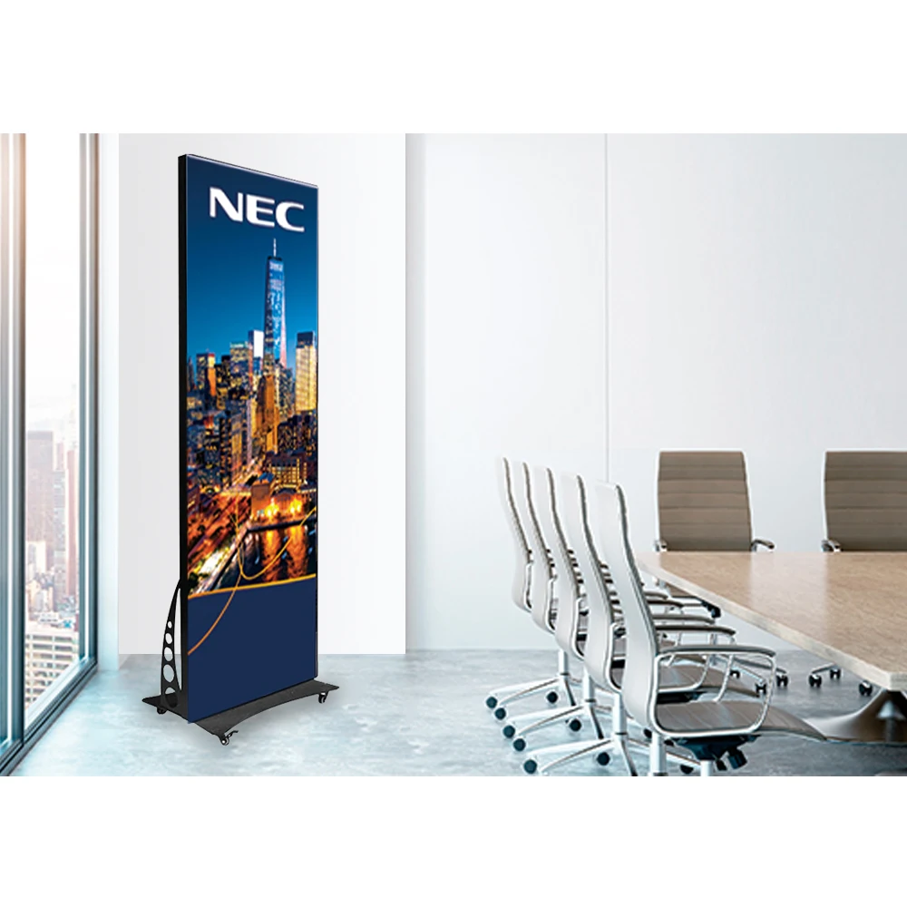
Inndørs LED-skjerm
Hjelpsom for innendørs områder med nært sevavstand, presentasjonsvegger, utstillingsrom og andre rom der bildekvalitet er viktig hver dag.
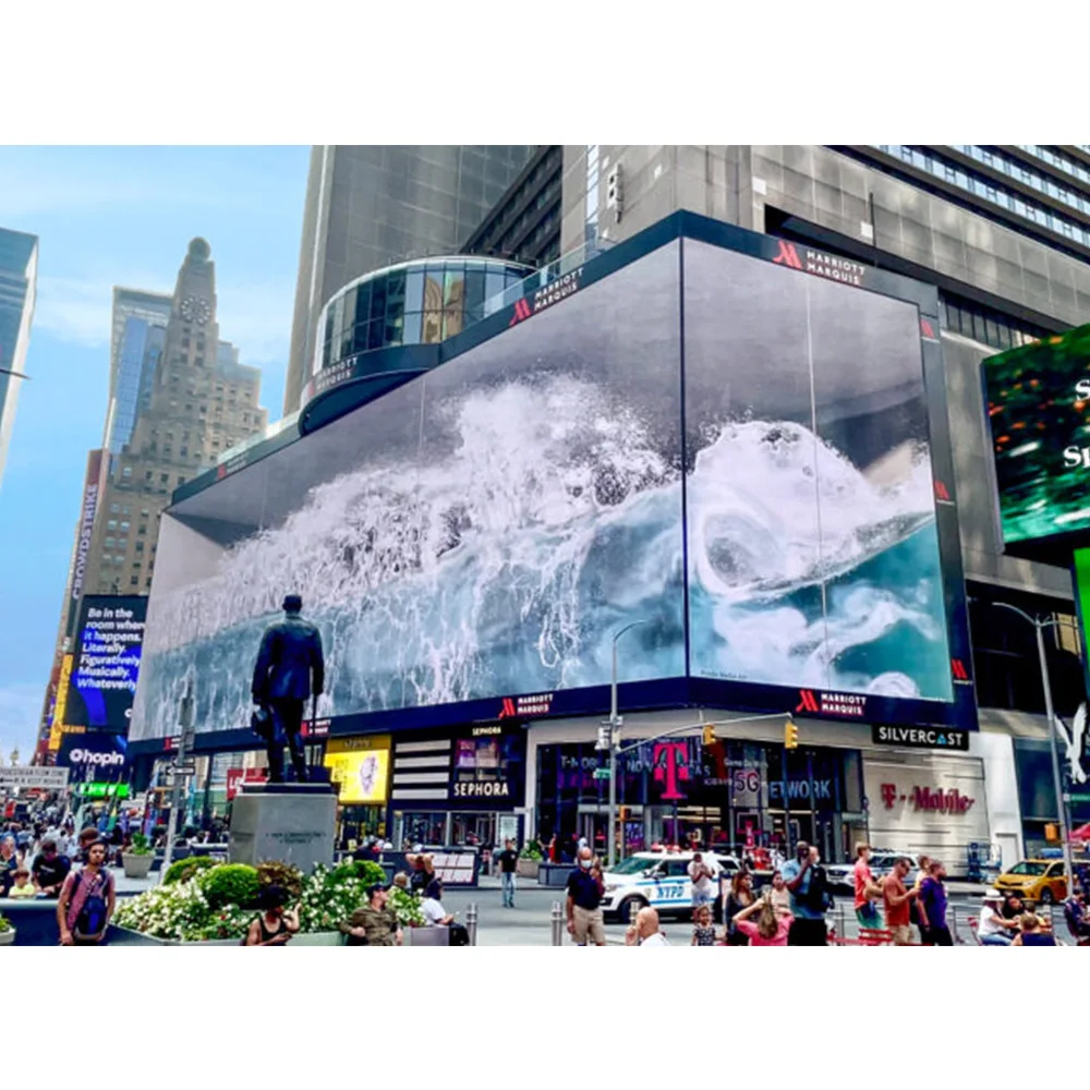
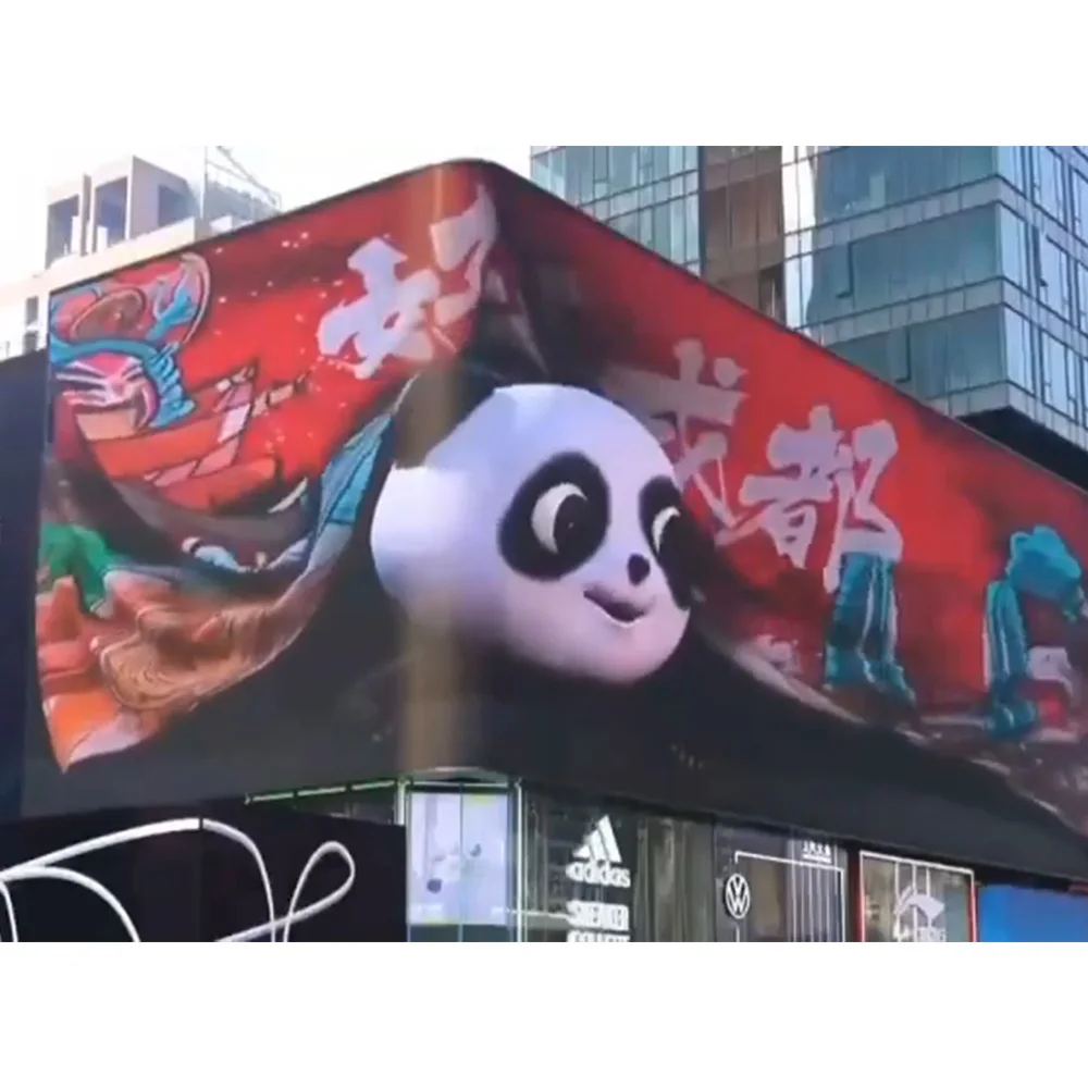
Stadion LED-skjerm
Et nyttig referansepunkt for større lokaler og lengre sevavstander der synlighet og holdbarhet styrer beslutningen.
Ofte stilte spørsmål
Hvordan bør sevavstand påvirke oppløsningen på en LED-skjerm?
Synsavstanden bør være avgjørende for beslutningen, siden den bestemmer hvor mye bildestruktur publikum faktisk kan merke i normal bruk. Kort synsavstand øker verdien av finere detaljer. Lengre synsavstander reduserer denne verdien og flytter ofte fokuset mot størrelse, lysstyrke, holdbarhet og enklere meldingsgjenkjenning.
Når er finere pitch verdt den ekstra budsjettressursen?
Det er vanligvis verdt tilleggsprisen når publikum står relativt nær, når veggen må vise små tekster eller detaljert innhold, eller når skjermen er plassert i et premiuminteriør der bildestrukturen påvirker hele atmosfæren. Verdien blir lavere når publikum befinner seg lenger unna eller når innholdet hovedsakelig består av kraftige grafikkelementer, direktesendt video og korte meldinger.
Hvordan påvirker innholdstype og bildesideforhold beslutningen?
Innholdstype avgjør hvor mye detaljnivå skjermen må kunne vise komfortabelt. Layouter med mye tekst krever mer disiplin enn fullskjermsvisuelle løkker. Sideforholdet er viktig fordi det avgjør hvor naturlig innholdet passer til veggen. I mange prosjekter forbedrer en bedrepassende veggform daglig bruksområde mer enn én ekstra oppløsningssteg.
Er en beregningskalkulator for seavstand alene nok?
Nei. Den er et nyttig planleggingsverktøy fordi den tidlig innskrenker det fornuftige området, men den bør ikke ta den endelige beslutningen alene. Den endelige valget må fortsatt reflektere innholdet, veggstørrelse, form, installasjonsforhold og hvilken synlig forbedring hvert oppgraderingstrinn gir i det faktiske rommet.
Hva skal være forberedt før man ber om et tilbud?
De mest nyttige inndata er installasjonsscenariet, omtrentlig seavstand, målscenestørrelse, eksempler på hovedinnhold, innendørs- eller utendørsforhold og eventuelle notater relatert til service eller kamera.
Før diskusjonen tilbake til virkelig bruk
Når prosjektkortet starter med rommet, seavstanden og innholdet som er viktigst, blir anbefalingen lettere å stole på. Det fører vanligvis til tydeligere sammenligning av tilbud, bedre fokus på budsjettet og en vegg som føles riktig etter installasjon, i stedet for bare å lyde riktig under planleggingen.
For prosjekter som krever tilpassede størrelser, scenariobasert oppløsningsveiledning og raskere vurdering fra fabrikksiden, del veggstørrelsen, seavstanden, innholdstypen og stedets forhold via kontakt oss . Det gjør det enklere å avgjøre om den riktige tilleggs led-skjerm bør prioritere finjustering for nærsyn, balanse for blandede bruksområder eller visuell innvirkning på lang avstand.
Få et tilbud