Ett skärmval börjar sällan med själva skärmen.
I verkliga projekt börjar det istället med ett problem som är lätt att känna igen men svårt att beskriva. En receptions vägg känns platt, även efter att arkitekten godkänt den. Ett övervakningsrum fungerar på papper, men layouten börjar kännas trängd när fler källor läggs till. En butiks korridor behöver rörelse och synlighet, men en full vägg känns för tung för utrymmet. En aula vill ha starkare visuell energi, trots att rummet fortfarande måste kännas permanent på vardagar och imponerande på evenemangs kvällar.
Det är därför detta ämne är så viktigt. LCD och LED tävlar inte enbart om teknik. De skapar olika resultat i verkliga rum. Den ena tenderar att föredra standardlayouter, bekanta format och en mer fast displaylogik. Den andra tenderar att föredra frihet, sammanhang, starkare närvaro och större arkitektonisk flexibilitet. Ingen av dessa val är automatiskt rätt. Det bättre svaret beror på vad väggen förväntas göra varje dag efter installationen.
Vad leverantörer av videoväggar ofta missar i det första samtalet
I början av ett projekt blir många diskussioner alltför tekniska alltför tidigt. Den ena parten pratar om ljusstyrka. Den andra parten pratar om budget. En tredje part begär en storlek. Sedan kommer offerterna, och beslutet börjar glida mot en jämförelse av enskilda poster.
Denna metod döljer dock vanligtvis det verkliga problemet.
De mest besvikande visningsprojekten misslyckas inte för att panelen var dålig. De misslyckas för att väggen valdes innan rummet förståddes. Visningen såg rätt ut i en datablad, men fel ut i utrymmet. Skärmstorleken stämde överens med ritningen, men inte med siktlängden. Kostnaden verkade effektiv vid inköpet, men väggen ledde senare till kompromisser när det gäller innehåll, arkitektur eller underhåll.
En bättre process känns från början långsammare, men sparar tid senare. Istället för att endast fråga »Hur stor?« eller »Hur ljus?« bör projektgruppen ställa en mer omfattande uppsättning frågor. Hur ska väggen kännas i dagligt bruk? Utgör den en del av arkitekturen eller är den helt enkelt en kommunikationsyta? Måste den försvinna i rummet som en enda bild, eller kan den förbli ett synligt system av plattor? Kommer innehållet att vara kinematografiskt, informativt, riktningsspecifikt, marknadsförande eller en blandning av dessa? Och lika viktigt: vad händer när en modul eller en panel eventuellt behöver service?
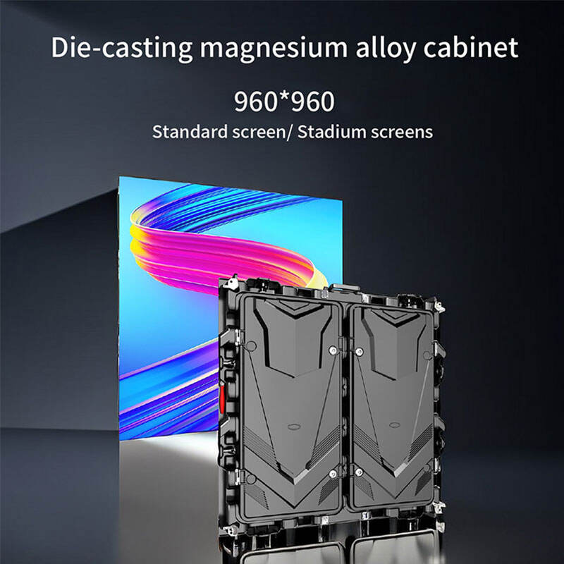
Produktstrukturen på webbplatsen stödjer redan detta bredare sätt att tänka. Katalogen är inte begränsad till en enda kategori. Den omfattar inomhuskabinetter, utomhuskabinetter, LED-plakatprodukter, transparenta display-sidor och tillbehör relaterade till processorer. Detta sortiment är viktigt eftersom en verklig jämförelse inte enbart handlar om LCD mot LED. Den handlar också om vägg mot plakat, standardformat mot anpassat format samt tänkande som fokuserar enbart på skärmen mot tänkande som omfattar hela systemet.
Med andra ord är den första användbara frågan inte "Vilken display är bättre?" Den första användbara frågan är "Vilken roll ska displayen spela i utrymmet?"
När denna fråga har besvarats börjar skillnaderna mellan LCD och LED snabbt bli tydliga.
Scen ett: lobbyn som behövde närvaro, inte bara information
Föreställ dig en företagslobby på en måndagmorgon.
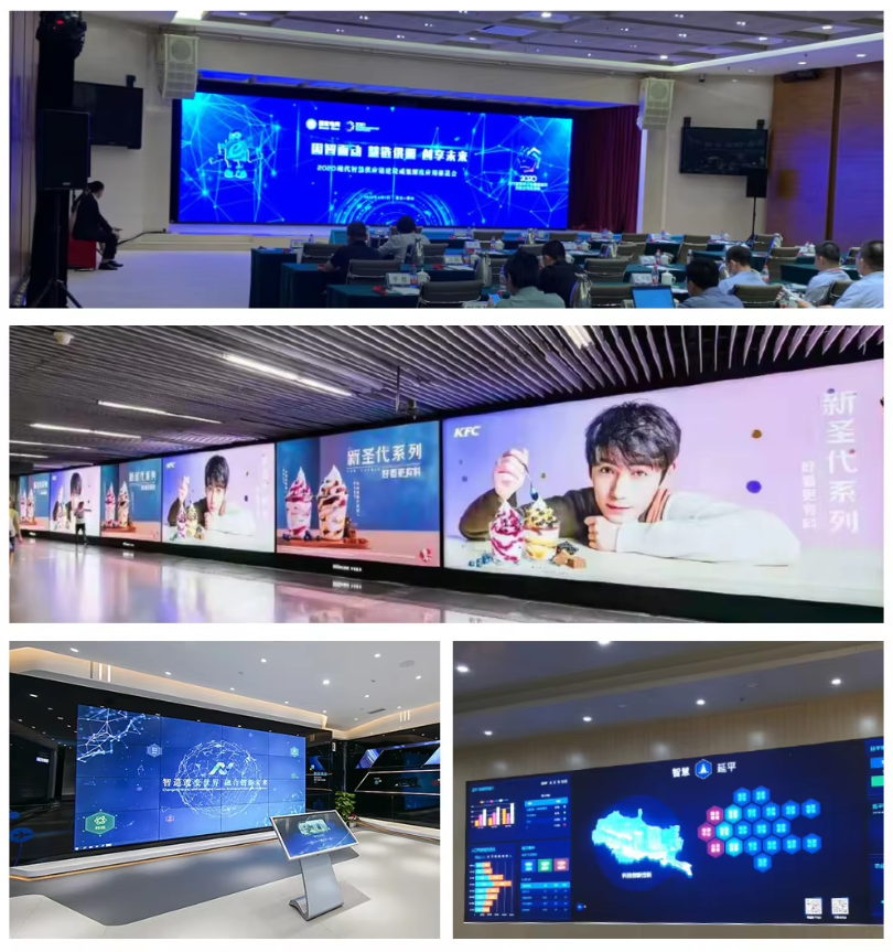
Människor går snabbt in. Vissa kommer till möten. Vissa väntar. Vissa letar inte ens efter en skärm, men uppmärksammar ändå en om den känns avsiktlig. I ett utrymme som detta är väggen sällan bara ett informationsverktyg. Den sätter tonen innan någon ens säger ett ord. Den förmedlar varumärkesidentitet utan att behöva en säljare. Den säger till besökare, investerare, partners och personal om byggnaden känns statisk eller levande.
Detta är där en standard-LCD-array kan kännas rätt – och samtidigt något besvikande.
Å andra sidan fungerar LCD väl när innehållet är strukturerat och budgeten måste hållas förutsägbar. Om designbriefet främst omfattar välkomstmeddelanden, presentationsbilder, schemaläggning eller enkla mediaslingor kan en panelmonterad LCD-vägg absolut utföra sitt arbete. Den är bekant. Den är ordentlig. Den passar standardbildförhållanden. För många anläggningar är det tillräckligt.
En premiumlobby kräver dock ofta mer än ”tillräckligt”.
Problemet uppstår när innehållet är utformat som ett enda visuellt fält. Rörliga bakgrunder går över panelgränserna. Varumärkesfilmer förlorar kontinuitet. En väggöppning som är bara lite bredare eller högre än en standardanordning börjar se bristfällig ut. Displayen känns inte längre integrerad i arkitekturen. Den känns istället placerad framför den.
Det är vanligtvis det ögonblick då LED börjar verka mer rimligt.
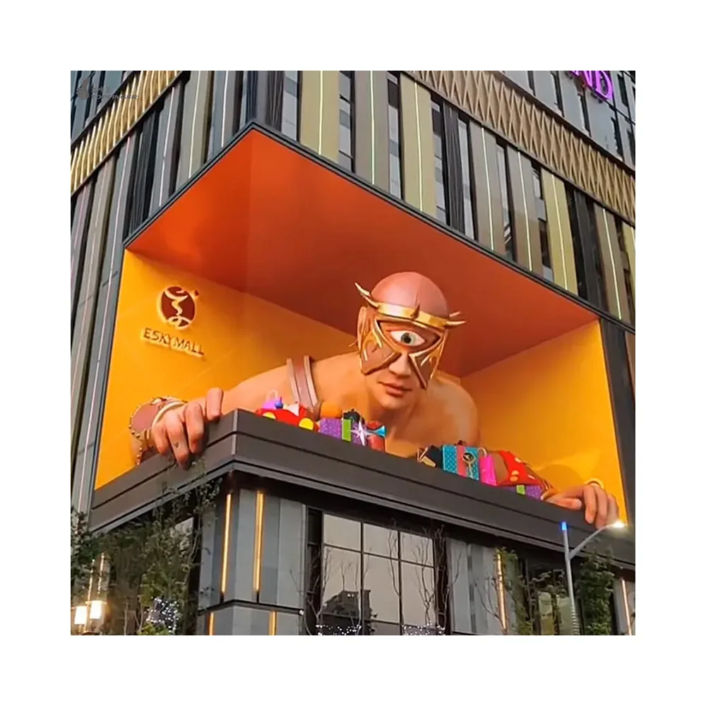
En bra LED-vägg i lobbyn förändrar den emotionella uppfattningen av rummet. Istället för att säga ”här finns en display” säger den ”denna yta hör hemma här.” Fogarna försvinner. Innehållet får utrymme att andas. Väggen kan följa arkitekturen istället för att tvinga arkitekturen att följa ett fast panelrutnät. Även ett tillbakahållande visuellt program känns mer genomtänkt när bilden är oavbruten.
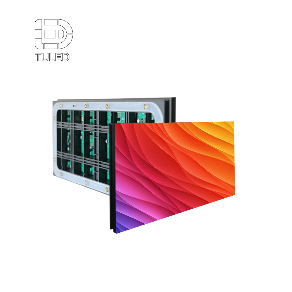
Webbplatsens inomhus-sida för kyrkskärmar är användbar här, inte för att projektet måste vara religiöst, utan för att produktlogiken är relevant. Sidan beskriver en kabinettfamilj med upplösningen 640×480, frontåtkomst, vägmontering och anpassning till storskärmsmonteringar i formaten 4:3 och 16:9. Den här kombinationen är lika viktig för kontorsinteriörer som för utrymmen avsedda för bön, eftersom den svarar mot ett av de vanligaste affärsbehoven: att passa renligen på en vägg utan att göra underhåll omöjligt vid ett senare tillfälle.
Den avgörande punkten är inte att LED alltid är det bästa valet för en lobby. Punkten är att premiumlobbier vanligtvis lägger större vikt vid kontinuitet och slutförandekvalitet än vanliga mötesutrymmen gör. När detta blir prioriterat slutar LED ofta att framstå som en lyxupgradering och börjar istället verka som det mer naturliga arkitektoniska valet.
Denna typ av inomhusväggavbild passar naturligt efter diskussionen om lobbyn, eftersom den visar den känsla av att vara ”byggd in i rummet” som standardtillverkade plattskärmsväggar ofta har svårt att åstadkomma.
Det finns också ett andra lager i denna lobbyhistoria. Ett receptionsområde förblir sällan oförändrat för evigt. Varumärkesidentiteten ändras. Evenemangsrelaterat innehåll introduceras. Säsongsbundna kampanjer roterar. Avdelningar begär ny media. Det innebär att displayen inte bara ska se bra ut den första dagen – den ska även fortsätta vara användbar när innehållsstrategin blir mer ambitiös sex månader senare.
Det är där en sömlös yta skapar långsiktig värde. Den gör det möjligt att använda fler typer av innehåll utan att behöva omforma väggen varje gång det kreativa teamet vill prova något mindre stelt.
Så i en lobby är den riktiga frågan inte »Vilken panel ser bättre ut?«, utan »Hur mycket visuell avbrott kan utrymmet tolerera innan väggen slutar kännas premium?«
Scen två: kontrollrummet som såg enkelt ut tills det blev fullt upptaget
Gå nu vidare till en annan miljö.
Kontrollrummet är tystare. Rummet värderar tydlighet framför skicklighet. Operatörer behöver synlighet, inte spektakel. Innehållet är funktionellt: instrumentpaneler, övervakningskameror (CCTV), kartor, varningar, våningsplan, statuspaneler och flera fönster från olika system.
På första anblick låter detta som en LCD-vinst. Ofta är det också det.
LCD fungerar mycket bra när väggen används som ett strukturerat informationsfält. Standardpanelgeometri kan passa perfekt med fönsterbaserade gränssnitt. Team som redan är vana vid Full HD-layouter kan hitta det lättare att distribuera. För många övervakningsrum, driftcentraler och schemaläggningsutrymmen är denna välbekanta logik en fördel snarare än en begränsning.
Dock förändras berättelsen när rummet utvecklas.
En kontrollcentral blir nästan aldrig enklare med tiden. Fler källor anländer. Fler instrumentpaneler tävlar om utrymme. Teamet vill ha en stor karta i mitten, livevideo på sidan, aviseringar längst upp och flexibla layouter som ändras beroende på skift. Plötsligt börjar den panelbaserade logiken, som kändes ren och ordentlig i början, skapa friktion. Ramarna delar upp en karta. Aviseringsfält klipps av vid panelens kanter. Gemensam situationssyn blir något svårare än den borde vara.
Detta är ögonblicket då jämförelsen slutar handla om bildkvalitet och istället börjar handla om operativ komfort.
Om rummet kan leva lyckligt med en fönsterbaserad, panelbaserad layout förblir LCD ett mycket rationellt val. Det är effektivt. Det är bekant. Det håller sig nära det sätt på vilket många kontrollmiljöer redan tänker.
Om å andra sidan rummet behöver ett mer enhetligt visuellt fält börjar LED motivera sig på ett mycket praktiskt sätt. Värdet är inte teatraliskt. Det är operativt. En slät vägg stödjer lagerad innehåll bättre. Den kan visa en stor miljökarta utan avbrott. Den hanterar långa anpassade förhållanden mer naturligt. Den minskar den visuella tröttheten som uppstår genom att man ständigt måste läsa runt panelens linjer.
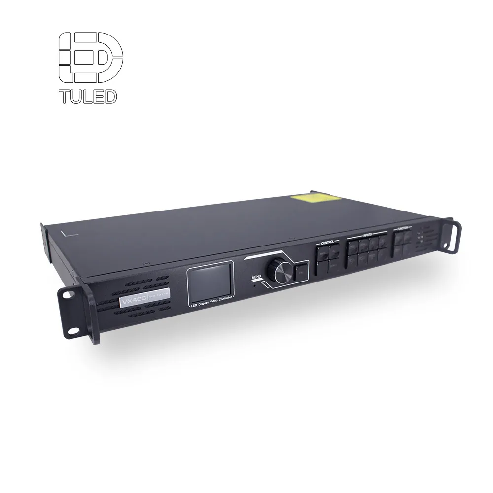
Återigen är den inomhusproduktslogiken på webbplatsen relevant här. Samma kyrkskärmsida betonar frontservice och kompatibilitet med stora skärmformat som passar väl för affärsanvändning. Samtidigt lyfter videosignalprocessorns sida en andra viktig punkt: skärmen utgör endast en del av systemet. Signalhantering, skalning, stöd för flera ingångar och kontrollflöde formar dagliga upplevandet lika mycket som själva väggen. Processorsidan definierar uttryckligen processorn som bro mellan källenheter och LED-skärmen och hänvisar till processorsystem såsom Novastar, Linsn, Colorlight och Huidu.
Det är viktigt eftersom kontrollrum är krävande miljöer. En vacker vägg med klumpig signalhantering är fortfarande ett svagt kontrollrum. En mer anspråkslös vägg med ren växling, stabil layoutlogik och underhållsbar åtkomst kan prestera bättre än ett mycket mer spektakulärt system i daglig användning.
Så jämförelsen av kontrollrummet kommer ned till detta: om rummet fungerar som en matris av informationsfönster är LCD ofta den renare, budgetmedvetna vägen. Om rummet fungerar som ett enda utvecklande visuellt arbetsområde blir LED mycket svårare att förkasta.
Scen tre: korridoren, utställningshallen och butiksområdet där en hel vägg var för mycket
Inte varje affärsskärm behöver vara en vägg.
Detta är ett av de mest användbara besluten som team ofta missar. I många verkliga inredningar är problemet inte "Vilken videovägg ska installeras?" Den bättre frågan är "Vill det här utrymmet ens ha en vägg?"
Tänk på en butikskorridor, en varumärkesutställningsyta, en mässstand, en hotellingång eller en återförsäljarzon mellan avdelningar. Dessa utrymmen kräver rörelse, synlighet och flexibla budskap. Samtidigt vill man ofta undvika permanent byggnadsarbete. De måste kunna ändras snabbt. De måste kunna anpassas till trafikflödet. De måste kunna övergå från ett kampanjlayout till ett annat utan stålkonstruktioner och ombyggnad av väggar.
Det är just här LED-plakatdisplayprodukter blir strategiskt intressanta.
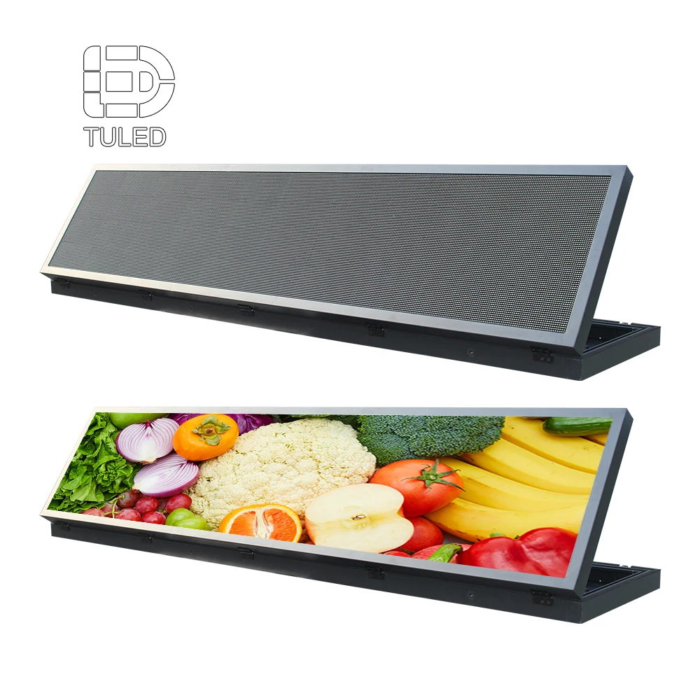
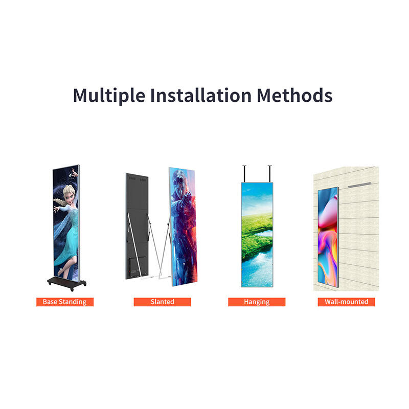
Platsens sida för plakatdisplay gör detta användningsfall mycket tydligt. Den beskriver ett lättviktigt, extremt tunt format som är utformat för reklamuppspelning, stödjer både fristående och kombinerad användning, möjliggör schemalagd in-/och av-funktion samt stödjer innehållsaktualisering via media och nätverksbaserade metoder. Den visar också flera installationsmetoder, inklusive ställning på fot, lutad placering, hängning och väggbefästning, vilket är långt mer flexibelt än ett traditionellt fast väggbeslut.
Den flexibiliteten förändrar samtalet.
En affischdisplay kan fungera som digital skyltning i en korridor. Den kan skapa ett kortvarigt utställningsområde i butiksmiljö. Den kan ramas in som en lanseringszon utan att bli en permanent byggnadsdel. Den kan ställas upp i grupp för en evenemang och sedan separeras tillbaka till enskilda enheter senare. Med andra ord löser den ett annat problem än en videovägg – och gör det ofta bättre.
Det finns också en designfördel här. Affischdisplays upplevs som lättare i utrymmen som annars skulle bli visuellt överväldigade av en fullständig vägg. En vägg kräver dominans. En affisch inbjuder till placering. Den kan betona rörelse utan att ta över hela arkitekturen.
För många affärsmiljöer gör detta den till det mer intelligenta LED-alternativet.
Istället for att ersätta LCD med en fullständigt slät vägg överallt är det ofta en mer strategisk tillvägagångssätt att använda affischprodukter där mediabehoven är mobila, kampanjdrivna eller spridda över platsen. Det kan vara en bättre användning av budgeten och en bättre anpassning till hur utrymmet faktiskt fungerar.
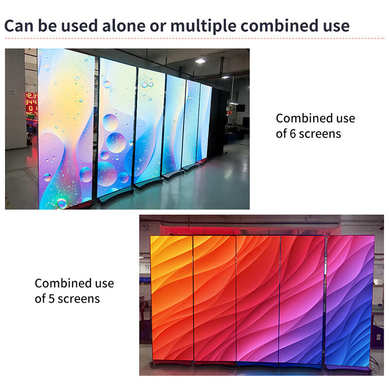
Denna bild fungerar väl i korridoren och utställningshallen eftersom den visar hur flera affischenheter kan fungera tillsammans utan att bli en permanent byggd vägg.
När denna möjlighet väl är på bordet blir den gamla debatten om LCD kontra LED mer nyanserad. Ibland är det bättre affärsmässiga svaret inte LCD-vägg kontra LED-vägg. Ibland är det LCD för ett rum, LED-affisch för ett annat rum och ingen stor vägg alls i det tredje utrymmet.
Det är detta som gör att en bra displaysplan känns mogen. Den tvingar inte en enda displayfilosofi på hela byggnaden.
En utställningsyta är ett annat bra exempel. I ett hörn kan en traditionell skärm fortfarande fungera bra för produktdemoer. I genomströmningszonen kan en affischdisplay hantera kampanjer och säsongsspecifik media bättre. Nära ingången kan en sömlös LED-display motiveras eftersom arkitekturen kräver en "hjältemoment". Dessa val kan samexistera. Faktum är att de ofta bör göra det.
Affischsidan understryker också en praktisk operativ fördel: innehallsuppdateringar kan hanteras utan att varje skärm behandlas som en enskild installation. Det är viktigt för företag där kampanjer ändras snabbt och arbetsinsats är lika viktig som visningskvalitet.
Denna andra affischbild placeras här eftersom den utvidgar berättelsen från "en produkt" till "en distributionsstrategi". Den visar varför affischdisplays passar utrymmen som kräver mindre permanent medieplanering.
Sett på detta sätt handlar LED inte bara om skala. Den handlar också om flexibilitet i mindre arkitektoniska sammanhang.
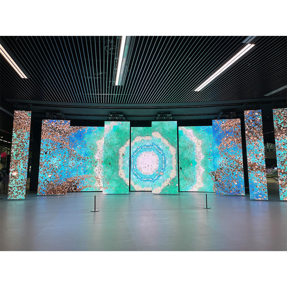
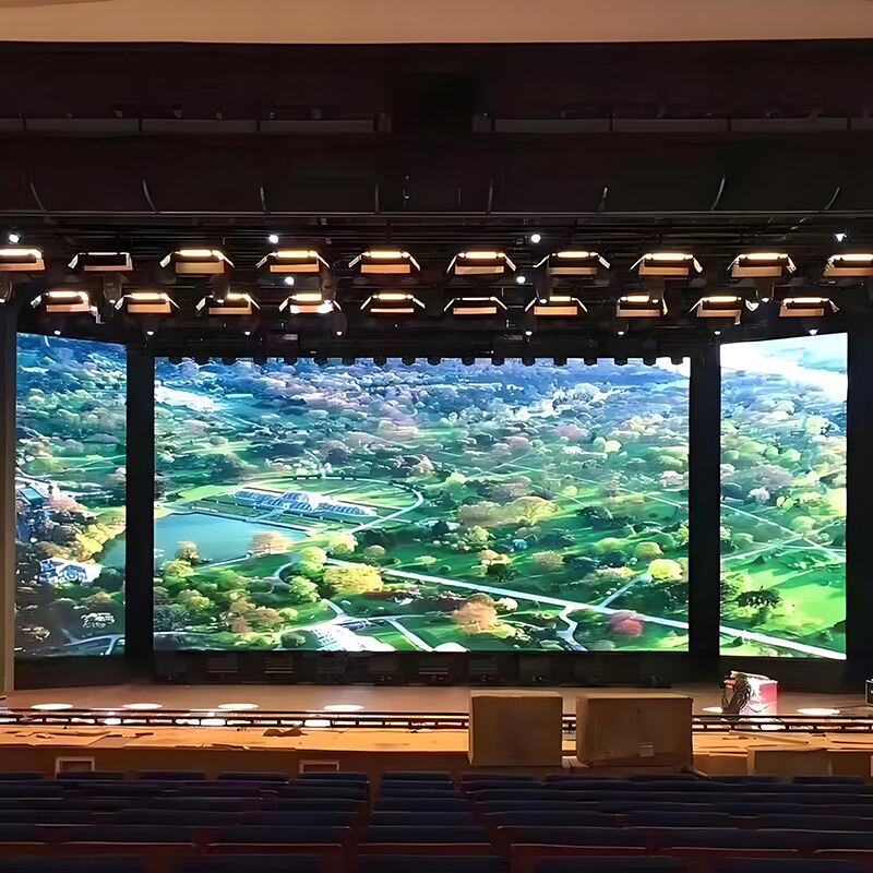
Scen fyra: salongen och scenen där sömmar blir synliga på fel sätt
Överväg nu ett rum som förändrar sitt karaktär när människor samlas.
Det kan vara en kyrkosalong, en evenemangshall, en företagsmöteslokal, en skolscen eller en flerfunktionell anläggning. Under dagen kan den användas för rutinmässiga möten. Vid vissa tillfällen måste rummet dock kännas dramatiskt mer levande. Musik börjar spelas. Belysningen förändras. En talare går upp på scenen. Videomaterial blir centralt snarare än stödjande.
I det slaget av utrymme spelar sömmar en annorlunda roll.
En färgskärm med paneler i en salong kan fortfarande visa innehåll. Ingen ifrågasätter det. Men så snart rörelse, framträdande, stämning och skala blir viktiga, slutar sömlinjerna att uppfattas som mindre tekniska detaljer. Istället uppfattas de som avbrott i själva evenemanget. En bakgrundsbild blir flera bakgrundsbilder. Ett levande visuellt ögonblick förlorar sin sammanhang vid exakt den tidpunkt då rummet ska kännas mest enhetligt.
Det är därför LED har blivit en så naturlig lösning för miljöer som är riktade mot scenen.
Webbplatsens sida för kyrkanskärmar stödjer den tolkningen på ett mycket konkret sätt. Den lyfter fram flera inomhusanvändningar, vägmontering, underhåll från framsidan, anpassning av bildförhållande och kameravänlig prestanda. Även utan att gå in på tekniska siffror visar sidan tydligt nyckelpunkten: denna kabinettlogik är utformad för utrymmen där en stor visuell yta måste fungera smärtfritt i verkliga miljöer, inte bara i en ren och prydlig försäljningsdiagram.
Det är särskilt viktigt i rum som fotograferas och filmscenas. När en scen en gång blir en del av livesändning, internt inspelning eller evenemangsdocumentation är displayen inte längre endast avsedd för de personer som sitter i rummet. Den blir också en del av hur rummet representeras på andra platser. Sammanhang är ännu viktigare i detta sammanhang.
Samtidigt bör jämförelsen förbli ärlig. Inte varje samlingsyta behöver LED med fin pitch. Om rummet främst visar texter, meddelanden, enkla presentationsbilder eller stora stödgrafik på längre avstånd bör systemet väljas med måtta. En scenvägg skapar endast värde när dess kapacitet motsvarar rummets verkliga användning. Överdimensionering hjälper ingen.
Det smartare argumentet för LED i scenmiljöer är inte överflöd, utan lämplighet. En sömlös yta är helt enkelt mer i linje med den visuella språket för livepresentationer än ett rutnät av paneler.
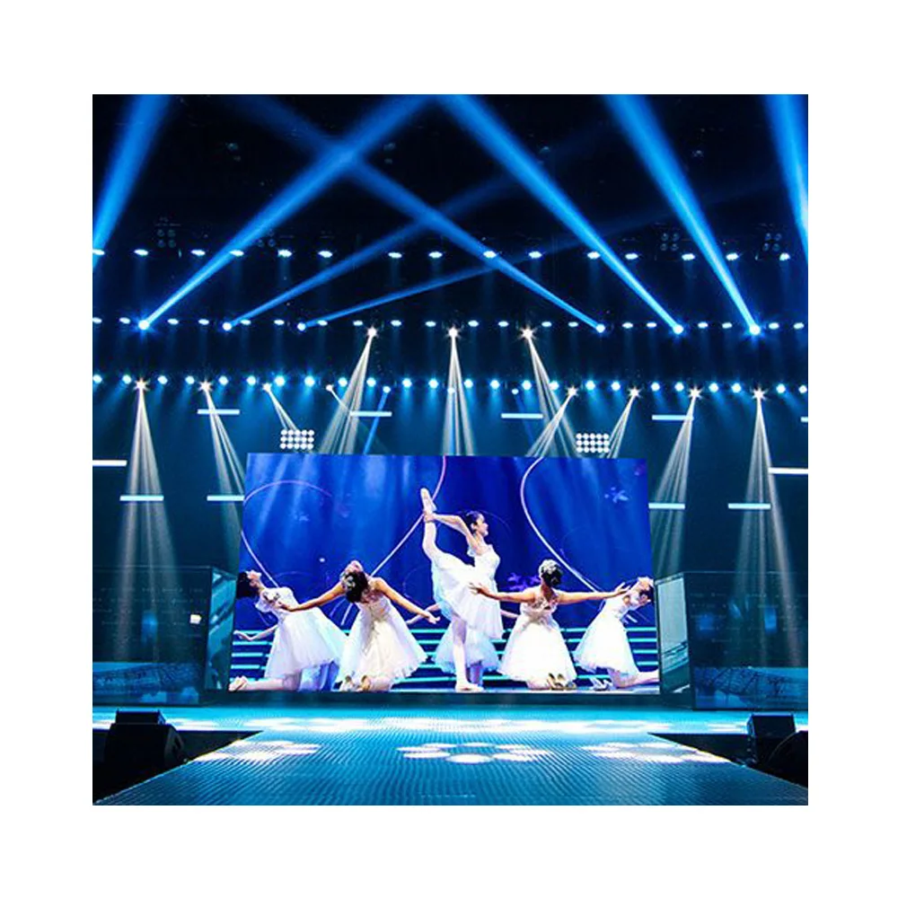
Denna scenstilbild passar här eftersom den visar anledningen till att LED blir övertygande i presentationstunga rum: väggen är en del av evenemanget, inte bara en monitor för det.
Det finns också en andra fördel som är viktigare än vad folk förväntar sig. En sömlös scenvägg förbättrar ofta rummet även när innehållet är enkelt. En statisk bakgrund, ett enda logotyp eller en mjuk miljöbild kan få hela evenemangslokalen att kännas mer genomtänkt. I den meningen hjälper LED inte bara när rummet är högljutt och dramatiskt. Den kan också hjälpa när rummet är lugnt och formellt.
Därför väljer så många multifunktionella lokaler att gå över till LED så snart displayen blir central för rummets identitet snarare än bara ett stödverktyg.
Scen fem: fasaden eller glasområdet där ”mer skärm” inte alltid är bättre
Det finns en ytterligare typ av affärsskärm som är värd att nämna, även om den ofta diskuteras separat.
Vissa utrymmen kräver både synlighet och öppenhet samtidigt.
Butiker med fönster, glasade kontorssidor, utställningsstrukturer och vissa utrymmen som är riktade mot transportmedel vill inte alltid ha en heltäckande bildyta. De vill ha digital påverkan utan att helt blockera genomskinligheten. Det är då transparent LED börjar komma in i diskussionen.
Sidans sida för transparenta displayar definierar denna kategori kring butiksutställningsfönster, glasstrukturer, utställningscentra, företagsbyggnader och transportknutpunkter. Den betonar naturligt ljus, bibehållen synlighet och direkt integration i miljöer med glasytor.
Detta är en viktig påminnelse, eftersom många team för snabbt går från ”vi behöver synlighet” till ”vi behöver en full vägg”. I vissa utrymmen är dock det bättre designsvaret inte en dominerande medieyta, utan ett lättare medielager som samverkar med arkitekturen.
Av det skälet bör en affärsmässig jämförelse inte fastna i en enkel binär LCD-mot-LED-jämförelse. Verkliga byggnader kräver ofta en bredare palett. En lobby kan behöva sömlösa LED-skärmar. Ett kontrollrum kan fortfarande föredra LCD. En korridor kan bättre tjänas av affischenheter. En glasfasad kan peka mot genomskinlighet snarare än fullständig täckning.
Den rätta jämförelsen är den som respekterar byggnaden i stället för att jämna ut varje utrymme till samma displaytyp.
LCD mot LED i enkelt affärsspråk
För att hålla beslutet praktiskt är det hjälpsamt att undvika specifikationsöverbelastning och istället jämföra de två alternativen utifrån verklig användarupplevelse.
| SPEC | Alternativ | Bäst för | Kostnadspåverkan | Anteckningar |
|---|---|---|---|---|
| Utrymmesstämning | LCD-videovägg | Standardmötesrum, informationsväggar, rutinmässiga driftoperationer | Vanligtvis lägre ingåndskostnad | Fungerar väl när skärmen kan förbli synligt plattad |
| Utrymmesstämning | LED-videoväggar | Premiumlobbys, scenvända rum, anpassade öppningar | Vanligtvis högre ingåndskostnad | Skapar ett mer arkitektoniskt och sammanhängande visuellt resultat |
| Innehållsstil | LCD-videovägg | Instrumentpaneler, fönster, uppdelade källor, strukturerade layouter | Lägre komplexitet i standardinställningar | Bäst när innehållet redan passar en panelrutnätslayout |
| Innehållsstil | LED-videoväggar | Varumärkesfilmer, rörliga bakgrunder, långa arbetsytor, evenemangsbackdropar | Kostnaden stiger med ambition och skala | Bättre när en oavbruten bild är avgörande |
| Formens flexibilitet | LCD-videovägg | Fastställda standardrektanglar | Lägre strukturell osäkerhet | Effektiv när öppningen matchar vanliga visningsförhållanden |
| Formens flexibilitet | LED-videoväggar | Anpassade bredder, integrerade väggar, funktionsytor | Större designfrihet, ofta mer designarbete | Värdefullt när arkitekturen ska styra skärmens form |
| Servicestrategi | LCD-videovägg | Känd logik för panelutbyte | Förutsägbar servicearbetsflöde | Lämpligt där bakre eller standardåtkomst är hanterbar |
| Servicestrategi | LED-videoväggar | Frontservice eller installationer med begränsat utrymme | Kan spara från långsiktiga underhållsproblem | Särskilt användbart när väggfack gör bakre åtkomst svår |
| Mindre distribuerad media | LED-plakatskärm | Korridorer, utställningsytor, tillfälliga kampanjer, distribuerad skyltning | Ger ofta mer flexibel användning av budgeten | Ibland ett bättre alternativ än vilken vägg som helst |
| Signal- och skalningsbehov | LCD eller LED | Beror på källans komplexitet | Kan öka systemkostnaden oavsett riktning | Vid LED blir valet av processor särskilt viktigt |
Syftet med denna tabell är inte att trycka allt mot LED. Det är att stoppa felaktiga jämförelser.
En standard-LCD-vägg kan fortfarande vara den smartaste lösningen i ett rum där ordning, välbekant layoutlogik och kontrollerad kostnad är viktiga. I själva verket kan det vara en slöseri att välja LED där bara för att det låter mer avancerat.
Samtidigt kan en sömlös LED-vägg rädda ett arkitektoniskt eller operativt koncept som aldrig skulle kännas rätt på ett panelnät. I dessa fall kan det bli den dyrare misstaget på lång sikt att insistera på LCD bara för att det första offertförslaget verkar enklare.
Den bästa affärsmässiga jämförelsen är alltså inte ”Vilken teknik är bäst?” utan ”Vilken teknik leder till färre kompromisser i just detta rum?”
Systemet bakom skärmen är viktigare än de flesta tror
Det finns en sista punkt som förtjänar större respekt i denna diskussion.
Displayen utgör aldrig hela systemet.
Det låter uppenbart, men många offertförslag behandlar fortfarande signalstyrning som en liten tillbehörsblock längst ner på sidan. I praktisk användning är det ett misstag. En svag signalväg kan snabbt omvandla en stark vägg till en irriterande vägg.
Processorsidan på webbplatsen förklarar logiken i enkla ord. Processorn sitter mellan källan och skärmen. Den hanterar signalomvandling, skalning, växling, flerskärmsbeteende och bildpresentation. Den är inte dekorativ. Den är funktionell. Samma sida pekar också på användningsområden såsom scenuthyrning, utomhusreklamskyltar, kyrkskärmar, sportdisplayar och väggar i operationscentraler. Detta utbud påminner oss om att olika rum kräver olika styrbeteenden, även om skärmkategorin låter liknande.
Detta är betydelsefullt på flera sätt.
I en scenmiljö är smidig växling och en genomarbetad presentationsflöde avgörande. I ett kontrollrum är stabilitet och tydlighet avgörande. I en butiksmiljö är innehållsschemaläggning och enkla uppdateringsrutiner avgörande. I en premiumlobby kan signalvägen kännas osynlig när den fungerar väl – vilket är precis syftet.
Därför bör valet av display alltid ställa en andra fråga efter frågan om skärmen: hur når innehållet faktiskt väggen, och hur kommer väggen att hanteras när den är i drift?
Om svaret på den frågan är vagt är offerten inte färdig.
En praktisk checklista innan offerten blir slutgiltig
Innan projektet godkänner den slutgiltiga riktningen skiljer denna checklista vanligtvis ett välgrundat beslut från ett överilat:
Definiera väggens huvudsakliga syfte i en mening.
Avgör om displayen är funktionell, arkitektonisk eller bådadera.
Bekräfta den typiska betraktningsavståndet och den närmaste troliga betraktningspunkten.
Notera om ramlinjer är acceptabla vid normal användning.
Granska öppningens storlek i förhållande till standardpanelutläggningar och anpassad skåpslogik.
Avgör om rummet behöver en visuell duk eller flera innehållsfönster.
Kontrollera om frontunderhåll krävs på grund av insänkningsdjup eller tillgänglighet från väggen.
Fråga om ett affischvisningsformat skulle lösa problemet mer elegant än en helvägg.
Granska signalflödet tidigt, särskilt om flera källor eller omkoppling är involverade.
Begär den exakta processorn eller styrvägen istället for en generisk tillbehörslinje.
Bekräfta om innehållet kommer att uppdateras ofta eller endast ibland.
Avgör om väggen måste förbli flexibel för framtida kampanjer eller ändringar av utformningen.
Granska installationsmetoden tillsammans med interiördesign och konstruktionsritningar.
Kontrollera om skärmen måste vara kameravänlig på grund av strömning, inspelning eller dokumentation av evenemang.
Se till att offerten återspeglar hur rummet faktiskt kommer att användas, inte bara hur rummet ser ut på en ritning.
Denna lista är avsiktligt enkel.
De dyraste misstagen är också enkla. De uppstår när displayen väljs innan utrymmet har beskrivits ordentligt.
Vanliga frågor
1) Är LCD fortfarande ett klokt val för affärsprojekt?
Ja. LCD är fortfarande mycket lämpligt för standardmässiga inomhusrum där strukturerat innehåll, förutsägbar layout och kontrollerad kostnad är viktigare än sömlös presentation. Det är fortfarande särskilt effektivt i miljöer med många instrumentpaneler, presentationsutrymmen och många informationsväggar där synliga panelindelningar inte är ett problem.
2) När motiverar LED den extra investeringen?
LED är vanligtvis lättare att motivera när väggen ska kännas som en del av arkitekturen, när öppningen är anpassad, när sömlös innehållsåtergivning är viktig eller när rummets visuella atmosfär är ett verkligt projektmål. I dessa fall är fördelen inte bara bildkvalitet – den innebär även designfrihet och bättre anpassning till utrymmet.
3) Utgör en affischdisplay verkligen en del av samma diskussion?
Absolut. Många affärsutrymmen behöver inte alls en permanent vägg i stort format. En affischdisplay kan vara det mer intelligenta valet i korridorer, butiksområden, mässlayouter och distribuerade skyltplaner. Platsens affischsida gör denna flexibilitet mycket tydlig genom användningsfall för fristående, kombinerade, hängande och väggmonterade lösningar.
4) Varför tas styrsystem upp i en blogg om vägguval?
Eftersom en imponerande skärm fortfarande kan bli svår att leva med om signalvägen är svag eller klumpig. Processorn påverkar växling, skalning, kompatibilitet med källor och daglig användning. Det gör den till en del av urvalskriterierna, inte något som ska döljas längst ner i offerten.
5) Vad är det säkraste sättet att jämföra LCD och LED utan att köpa för mycket?
Börja med rummet och innehållet, inte med teknikbeteckningen. Om rummet kräver struktur och bekantskap kan LCD fortfarande vara rätt val. Om det kräver kontinuitet, starkare närvaro eller mer frihet i formen blir LED mer övertygande. Om rummet kräver flexibel distribuerad media kan affischprodukter vara det smartare valet.
Slutsats
Ett bra displaybeslut känns förvånande mänskligt så snart jämförelsen är gjord på rätt sätt.
Lobbyn bör kännas mer avsiktlig, inte bara dyrare. Kontrollrummet bör kännas tydligare, inte bara större. Korridoren bör kännas mer levande, inte mer trängd. Scenen bör kännas mer enhetlig, inte mer teknisk. Därför vinner de bästa projekten sällan genom den längsta parametrarlistan. De vinner genom den tydligaste förståelsen av hur ett rum faktiskt används.
För team som just nu jämför leverantörer av videoväggar , bör nästa steg vara praktiskt: begär ett offert, fråga efter kontrollvägen, bekräfta installationsmetoden och granska om utrymmet verkligen behöver en LCD-vägg, en sömlös LED-vägg eller en mer flexibel produktlösning, till exempel affischdisplay. De mest relevanta startsidorna är fortfarande LED-videoväggar , videovägg , och kontaktsidan .