Den tidigare utkastet täckte rätt specifikationer, men lät lite "sammanställt", och urvalsstegen behövde mer detaljerad information om arbetsplatsen.
Föreställ dig ett möte klockan 09:05: persiennerna är halvvägs öppna, taklamporna är fortfarande på, någon delar ett kalkylblad och rummet blir tyst eftersom siffrorna inte går att läsa från baksidan. Det är just den stunden då en inomhus LED-skärm antingen visar sitt värde eller blir en dyr vägdekoration. Målet med den här guiden är enkelt: välj en inomhus-LED-skärm som ser skarp ut vid den verkliga betraktningsavståndet, förblir ren även vid låg ljusstyrka, fungerar bra i kamerabilder och inte orsakar underhållsproblem sex månader senare. Ingen teoriladdning. Bara de beslut som faktiskt driver projektet framåt – pixelpitch, förpackning (SMD/COB/GOB), ljusstyrka och dimning, kabinetter och underhållsåtkomst, processorn/signalkedjan samt installationsdetaljerna som avgör om väggen känns "färdig".
1) Börja med rummet: tre mått som är viktigare än broschyren
De flesta inomhus-LED-skärmar misslyckas av en tråkig anledning: rummet mättes aldrig korrekt.
Mätning A: närmaste och längsta betraktningsavstånd
Skriv ner två siffror i meter:
Närmaste betraktningsavstånd (den närmaste platsen att sitta eller stå)
Längsta betraktningsavstånd (baksidan, korridoren, entréns trafikflöde)
Ett vanligt mönster för inomhusanvändning ser ut så här: 2,5 m närmast, 10 m längst bort. Denna spridning påverkar valet av pixelpitch och hur ”fin” väggen behöver vara.
Mätning B: den "sidovinklade platsen"
Välj en plats till sidan – 30° till 45° från centrum – och notera om den platsen är viktig (platserna vid sidan av ett styrelserum är oftast det). Vid moderna väggar är breda betraktningsvinklar vanliga, men sidoplatserna avslöjar ofta uniformitetsproblem först.
Mätning C: omgivande ljus och reflektioner
Klockan 14.00 kontrollerar du om solljuset träffar väggen direkt eller om blanka golv kastar reflektioner uppåt. Entréer med glas kan vara tillräckligt ljusa för att minska kontrasten, även om ljusstyrkan i specifikationerna verkar ”hög”. Antireflektionsbeteende och stabil prestanda vid låg ljusstyrka är lika viktiga som maximal ljusstyrka (nits).
2) Pixelpitch handlar inte om ”4K”. Det handlar om läsbarhet på den verkliga avståndet
Här är det praktiska ställningstagandet: pixelpitch bör väljas utifrån den närmaste meningsfulla betraktaravståndet och den innehållstyp som innehåller mest text. Video-loopar är generösa. Kalkylblad är det inte.
Team frågar ofta: ”Bör pixelpitchen vara så liten som möjligt?” Den vanliga misstaget första gången är att investera stort i en extremt fin pixelpitch, men sedan mata den med en svag 1080p-signalkedja, vilket gör att skalning suddar ut allt ändå. Pixelpitch är bara en del av klarheten.
Pixelpitch jämfört med betraktaravstånd och innehåll (snabbvalstabell)
| Typiskt betraktaravstånd (närmaste) | Innehållsstil som dominerar | Rekommenderat pixelpitchområde (vanligt för inomhus) | Anteckningar från verkliga installationer |
|---|---|---|---|
| 1,2–2 m | Täta texter, användargränssnittsöversikter, handels-/styrpaneler | P0,9–P1,2 | Fungerar bäst med kraftfull bearbetning och noggrann kalibrering; liten teckensnittsstorlek förblir stabil. |
| 2–3 m | Presentationer + kalkylblad + videomöten | P1,2–P1,8 | ”Mötesrummets guldiga punkt” för läsbarhet utan onödiga utgifter. |
| 3–4 m | Blandat innehåll, mer video, ibland text | P1,8–P2,5 | Lämpligt för utbildningsrum och medelstora rum; text kräver rimlig mallstorlek. |
| 4–6 m | Varumärkesvideo + evenemangsbilder, mindre fin text | P2,5–P3 | Verkar skarpt från mitt i rummet; undvik små undertexter. |
| 6–10 m | Stora visuella element, scen-IMAG, flerändamålsal | P3–P4 | Ofta kombinerat med evenemangsinspirerad samling och snabbare installationsarbetsflöden. |
| 10 m+ | Stora bakgrundsbilder, enkel budskapsförmedling | P4–P5 | Inomhusanvändning är sällsynt på denna pitch om inte väggen är mycket stor och betraktarna befinner sig långt borta. |
Om en inomhusvägg främst används för att visa Excel-rader och små diagrametiketter bör du rikta in dig mot den tätare änden av intervallet. Om den istället används för varumärkesloopar och stort typsnitt kan en något större pitch ofta se lika ”premium” ut på vanliga avstånd.
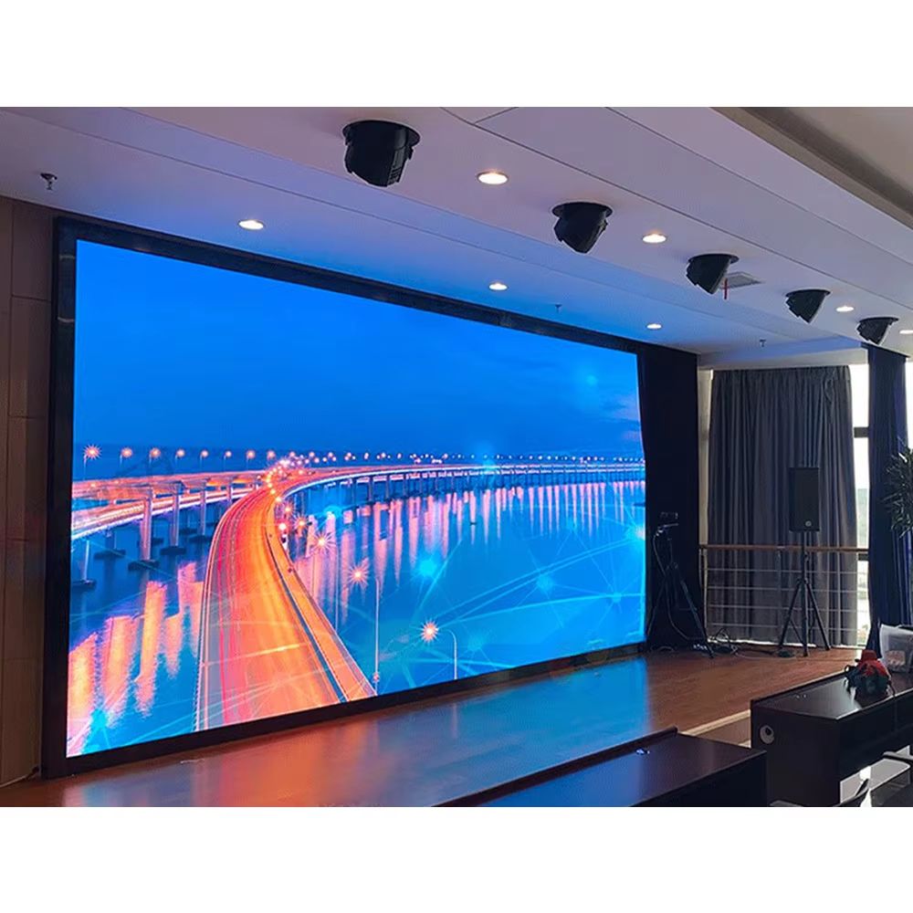
Bildtext: Vid nära inomhusbetraktning är det där fin pitch och ytbearbetning visar sitt värde – små detaljer förblir släta istället for att se ”gnistrande” ut.
Var man ska leta på webbplatsen efter alternativ med fin pitch
För projekt som lutar mot nära betraktning och textintensiv användning är UHD liten pixel LED-skärm produktgruppen den rätta utgångspunkten.
3) Förpackning och yta: SMD vs COB vs GOB (vad var och en är bra för inomhus)
Skärmens framsida är inte bara ”LED-lampor.” Den är också ytan som trycks på, rengörs, ibland stöts av en rulltrappa och stirras på under nedåtriktade belysningsarmaturer.
Här är beslutslogiken som oftast håller:
SMD (Surface-Mounted Device): flexibel, välbekant och kostnadseffektiv
Bäst lämpad för inomhusanvändning
Mötesrum och utbildningsrum där avståndet till skärmen inte är extremt litet
Lobbyer där risken för beröring är låg (ingen trängsel som lutar sig mot väggen)
Installationer där snabb service och tillgänglighet av reservdelar är viktiga
Vad som visas på plats
SMD är vanligtvis det ”arbetshäst”-val som görs när budgeten måste hållas rimlig.
Det är också i många fall enklare att reparera på modulnivå, vilket underlättar den långsiktiga driften.
Varningar
Vid mycket nära betraktning kan en ”kornig” effekt bli synlig.
Högre risk för vidröring (barn, trafikerade korridorer) kan leda till mer ytskada över tid.
COB och GOB diskuteras ofta som hållbarhetsförbättringar inom samma familj av jämförelser.
COB (Chip-on-Board): slätare ytkänsla, starkare vid nära betraktning
Bäst lämpad för inomhusanvändning
Konferensrum och kontrollrumliknande utrymmen där åskådare sitter nära
Utställningshallar där premiumutseende är viktigt och belysningen är reglerad
Studio-miljöer där kamerabeteende och rena tonåskningar är avgörande
Varför team väljer det
COB väljs ofta för täta pixelpitch och en slätare uppenbar bild vid nära avstånd. Ytan kan se mer enhetlig ut eftersom paketeringen skiljer sig från den traditionella lamptypens placering.
Varningar
Det kan kosta mer från början.
När väggen är stor och innehållet inte är texttungt kan premiumkostnaden inte märkas på normala avstånd.
GOB (Glue-on-Board): extra skydd vid högre risk för beröring eller stötar
Bäst lämpad för inomhusanvändning
Butikskorridorer och utrymmen med offentlig tillträde där oavsiktlig kontakt är vanlig
Installationer där rengöring sker ofta (fingeravtryck, damm, smudgar)
Platser med högre risk för stötar från utrustningsrörelser
Varför team väljer det
Den extra skyddande lagret förbättrar hållbarheten och ytskyddet. I ”livliga” miljöer minskar detta små fel och ytskador över tid.
Varningar
Vissa ytor kan ändra sitt reflektionsbeteende, så anti-bländningsegenskaperna bör kontrolleras i kombination med rummets belysning.
Reparationer kan skilja sig åt beroende på implementeringen.
En snabb regel för att "anpassa ytan till rummet"
Täta säten + tung text → COB är ofta värt att överväga.
Livligt allmänt område + risk för vidröring → GOB är vanligtvis det lugnare långsiktiga valet.
Vanliga mötesutrymmen + balanserad budget → SMD förblir ett starkt basalternativ.
4) Ljusstyrka och dimning: ljusstark gråskala med låg ljusstyrka är den verkliga kvalitetstestet för inomhusanvändning
Inomhusljusstyrkan är missförstådd. Maximal ljusstyrka ser imponerande ut, men inomhuskomfort handlar om kontroll.
Typiska inomhusljusstyrkor (realistisk terminologi)
Många inomhusväggar fungerar bekvämt i området ~600–1200 nit i daglig användning, beroende på rummets belysning. Vissa produktspecifikationer anger värden runt detta intervall för inomhusprodukter.
Lobbyer med mycket dagsljus behöver ibland extra marginal, men väggen måste fortfarande se bra ut när den dimmas ner på kvällen.
Det som ofta missas: lågbelyst gråskala
En vanlig klagomål på plats lyder ungefär så här: "Väggen ser utmärkt ut vid 80 % ljusstyrka, men faller isär vid 15 %."
Det är oftast ett problem med mörkgrå nyanser:
Svarta nyanser lyfts upp till mörkgrå
Detaljer nära svart sammanpressas
Hudtoner ser plastliknande ut vid videomöten
Gradientband
Ett enkelt igångsättningsprov hjälper: ladda en gråskala-ramp från 0–100 % och sänk ljusstyrkan till den nivå som används för möten. Om stegen mellan 2 %, 4 % och 6 % är synliga och stabila är väggen på rätt spår.
Stabilitet i färgtemperatur
Inomhusutrymmen ställer ofta in skärmar kring en neutral vitpunkt (vanligtvis 6500 K i AV-arbetsflöden), men den viktigare delen är håll dig konsekvent :
Om en vägg blir varmare vid låg ljusstyrka börjar varumärkesgrafik se ”fel” ut
Om den blir kallare under starka nedåtriktade belysningsarmaturer upplevs vita nyanser som hårda
Anti-reflektions- och bländningsskydd
En lobby kan ensamt förstöra en utmärkt LED-vägg genom reflektioner. När bländningen är stark ger förbättrad anti-reflektionsprestanda ofta ett subjektivt intryck av ökad kontrast, även om ljusstyrkan förblir densamma.
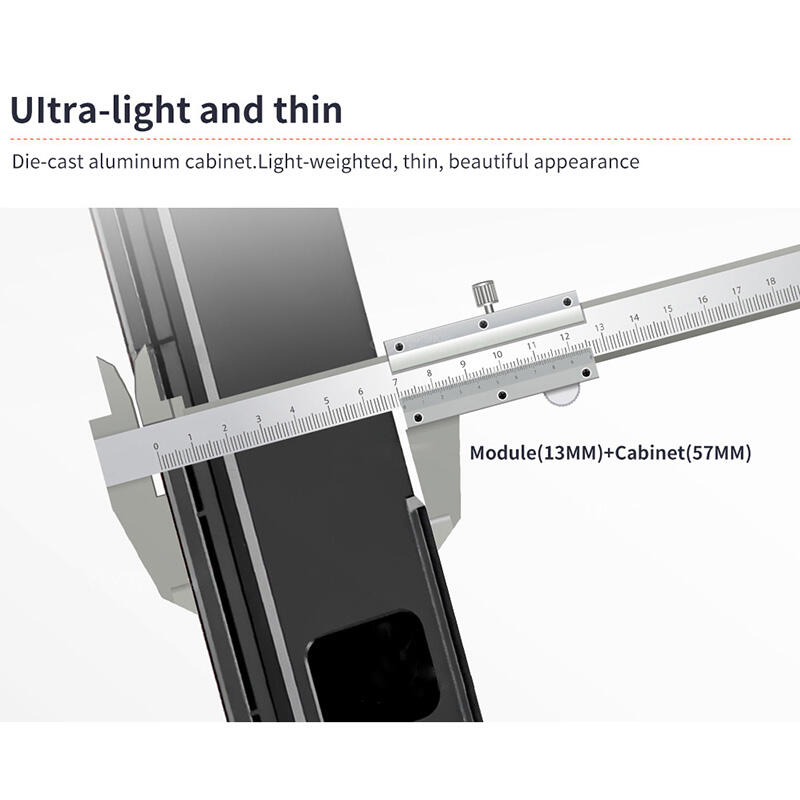
Bildtext: Skåpets djup påverkar hur ren väggen kan integreras i inredningen och om frontunderhåll är realistiskt utan att bygga en djup underhållsugn.
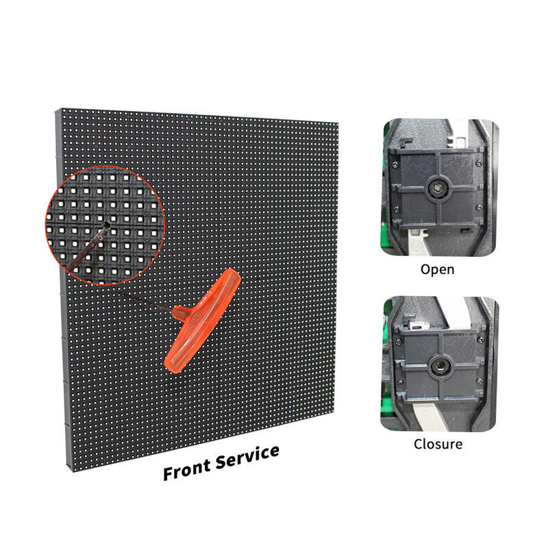
5) Skåp, underhållsåtkomst och konstruktion: vad avgör långsiktiga problem
Väggen kan se perfekt ut på första dagen och ändå vara en dålig konstruktion om underhållsåtkomsten är fel.
Frontunderhåll jämfört med bakkunderhåll (och varför inre djup förändrar allt)
Frontservice hjälper när det inte finns utrymme bakom väggen. Det behåller också rummets layout enkel – ingen bakkunderhållskorridor, ingen dold åtkomstdörr i en lobbyavslutning. Många inomhusprodukter anger frontunderhåll som underhållsmetod.
Bakservice kan fortfarande fungera väl, särskilt när en underhållskorridor finns och väggen är stor. Den är oftast mer tolererande för kabelföring och luftflöde, men kräver utrymme.
Inredningsarkitekter bryr sig om väggens djup av en anledning. En skillnad på 50–80 mm kan avgöra om skärmen sitter jämnt eller verkar ”sväva” från väggen.
Planhet och fogdisципlin
På byggarbetsplatsen handlar striden vanligtvis om millimeter:
Ram inte helt horisontell
Vägyta ojämn
Skåp åtdragna hårt i ett hörn men inte i ett annat
När sömmar inte är justerade förstärks reflexerna detta. Under nedåtriktade armaturer framträder även små feljusteringar som konturlinjer.
Brus och termiskt beteende (mötesrum och studior är känslomässigt särskilt känslomässiga)
I tysta rum blir fläktnöjen ett verkligt problem efter 20–30 minuter. Om utrymmet används för inspelning, livestreaming eller innehåller känslomässiga mikrofoner är både termisk och akustisk planering avgörande:
Håll luftflödesvägarna rena
Undvik att blockera ventiler med dekorativa lister
Sprid effekttätheten istället for att koncentrera den till en enda zon
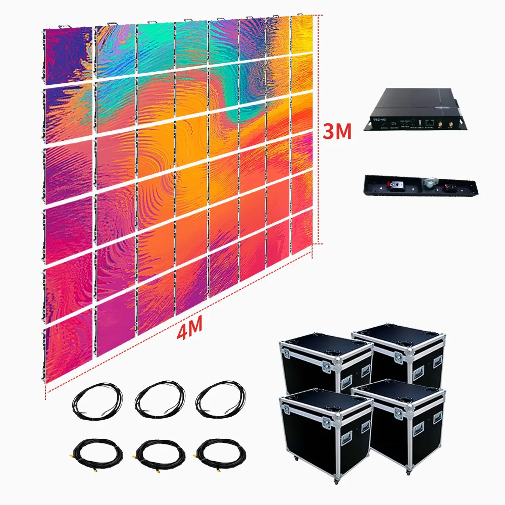
En praktisk referens för produktfamiljen
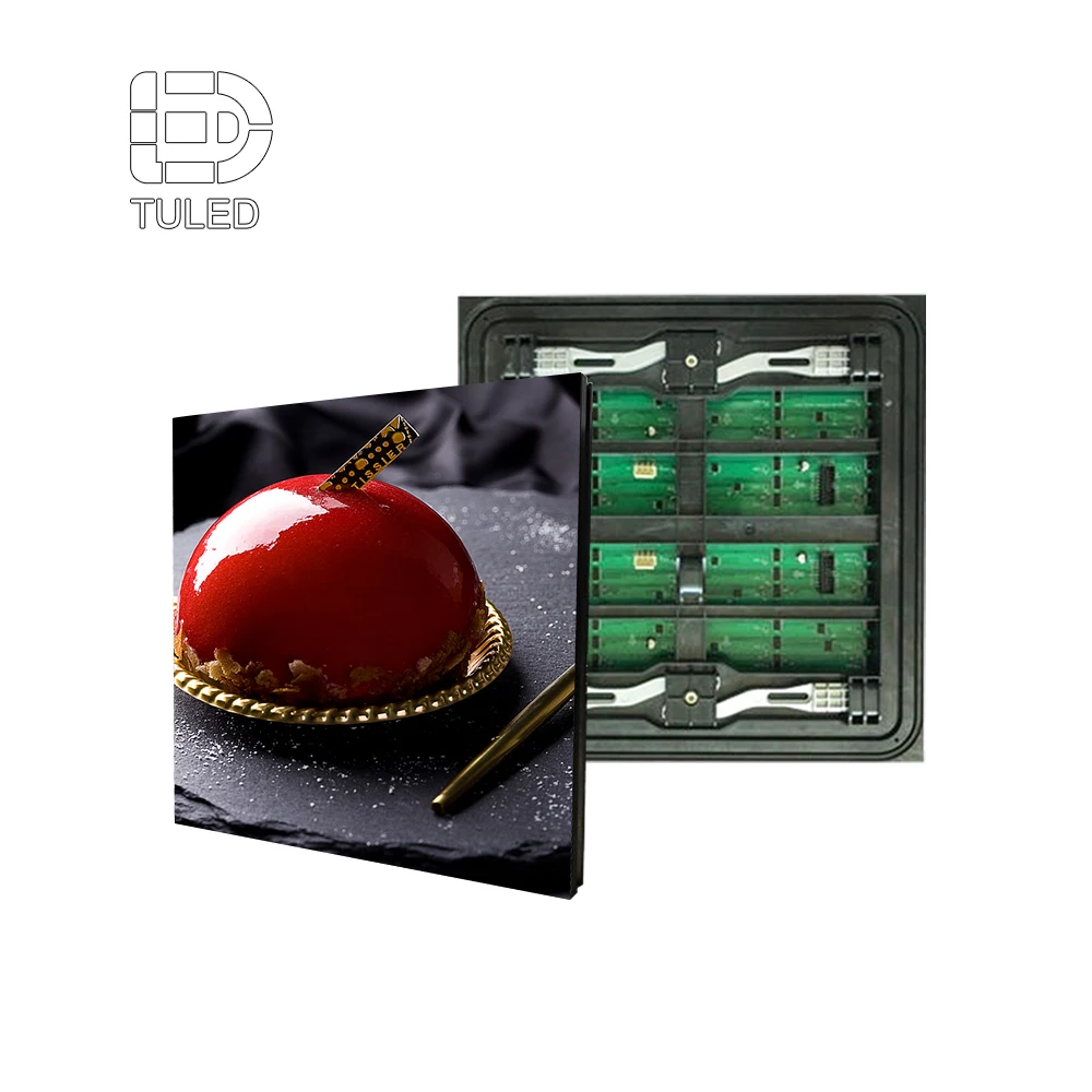
Den 640*480 LED-skärm kategorin är ett av de inomhusmonterade skåpformaten som visas på webbplatsen och är användbar vid diskussioner om modulär inomhusväggsmontage och planering av underhåll från framsidan.
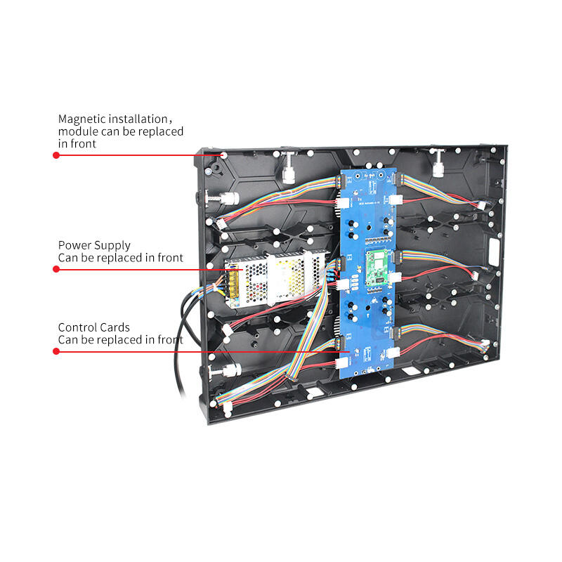
Bildtext: Underhållsdesignen syns i layouten på baksidan av skåpet – komponenter som kan bytas ut från framsidan kan minska driftstopp när utrymmet är begränsat.
6) Signalvägen och processorn: där 'skarpa' detaljer ofta går förlorade
En skarp panel kan fortfarande se mjuk ut om signalkedjan är oordnad. Detta är ett av de vanligaste scenarierna där det "såg bättre ut i demonstrationen".
Vanliga inmatningar för inomhusmiljöer som förekommer i verkliga projekt
HDMI från bärbara datorer
DisplayPort (DP) från arbetsstationer
USB-C / Type-C via dockningsstationer
Beräkningsenheter för konferensrum / mötesvärdboxar
Signage-uppspelningsboxar för schemalagd innehåll
Det är normalt att ha fyra källor för en vägg. Väggen måste växla renligen och behålla en konsekvent skalning.
Upplösningsmismatch: den klassiska frågan "varför ser texten suddig ut?"
Detta uppstår ständigt:
LED-väggens inbyggda pixellayout är inte 1920×1080
En bärbar dator skickar ut 1080p
Processorn skalar upp dåligt
Kanterna på text blir mjukare, tunna linjer flimrar
Lösningar innebär vanligtvis:
Att ställa in en källa som skickar ut en upplösning som matchar väggens arbetsyta bättre
Att använda en processor med bättre skalnings- och mappningsverktyg
Designa innehållsmallar som matchar den faktiska pixelmappningen
Bildfrekvens- och synkroniseringsproblem
Ett annat verkligt problem:
Laptopen genererar 59,94 Hz
Mediaspelaren genererar 60 Hz
Kamerabildens frekvens är 50 Hz (i vissa regioner)
Processorn försöker hålla synkroniseringen, men rörelsen verkar ”fel”
Även om skillnaden är liten kan LED-väggar avslöja den. Att låsa hela kedjan till en konsekvent uppdateringsstrategi undviker slumpmässig stamning.
EDID: tråkigt, men nödvändigt
EDID orsakar mycket tyst smärta:
Datorn identifierar felaktig EDID och väljer en ovanlig upplösning
Signalen avbryts vid växling
En presentation startar med svarta balkar eller beskurna kanter
Bra processorer gör att EDID kan hanteras avsiktligt i stället för att lämnas åt slumpen.
Transport på långt avstånd: ett rent tillvägagångssätt
När utrustningsracken befinner sig långt borta – 30 m, 50 m, ibland ännu längre – kräver signalen en plan:
Fiber-HDMI/DP-förstärkare för långa sträckor
SDI-arbetsflöden för sändningsliknande miljöer
Nätverksbaserad videotransport när strukturerad kablingsinfrastruktur redan ingår i platsens design
Nyckeln är konsekvens: en metod, testad från ände till ände, med reservdelar till hands.
En webblänk för processorer och styrdon
Produktkatalogen innehåller Videoprocessor som en tillbehörskategori, och den är en användbar referenspunkt vid planering av växling, skalning och mappning.
7) Installationsingenjörsarbete: vad som fastställs innan den första skåpet monteras
Det är här projekt tyst och stilla vinner eller förlorar.
Struktur och last
Innan LED anländer måste väggen ha svar på följande frågor:
Var går lasten – betong, stålprofiler, ett särskilt konstruerat fackverk?
Vad är den tillåtna punktlasten per ankare?
Rör sig väggen eller vibrerar den (i närheten av dörrar, hissar, maskinrum)?
Ett vanligt misstag för nybörjare är att anta att "det är bara en skärm." Stora LED-väggar beter sig snarare som arkitektoniska konstruktioner.
Underhållstillträde påverkar arkitekturen
Frontunderhåll minskar vanligtvis kraven på djup, men kräver ändå:
Ett rent sätt att dra ut moduler
Utrymme för att hantera verktyg utan att skada ytor
En plan för "var modulen placeras" när den tas bort (vagn, bord, skyddande skum)
Bakunderhåll kräver korridorutrymme, åtkomstdörrar och belysning bakom väggen.
Strömförsörjningsplanering och kretsar
Strömbesläktade problem brukar ofta läggas på displayen, trots att den verkliga orsaken är bristfällig kretsförplanering.
Fördela strömförsörjningen över flera kretsar så att ett avbrott inte stänger av hela väggen
Märk tydligt kretsarna i racken och vid distributionspunkten
Planera för inrush- och toppbelastningsögonblick
Grundläggande redundansidéer som faktiskt hjälper
Ingen behov av exotisk redundans. Några enkla åtgärder räcker långt:
Reservmottagarkort och reservströmförsörjningar på plats
Dubbla signalvägar där processorn stödjer detta
Två oberoende uppspelningsenheter för skyltloopar (huvud + reserv)
En reservingång som kan visa ett statiskt "systemmeddelande" om en primär enhet går sönder
8) Hur du spenderar budgeten så att väggen ser dyr ut (även om den inte är det)
Priserna varierar för mycket för att ange rimliga citat här, så detta avsnitt fokuserar på prioritering.
När budgeten är knapp
Det bästa "värde"-baserade tillvägagångssättet ser vanligtvis ut så här:
Välj pixelpitch baserat på närmaste betraktningsavstånd , inte för att imponera
Investera i en ren processor-/skalningsväg istället for att jaga ultrafin pitch
Lägg ner möda på platt struktur och justering (dålig planhet förstör allt)
Håll fast reservdelar för de få delar som förhindrar att väggen fungerar
En vägg som är platt, välkartlagd och välkalibrerad ser ofta bättre ut än en vägg med finare pitch men svag signalväg.
När budgeten är bekväm
Det är här uppgraderingar faktiskt känns meningsfulla:
Överväga COB för närvyning, premiumutrymmen
Överväga GOB i offentliga utrymmen med risk för beröring och rengöring
Uppgradera processorer för bättre skalning, inmatningshantering och EDID-styrning
Lägg till redundans och reservmoduler för att minska risken för driftstopp
Budgetera tid för igångkörning: gråskalekontroller, kamerakontroller, enhetlighetskontroller
En naturlig produktnotering (inte en hård försäljningspitch)
För ett inomhusprojekt som kombinerar mötesanvändning och skyltning täcker platsens inomhusfamiljer— UHD liten pixel LED-skärm , 640*480 LED-skärm , samt kontrolltillbehör som Videoprocessor —de typiska byggstenarna utan att skapa anpassade "mysteriemodeller."
9) Vanliga fallgropar som uppstår vid första gången man genomför ett inomhusprojekt (verkliga, specifika)
Att välja pitch utifrån "HD"-språket istället för sittavstånd. Väggen ser fantastisk ut på nära håll i utställningsrummet, men installeras sedan i ett rum där den närmaste åskådaren befinner sig 6 meter bort, och den extra kostnaden ger inget märkbart resultat.
Att bortse från prestanda vid låg ljusstyrka. Ljusstark demonstrationsinnehåll döljer problem. Den första allvarliga mötet körs vid 15–25 % ljusstyrka, och tonskalor visar banding, svarta nyanser lyfts och ansikten ser felaktiga ut.
Att låta laptoppen diktera upplösningen. Väggen slutar köras med en icke-matchande arbetsyta, och text skalas två gånger (en gång av operativsystemet, en gång av processorn).
Ingen EDID-plan. Olika bärbara datorer visar olika upplösningar. En dag fungerar det, nästa dag är inmatningen beskuren eller har breddband.
Struktur byggd "nästan platt". Ett par millimeter ramvariation kan leda till synliga fogar under nedåtriktade lampor. Människor fäster mer uppmärksamhet vid fogar än vid innehållet.
Glömma åtkomst för service. En dekorativ väggyta hindrar modulernas borttagning. Utbytet av den första modulen blir ett byggprojekt.
Underskatta buller. En vägg som låter bra i ett lager blir irriterande i ett mötesrum efter 30 minuter.
Ingen strategi för reservdelar. Ett litet fel leder till en lång driftstoppperiod eftersom ersättningsdelar inte finns på plats.
10) Valchecklista (kopierings-/klistringsvänlig, färdig för upphandling)
Använd denna lista innan du godkänner någon inomhus-LED-skärm:
Närmaste och längsta betraktningsavstånd registrerat (meter).
Primära innehållstyper rankad (texttung / blandad / videodominerande).
Kameranvändning bekräftad (ingen / gelegent / frekvent inspelning eller livestreaming).
Målområde för pixelpitch vald utifrån närmaste meningsfulla betraktare.
Ytval beslutad: SMD vs COB vs GOB baserat på avstånd + risk för beröring.
Ljusstyrkeplan skriven: typisk dagsnivå + kvällsnivå + metod för test vid låg ljusstyrka.
Godkännandetest för låg gråskala definierad (ramp + nästan-svarta fält).
Plan för anti-reflektion övervägd (belysningens riktning, blanka golv, fönster).
Upplösning för väggkanvas dokumenterad (inbyggd pixellayout + avsedda innehållsmallar).
Krav på processor listad (ingångar, växling, skalningskvalitet, EDID-styrning).
Signaltransportplan inställd (kort sträcka / förlängare / fiber / rackplacering).
Bildfrekvensstrategi fastställd (konsekvent Hz över källor där det är möjligt).
Underhållsåtkomst bekräftad (framservice vs bakservice, frihöjd, verktyg).
Konstruktion och lastväg utformad (ankrar, skruvar, stål, fackverk).
Strömfördelning och kretsar planerad (etikettering, lastbalansering, skydd).
Jordning och kabelföring planerad (rena vägar, dragavlastning, separation).
Plan för störningar och värme granskad (rumskänslighet, luftflöde, detaljer i inredning).
Reservdelspaket definierad (moduler, strömförsörjningsenhet, mottagarkort, kablar).
Driftsättningsschecklista schemalagd (enhetslighet, kameratest, ingångsväxling).
Överlämning till drift planerad (innehållsarbetsflöde, ljusstyrkeschema, grundläggande utbildning).
11) Tre vanliga inomhusuppsättningar och hur de vanligtvis konfigureras
Detta avsnitt fokuserar på praktiken: avstånd, innehåll, pitchområde, ytväljning, installationsstil, processor/spelning och underhållsanmärkningar. Produktreferenser återfinns fortfarande inom webbplatsens verkliga kategorier.
A) Mötesrum / utbildningsrum (text och tabeller hela dagen)
Typavstånd för visning: närmast 2–3 m, längst bort 6–10 m
Innehållens beteende: presentationer, kalkylblad, gränssnittsdemonstrationer, videomöten, tillfälliga videor
Rekommenderat pixelpitchområde: ungefär P1,2–P1,8
Ytval:
COB om platserna ligger mycket nära varandra och rummet är premium
SMD om avståndet är måttligt och väggen kräver kostnadskontroll
Installationsansats: väggmonterad, strikt planhetsnoggrannhet, frontunderhåll föredras när utrymmet är begränsat.
Processor och uppspelning:
Processor med pålitlig skalning och EDID-hantering (HDMI- och DP/Type-C-källor är vanliga)
En rumsdator eller mötesvärdbox för liveinnehåll, samt en skyltspelare för inaktivitetsloopar
Underhållsnoteringar:
Håll reservmoduler och en reservmottagarkort nära racken
Schemalägg en kvartalsvis enhetlighetskontroll om väggen används dagligen
Platsreferenser:
Finkorniga alternativ: UHD liten pixel LED-skärm
Kabinettformatalternativ: 640*480 LED-skärm
En andra plats där en inomhus LED-skärm skapar värde i mötesrum är enkelt: färre 'zooma in'-ögonblick, mindre ögonbelastning och renare kamerabilder vid hybridmöten.
B) Entréer / utställningsytor (varumärkesvideo + informationspublicering)
Typavstånd för visning: närmaste 3–6 m, längsta 10–20 m (flödet i entrén kan vara brett)
Innehållens beteende: varumärkesloopar, kampanjvideor, vägvisning, scheman, produktbilder
Rekommenderat pixelpitchområde: ungefär P1,8–P3 (beroende på hur nära personer står)
Ytval:
GOB när väggen ligger i en offentlig gångväg med risk för beröring/rengöring
SMD för de flesta standardentréväggar
COB för premiumutställningsytor där personer står nära och granskar detaljer
Installationsansats: vägmonterad med genomtänkt belysningsplanering. Om glas ingår bör anti-reflektionsbeteende prioriteras samt stabil dimning på natten.
Processor och uppspelning:
En skyltspelarbox med schemaläggning (dagliga loopar, säsongsspecifika kampanjer)
Processor om flera direkta ingångar finns (evenemang, lanseringar, besökande presentationer)
Underhållsnoteringar:
Rengöringsplanen bör anpassas efter ytväljningen; offentliga utrymmen får fingeravtryck
Håll ljusstyrkan schemalagd konsekvent så att väggen inte kör på "fullt tryck" på natten
Platsreferenser:
Alternativ för skyltning i affischstil: Digital led-skylt
Referens för videoväggskategori: Videoväggpaneler
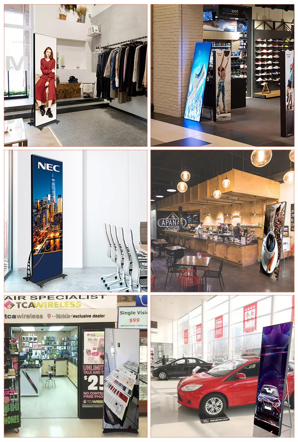
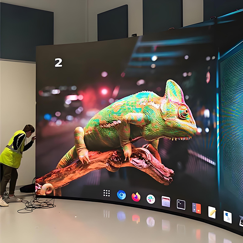
Bildtext: Skärmar i affischstil fungerar väl nära ingångar och korridorer – innehållsaktualiseringar kan förbli enkla samtidigt som de ser genomarbetade ut.
C) Inspelnings-/live-streaming-/studiorum (kameravänlighet är icke-förhandlingsbart)
Typavstånd för visning: närmaste 1,5–4 m, längsta avståndet 6–12 m
Innehållens beteende: bakgrunder för kamerabilder, överlägg, grafik, liveomkoppling, gradienter
Rekommenderat pixelpitchområde: ungefär P0,9–P1,8 (beror på kamerans bildramning och avstånd)
Ytval:
COB föredras ofta för en jämnare utseende och närvåning i studioliknande miljöer
GOB kan vara rimligt vid frekvent hantering, även om reflexegenskaperna måste kontrolleras
Installationsansats: väggmonterad eller inscenarad vägg med strikt planhet och ren kabelföring. Bullerstyrning är viktig – mikrofoner fångar upp allt.
Processor och uppspelning:
En kraftfull processor och en konsekvent bildfrekvensplan (undvik blandade 50/60 Hz-kedjor när det är möjligt)
Planera signaltransporten ordentligt om racken ligger långt borta (fiberlösningar är vanliga i studior)
Underhållsnoteringar:
Kameratest är en del av igångsättningen: gråskala-rampor, rörliga staplar och verklig kameraexponering
Håll reservstyrkort och ett reservmodul på plats; studior avskyr driftstopp
12) Målspecifika hallar och ”evenemangs-dagar”: låna turnéns disciplin
Vissa inomhusutrymmen fungerar så här: nyckeltalstal på tisdag, prisutdelning på fredag, gemenskapsvisning på lördag. Det är där disciplin i evenemangsformat kommer till nytta.
Två aspekter av turnébaserat tänkande översätts perfekt till inomhusmiljöer:
Snabb, upprepelig montering och kartläggningskontroller
Ett snabbt visuellt testrutnät innan dörrarna öppnas
Det är exakt den inställningen som används kring konstledskärmar —väggen måste se rätt ut under tryck, och att växla mellan källor får inte vara en gåta.
I multifunktionella salar följer vanligtvis val av pixeldensitet avståndet snarare än något annat:
Om den närmaste åskådaren befinner sig 6–8 m bort är det sällan bästa investeringen att jaga ultrafin pixeldensitet
Processorstabilitet, kartläggningsdisciplin och reservdelar är viktigare på ”evenemangsdagar”
En andra referenspunkt för den arbetsflödesprocessen för evenemanget ligger i samma riktning: konstledskärmar betonar ofta snabb testning och konsekvent signaldisципin, vilket är exakt vad som håller inomhushallar lugna när scheman blir tajta.
13) Innehåll och drift: små vanor som gör att väggen ser ”ny” ut
Displayen kan vara utmärkt och ändå se oredlig ut om det saknas innehållsdisiciplin.
Skapa mallar som matchar den verkliga ytan
Undvik att som standard designa allt i upplösningen 1920×1080. En vägg har ofta en anpassad pixeldistribution. Mallarna bör matcha denna distribution så att text inte skalas två gånger.
En enkel vana hjälper: ha tre mallstorlekar redo:
Presentation (stort textinnehåll, tydliga diagram)
Skyltloop (varumärkesmotion, minimal liten typografi)
Flerrutnämningslayout (huvudinnehåll + sidopanel för schema/nyhetsrad)
Ställ in en ljusstyrkereglering efter schema
En lobbyskärm som kör på maximal ljusstyrka klockan 21 ser hård ut och slösar bort livslängd. En dag/nattschema är enkelt att implementera och gör väggen mer avsiktlig.
Planera kalibrering som underhåll, inte som en kris
Kvartalsvisa kontroller räcker oftast för många inomhusutrymmen:
Jämnhet och färgkonsekvens
Stabilitet i låga gråtoner
Modulhälsokontroller
Håll en realistisk reservkit
Reservkitet bör motsvara det som faktiskt stoppar en vägg:
Ett fåtal reservmoduler (helst från samma parti)
Strömförsörjningar
Mottagarkort och nyckelkablar
Vanliga frågor (12 praktiska frågor, besvarade med verkliga urvalsdetaljer)
1) Hur väljs pixelpitch när ett rum har både nära och avlägsna platser?
Grunda beslutet på den närmaste meningsfulla åskådaren och innehållet som innehåller mest text. Om den närmaste platsen sällan används kan den inte påverka valet av pitch. Om den platsen används dagligen är den avgörande för allt.
2) Varför är låg ljusstyrka i gråskala så viktig inomhus?
Inomhusväggar drivs sällan vid full ljusstyrka under verklig användning. Vid 10–25 % ljusstyrka visar svag prestanda i låga gråtoner sig som banding, lyfta svarta nyanser och förlorade detaljer i nästan-svarta områden. Möten och studior märker detta omedelbart.
3) När är COB faktiskt meningsfullt inomhus?
COB är mest uppenbart vid nära betraktning och textintensiv användning: styrelsesalar, kontrollrum, studior och premiumutställningsytor. Det är mindre uppenbart i stora lobbyer där åskådarna står långt borta.
4) När är GOB värt att välja inomhus?
GOB är en lösning för ökad hållbarhet. Den passar utrymmen som är offentligt tillgängliga och utsätts för mer beröring och rengöringsrisk – t.ex. korridorer, butiker och upptagna ingångar – där ytskydd minskar långsiktiga problem.
5) Vilken ljusstyrkeomfattning är ”normal” för inomhus-LED-väggar?
Många inomhus-system fungerar bekvämt i ett mellanområde, ofta runt hundratals till några tusen nits beroende på rummet. Det verkliga kvalitetsmåttet är hur stabila färg och gråskala förblir vid mörkning. Produktsidorna på webbplatsen visar ljusstyrkevärdena för inomhusanvändning inom detta intervall.
6) Vilket är det vanligaste felet i signalkedjan?
Upplösningsmismatch och dubbel skalning. En bärbar dator genererar 1080p, väggen har en annan inbyggd pixellayout och processorn utför en undermålig skalning. Lösningen är en ren canvas-plan och en processor som pålitligt hanterar skalning och EDID.
7) Vad bör finnas på inmatningslistan för ett inomhusmötesutrymme?
Vanligtvis: bärbar dators HDMI, rummets PC, konferensvärdlåda och en skyltspelare. Om växling sker ofta hjälper en dedikerad processor till att hålla beteendet konsekvent mellan enheterna.
8) Hur kan text hållas skarp på LED-väggar?
Anpassa innehållsmallen till väggens pixellayout, undvik tunna teckensnitt och håll användargränssnittets skalning realistisk. Stark skalning och ren mappning är lika viktiga som pixeldensiteten.
9) Vad gör en LED-vägg ”kameravänlig” för inspelning eller livestream?
Konsekvent uppdateringsbeteende, stabil gråskala och en ren ramhastighetsstrategi mellan olika källor. I kommissioneringsprocessen bör en verklig kameratest ingå: tester av tonövergångar, rörliga staplar och hudtonkontroller.
10) Krävs frontunderhåll inomhus?
Inte alltid, men det påverkar arkitekturen. Utan utrymme för underhåll från baksidan innebär frontunderhåll att framtida reparationer inte blir byggarbete. Många inomhusprodukter lyfter fram frontunderhåll eller dubbelunderhållsområden.
11) Vilka kommissioneringstester upptäcker problem tidigt?
Gråskala-ramp vid låg ljusstyrka, enhetligt grått fält (för att upptäcka fogar och nyansförskjutningar), ingångsväxlingstester och kameratests där det är relevant. En timmes tester kan spara veckor av frustration senare.
12) Vad är en rimlig underhållsfrekvens?
En lätt kvartalsvis kontroll fungerar för många inomhusväggar som används dagligen: enhetlighet, stabilitet vid låg gråton och en snabb modulhälsokontroll. Håll reservmoduler och kritiska kort redo så att reparationer går snabbt.
En kort sammanfattning och tre nästa steg
En solid inomhus-LED-vägg känns tråkig på bästa sätt: den slås på, ser konsekvent ut vid låg ljusstyrka och gör text läsbar utan att någon behöver tänka på den. Det är vad urvalsdisciplin ger. När rumsmätningarna, pixelpitchen, ytväljningen och signalkedjan stämmer överens blir en inomhus LED-skärm till ett pålitligt verktyg i stället för ett återkommande projekt.
Registrera de tre rumsmätningarna (närmaste, längsta och sidovinkelplats) och välj pitch utifrån denna verklighet.
Fastställ väggens arbetsyta och signalkedja tidigt (upplösning, EDID-plan, konsekvens i bildfrekvens), sedan skapa mallar som matchar.
Välj yta och underhållsåtkomst för miljön (COB för närgående granskning, GOB för risk för vidröring, frontservice när åtkomst från baksidan är begränsad).