EN
EN

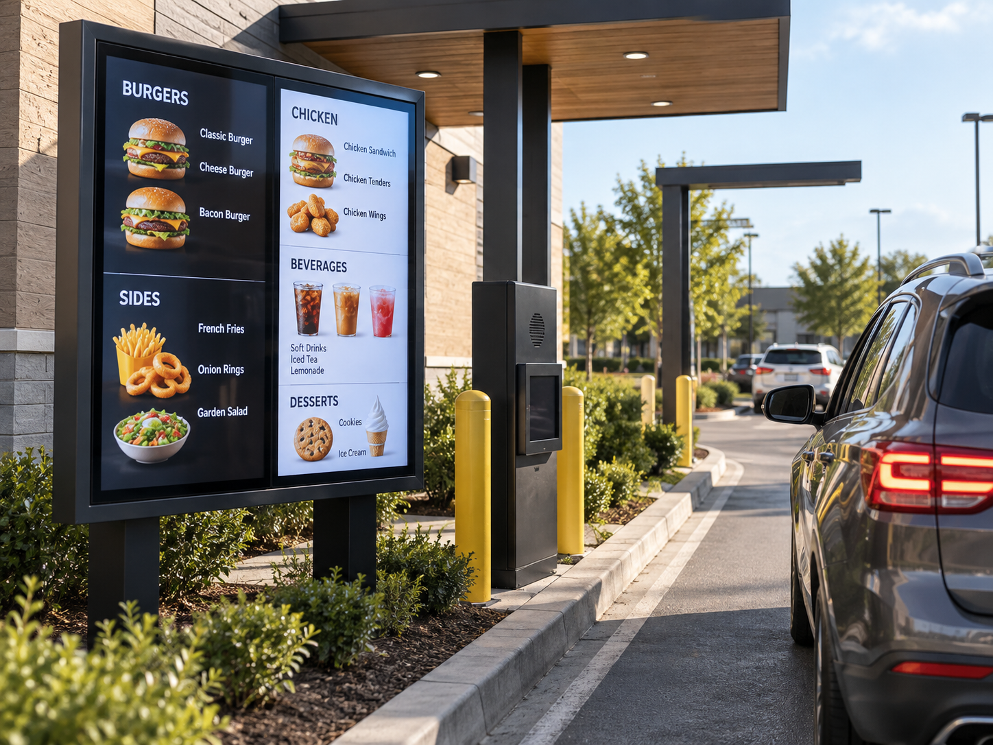
A driver entering a drive-thru does not study the menu the way someone reads a restaurant website. The vehicle is moving, the queue is changing, another car may be blocking part of the view, and the ordering point is getting closer. The useful reading window can be surprisingly short.
That is why a drive-thru menu board project should not begin with the question, “How much menu can we fit on the screen?” A better starting point is: what does the driver need to see at each point in the lane in order to make the next decision?
For a multi-unit LED sign wholesale project, lane geometry, menu hierarchy and daypart changes need to be considered together. A display can be large enough and still feel difficult to use if the important category appears too late, a promotion takes over the strongest viewing area, or breakfast and lunch layouts reorganize the whole screen every time the content changes.
The purpose of this guide is to connect the physical drive-thru lane with the way the menu is actually read. It stays focused on vehicle approach, viewing sequence, menu zoning and daypart readability rather than chain-store rollout, OEM programs, pricing or general outdoor advertising.
The Menu Board Only Makes Sense in the Context of the Lane
Two restaurants can offer almost the same menu and still need very different screen arrangements.
At one site, vehicles may approach the ordering area along a long straight lane. Drivers can see the first display early and have time to absorb the major categories before reaching the speaker. At another site, the lane may wrap around the building. A wall, landscaping, another vehicle or the turn itself may keep the display outside the useful viewing angle until much later.
Those differences change the role of the screen. A board visible early in the approach can help people narrow their choices. A board that only becomes clear close to the ordering point may need to concentrate on the information that matters immediately before the order is placed.
The queue matters too. The “viewing distance” of a drive-thru is rarely one fixed number. A driver may first notice the menu from farther away, then stop at a different angle behind another car, move again, and finally arrive at the ordering position. Content that looks clear from one ideal front-facing position may be much less useful through that sequence.
The menu board should be treated as part of the ordering journey, not as a digital poster placed beside the lane.
This is also where project responsibilities begin to overlap. Procurement may be selecting the displays. An installer may be working from the site structure. Restaurant operations may decide which categories have priority. A marketing or content team may change promotions and dayparts after installation.
Those teams do not need to make the same decisions, but they do need to work from the same lane logic. Otherwise, a mounting position that makes sense structurally can conflict with the content hierarchy, or an attractive menu layout can assume a viewing position drivers rarely have.
It is particularly relevant when the display has to support an actual ordering decision rather than simply attract attention.
- Restaurant groups planning a new or revised drive-thru layout
- Signage integrators working from lane drawings and proposed mounting positions
- Procurement teams sourcing several menu-board displays for the same project
- Operators replacing static menu panels with content that changes by daypart
- Projects where promotions must share the same screen area as the core menu
Lane Geometry Decides What the Driver Can Read First
It is useful to think about the lane as a sequence of reading opportunities rather than one viewing point.
A driver may first catch sight of a menu board while still moving through a bend. A few seconds later, the vehicle may be nearly square to the screen. Then the car in front advances and the driver moves into a position where part of the board becomes harder to see. Each stage offers a different amount of attention and a different quality of view.
The earliest view should make the next choice easier
The first visible board does not automatically need the complete menu. At that point, drivers may still be steering through the lane, checking the queue or following another vehicle. Giving them every item, every price and every promotion at once can make the first screen technically complete but practically slow to read.
Instead, the early view can answer the broad question first. What type of meal is available? Where are the main categories? Is there one offer that genuinely needs to be understood before the driver reaches the next position?
That question creates a much stronger content hierarchy than “What else can we fit?”
The clearest position should carry the harder comparison
As the angle improves and the vehicle moves closer, the menu can support more detailed comparison. This is where item groups, variations or secondary decisions become easier to process.
A common mistake is to arrange the screen according to graphic symmetry alone. Four zones may look balanced on an artwork file, but the real lane may give one side of the display a noticeably better viewing position. A menu that follows the driver’s visual sequence is usually more useful than one that merely looks evenly divided when viewed straight on.
On a straight approach, the menu may enter the driver’s view gradually and remain visible for longer. On a turning approach, the screen may become readable much later and at a changing angle. The second situation generally leaves less room for visual clutter at the beginning of the reading sequence, even when the physical display area is similar.
The ordering point is too late to begin the whole decision
If the driver only starts searching the menu at the speaker, the content and the operator are competing for attention at exactly the wrong moment.
A stronger drive-thru sequence allows the customer to make progress before arriving there. The early view provides orientation. The strongest viewing position supports comparison. The ordering position confirms the choice or supports the final small decision.
This does not mean every drive-thru requires several screens. It means that each visible area should be given a clear role based on where the driver is in the decision process.
Menu Zoning Should Follow the Decision, Not the Empty Space
Once the viewing sequence is understood, the next challenge is deciding what should remain stable and what needs to change.
A drive-thru menu usually contains information with very different jobs. Core categories help people navigate. Individual items allow comparison. Drinks, sides or add-ons may come later in the decision. Promotional content needs space to change without forcing the whole menu to be rebuilt.
That is why an LED Display Board should not simply be divided into equal graphic boxes. The content zones should reflect how the customer moves through the order.
Keep core navigation more stable than promotions
A useful distinction is between information that helps drivers understand the menu and information that changes frequently.
If the main meal category is in one place today and moved somewhere completely different tomorrow because a promotion changed, repeat customers have to search again. Promotions can remain dynamic without turning every menu update into a completely new visual map.
Stable zones help the driver know where to look. Dynamic zones give the operator room to change offers without disturbing the entire menu.
The exact balance depends on the restaurant. A short menu can devote more area to imagery. A larger menu may need more disciplined category separation. What matters is that each zone has a reason for its position.
Primary space should go to the first important decision
Primary and secondary information should not receive identical treatment.
If the customer normally chooses a meal group first, that choice should be easier to locate than an optional add-on. If a promotion applies only after the main item is selected, placing it in the most dominant area may interrupt the natural order instead of helping it.
This becomes especially important in a moving queue. Every extra visual element has a reading cost. Adding one more product photo or banner can reduce the attention available for prices, names or category labels somewhere else.
Good menu zoning therefore does not ask how much content the display can physically show. It asks how much content a driver can realistically process before the next decision point.
Start With the Sign Application, Then Confirm the Screen Format
For a drive-thru project, the useful product discussion starts with the outdoor sign application rather than choosing a cabinet size first. The actual screen format still needs to follow the lane, mounting position, available display area and menu structure.
This is particularly important when the same project contains several boards with different jobs. The first screen may support category recognition, while another position may need more detailed menu information. Those screens do not automatically need to be treated as identical simply because they belong to the same restaurant.
Use the LED Sign Board range as the commercial starting point, then bring the lane drawing and content plan into the project review before finalizing the display arrangement.
Explore LED Sign BoardDaypart Readability Is a Menu-Consistency Problem Too
Drive-thru content often changes between breakfast, lunch and evening service. The products may change, the promotion may change and the visual tone may change. At the same time, the screen is being viewed under different daylight conditions.
It is tempting to treat those as separate issues: operations manages dayparts, while the display handles visibility. In practice, they meet on the same screen.
Change the content without rebuilding the driver’s mental map
Breakfast does not have to look identical to lunch, but the major content roles should remain recognizable where the menu allows it.
If the primary category area sits in one position during breakfast, there is a strong usability reason to consider keeping the same role there later in the day. The items can change without forcing the driver to relearn where the important information lives.
The same applies to promotions. A dynamic offer can change frequently while still occupying a predictable part of the menu. That makes daypart management easier to understand from the lane and easier to control operationally.
Do not judge readability only from a desktop artwork file
A layout can look clean when viewed straight on from a monitor and still become difficult from the car.
The lane introduces distance, angle, movement, partial obstruction and changing ambient conditions. Small text that seems comfortable in the design file may compete with large imagery. A subtle distinction between two background areas may become less useful outdoors. A promotion designed to be visually dominant can overpower the category a driver actually needs to find.
A practical content review should therefore ask:
- Can the main categories still be identified quickly from the actual lane position?
- Are names and prices competing with decorative graphics?
- Does a promotional area dominate more of the screen than its decision value justifies?
- Do breakfast, lunch and evening menus keep a recognizable reading order?
- Does the layout still make sense when another vehicle blocks part of the lower or side area?
The goal is not to make every daypart visually identical. It is to preserve a usable decision path while the content changes.
What to Decide Before Asking for a Wholesale Menu-Board Proposal
A procurement team can save a great deal of back-and-forth by resolving the lane logic before asking a factory to recommend a display arrangement.
The first decision should not be a screen specification. It should be whether the project team agrees on where the driver sees the menu, what must be read first and what content changes during operation.
Do not choose a screen only because it fits the available wall, pole or sign frame. First confirm the useful viewing positions, the order of menu decisions and the daypart content structure.
Once those questions are clearer, the discussion with a wholesale LED sign supplier becomes more useful because screen size, layout and mounting position can be reviewed against a real operating requirement rather than an isolated dimension.
Show the lane, not only the building
Send a lane drawing or marked site plan showing the vehicle approach, turns, queue direction and ordering point. If there are several proposed screen positions, mark them separately instead of presenting one generic location.
Show where the driver is expected to read
Include the important viewing positions and approximate distances along the approach. The same screen may be encountered from more than one point, so a single front-facing distance does not always describe the real experience.
Explain the menu before finalizing the display
Identify the major content zones: core categories, detailed item information, promotions and secondary choices. Also explain what changes between breakfast, lunch and evening if the screen carries several dayparts.
Add the project information that affects implementation
Include the proposed screen size or available installation area, quantity, expected power and control source, installation country and project timeline. These details give the factory enough context to review the display direction without guessing at the site.
This project brief does not replace structural, electrical or local installation review. It gives procurement, operations, content and the display supplier a common reference so they are not solving different versions of the same project.
Factory Support Should Connect the Screen Back to the Project
Factory involvement is most useful when it helps confirm whether the proposed display arrangement makes sense for the information already gathered.
That does not mean the factory should decide the restaurant’s menu strategy. The operator still owns the content priorities, and site professionals remain responsible for the parts of the project that fall under their scope. The display discussion should connect those inputs rather than replace them.
Size and layout should be reviewed together
A screen can fit the available structure and still create an awkward menu. If the content requires several distinct zones but the chosen display shape forces those zones into narrow or crowded areas, the physical fit has not solved the communication problem.
Likewise, a larger screen does not automatically fix poor hierarchy. If the layout treats every message as equally important, adding more area can simply create a larger version of the same confusion.
The useful review is therefore the relationship between the available display area, the proposed content zones and the viewing sequence.
Mounting position and project interfaces should not remain hidden assumptions
The mounting concept, screen location, expected power source and control source should be visible in the project discussion before the order moves forward.
This matters because the content team may assume one screen orientation while the installer is working around a different site constraint. A small position change can alter viewing angle or the point at which the menu becomes readable.
Bringing these assumptions into the same review makes it easier to identify conflicts before the display arrangement is locked.
For several units, document what is meant to stay consistent
A multi-unit purchase benefits from a clear project reference. Instead of relying on scattered emails, the agreed display arrangement, dimensions, content assumptions and interface requirements should be easy for procurement and installation teams to identify later.
Consistency does not mean every screen must perform the same job. It means the project team should know which elements are intended to match and which differences are deliberate because the lane positions are different.
A Useful Decision Flow Starts With the Driver, Not the Artwork
When a project becomes complicated, the sequence below helps keep the discussion anchored to the drive-thru experience rather than jumping directly into display selection.
Identify where the driver first gains a useful view and how that view changes as the vehicle moves toward the ordering point.
Decide what the driver needs to understand first, what can wait and what only matters immediately before the order.
Separate stable navigation from changing offers, then give primary and secondary information different levels of attention.
Confirm what changes between breakfast, lunch and evening while preserving a recognizable reading pattern where practical.
Confirm who changes the content and make sure the zoning concept remains practical during normal menu updates.
Only after those points are clear does it make sense to close the loop on screen size, placement and the final display arrangement.
Starting with artwork and trying to force it into the lane later reverses the logic. Starting with the driver creates a clearer basis for both the content team and the supplier.
Frequently Asked Questions
How does lane geometry affect a Drive-Thru LED menu board?
How should menu content be divided into zones?
What changes when the menu needs to work across several dayparts?
What should be sent before requesting an LED sign wholesale quote?
Turn the Lane Plan Into a Menu-Board Project Brief
If the drive-thru layout is already available, send the lane drawing, ordering point, proposed screen locations, screen size, viewing distance, menu/content zones, quantity, power/control source, installation country and timeline. That gives the project review a real operating context instead of starting from a screen size alone.